For day 3 of Dashboard Week DS32 got stuck into creating dashboards that were focused on accessibility.
The Task
Glasgow City Council are trying to make their city’s data more accessible to residents, and have given us a sample of road repair data from FixMyStreet to show what we can do.
Create a product which enables users who are not well served by current interfaces to access data about their surroundings. Product outcome must utilise features we learned about accessibility and universal design.
My Plan
- Read through all the documentation - 15 minutes
- Lunch - 30 minutes
- Decide on which disability group to focus on - 5/10 minutes
- Create dashboard sketch in Excalidraw - 45 minutes
- Create Tableau dashboard - 90 minutes
I decided not to focus on a specific disability type and instead create a dashboard that was accessible for all users.
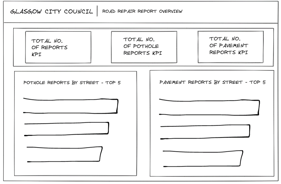
Excalidraw
I focused on designing a simple dashboard that would be suitable for users with a range of disabilities - this is what I came up with as a first draft:
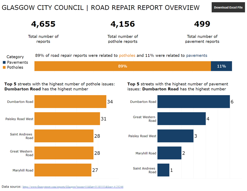
Final Dashboard
Key considerations when creating the dashboard in Tableau:
- Made sure KPIs were in the title so it can be read by a screen reader. Also used
large font for the text and numbers so that it was suitable for the visually impaired - The titles of the charts explain what the chart shows so that a screen reader
can read this information out to the user so they understand what the chart is
showing - Font used was Verdana - this is a sans-serif font which is designed specifically for online legibility and makes it easier to read for the user
- Used a high contrast colour combination of orange and dark blue to make it easier for the user to see which graphs referred to which category - this was consistent throughout the dashboard. Checked this against a colour palette contrast checker to ensure that it was suitable for users with visual impairments
- Avoided visual overload by reducing the use of marks/colours/categories
- Used simple bar charts to make it easier for the user to understand the chart
- An Excel format was included as a dashboard navigation button so the reader could easily view the underlying data
Link to dashboard: https://public.tableau.com/app/profile/imogen8656/viz/GlasgowCityCouncilRoadRepairReportOverview/Dashboard1
Tips for Future Cohorts
- Read all of the documentation before getting started with the task.
- Make sure you allocate enough time to testing how accessible the dashboard is using the different tools (screen reader, colour palette checker, etc).