Systems that record data containing a timestamp whenever a change is made allow us to investigate the different stages certain opportunities, tickets, operations go through. This includes, time between data points, time since starting something, relative points in time, and more.
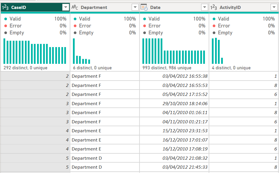
As an example, I will use a support desk ticket data set containing a Case ID, Activity, Department Name and Date/Time field.
Power Query
There are a few data transformations that are required in order to even start looking at the timelines these tickets go through.
First, how long does each activity take?
In order to figure this one out we need to look 1 row below and find the difference between the date/time it started and when the next activity started, e.g., the first activity finished.

Unfortunately, we have no multi-row capabilities like in tools as Alteryx or Tableau prep, but we can work around this by carrying out a self join using the Index Column.
We'll start by sorting the data by CaseID and Date Ascending, followed by adding two Index Columns; one starting from 1 and another starting from 0.

this will allow us to merge a duplicate query back to itself to obtain the next row of data against the previous as a left outer join.

Great, this will now allow us to carry out date difference calculations at the whatever level we want (seconds, minutes, hours, days, etc).
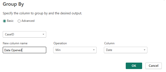
Before we delve further into Power BI Desktop, we'd also want to know at what relative point in time we are, since starting the Case, e.g., we want to reference the first date/time each CaseID was registered.
This is slightly easier to accomplish, as we can create a reference to the original table and aggregate it to the CaseID level with a minimum Date and merge this back to the table from above.

At this stage you can either decide to pre-calculate all the relative time points if you know at what level (seconds, minutes, hours, days, etc) you want your analysis to be at. If not, you can be a bit more flexible and calculate it within Power BI desktop. For the purpose of this Report, I looked at the hours spend within each Activity as well as hours since a ticket opened and pre-calculated these for usage in Power BI Desktop.
for your reference, you can find the .pbix file in my GitHub repository: "explaining with"
Power BI Desktop
There are several time based analysis shown in the Report below, for this blog we will focus specifically on the relative point in time analysis so we can answer questions like: how many tickets are Closed after 24 hours since opening?
Even though we've prepared the data to tell us how long it took to get from one stage to the next, we only have one row for each Activity change. So what happens if I filter to 24 hours since the start? It will only show records that took exactly 24 hours since a ticket was first opened.
What if I filter to 24 hours and below? Than I will see all Activity stages per ticket, rather than the latest.
Ultimately, we only want the latest Activity to show after 24 hours. We could scaffold the data to insert a row for each ticket and every hour between opening and closing the ticket. This will however, increase the data size massively. For your reference, I tried this and it turned the 3309 unique tickets with a total of 12k rows into 1.2M rows. Imagine if you'd want to investigate this dataset at the minute level or increase the total tickets...
So scrap that, and let's use some DAX and a Numeric Range Parameter to figure out what stage a ticket is in at any given hour since the ticket opened.
First we will create a numeric value parameter, through the interface of by writing DAX.
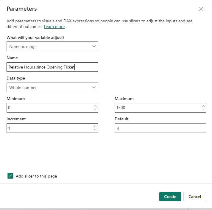
Relative Hours since Opening Ticket = GENERATESERIES(0, 1500, 1)Numeric range Parameter
When added to a slicer, this will allow us to dynamically update a point in time within a Measure.
Point in Time Activity =

VAR RelativeHour = SELECTEDVALUE('Relative Hours since Opening Ticket'[Relative Hours since Opening Ticket])

//this will allow us to pick up the number from the parameter and refer to it within this measure

VAR Table1 =
FILTER(
    HelpDeskData,
    HelpDeskData[Relative Hour since Ticket Submission] <= RelativeHour
)

//we narrow down the existing helpdeskdata table to only records that are within the selected hour since opening the ticket

VAR Result =
SUMX(
    Table1,
    //our narrowed down table
    IF (HelpDeskData[SequenceID]=
    CALCULATE(
        MAX(HelpDeskData[SequenceID]),
        //the maximum record

        HelpDeskData[Relative Hour since Ticket Submission]<= RelativeHour,
        //only records that are equal or below the parameter

        ALLEXCEPT(HelpDeskData, HelpDeskData[CaseID])
        //removes all the context filers apart from the case id column to make sure that the maximum record for each case is returned

    ),
    1,
    //if the above record per case equals the maximum within the specified parameter value, return 1 to so we can count the cases

    0 )
)
RETURN
Result
Measure
I've tried to annotate the calculation the best I could. In essence we are first returning a table of the help desk data where we narrow down the table to only contain rows that are equal or below our selected hour.
From that table we identify the maximum stage found of a case using the calculate function. This is compared to all stages left in the table for the case and gives a 1 when it's equal to the maximum found, else a 0. We can use SUMX to add up the remaining 1's to get a total case load for each stage, department and time frame selected.
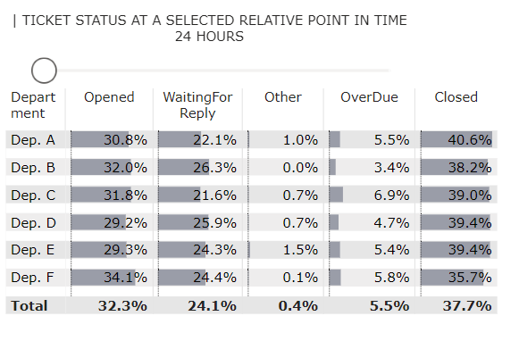
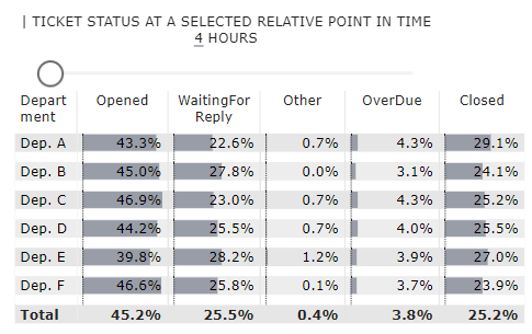
To give you a short example matrix below, we can see how at 4 hours since opening a case, just over 29% of tickets from department A have already been closed.
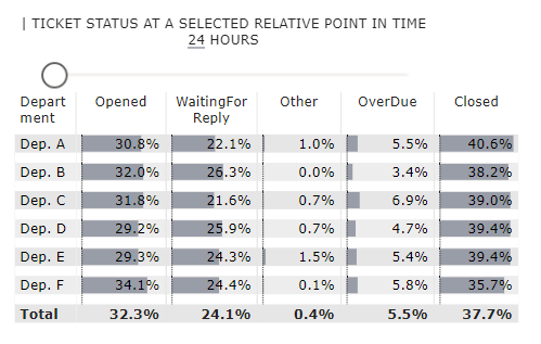
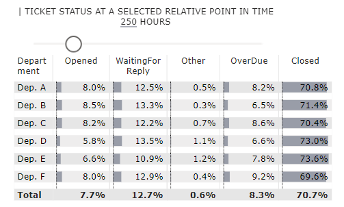
And once we reach the 24 hour mark it's over 40%, with tickets from department F still having 34% of tickets stuck in the open status. The 250 hour mark does start to show a bunch more tickets in the Over Due status, but overall the Support Desk seems to be churning through the tickets!
You can find the full Report embedded below for you to interact with (use the radio button to change from State of the Week to the Analysis Report view).
If you are interested in the Boxplots shown in the Report, have a look at my previous blog on Boxplots without custom visuals