The Feb 2024 feature release for Power BI brought us Visual Calculations as a preview feature. Visual calculations allow us to carry out aggregations on marks present on the visual. Effectively allowing us to aggregate a measure that is already aggregated.
For people coming from a Tableau background, this would be equivalent to table calculations or window calculations and Power BI makes it visually easier for you to develop calculations for metrics such as running totals, moving averages and percentage of totals.
In this blog I'll run us through four metrics frequently used by business, show you how we create it using the new Visual Calculations and how we (used to) do it using DAX measures.
Link to the GitHub repository containing all files and links to the blogs related to this project.
At the time of writing, 01/03/2024, visual calculations are not supported within embedded reports, I will embed them regardless preparing for future releases when it does get supported.
1. Running Totals
Tracking a total value over time allows us to investigate growth trends as well as monitor our progress towards targets.
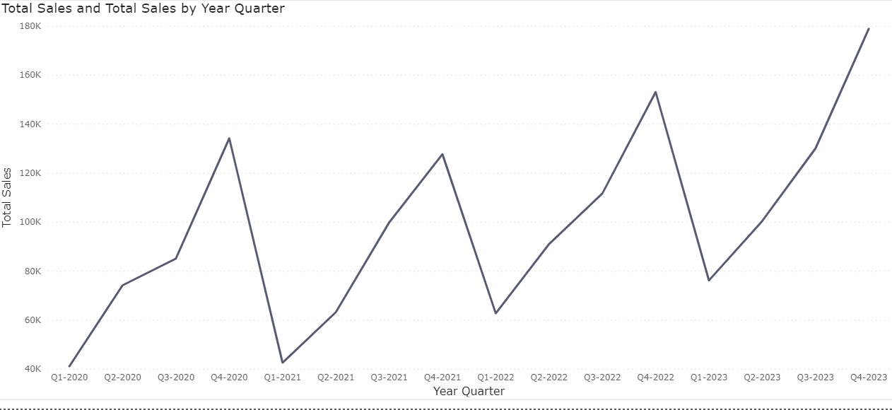
If we look at quarterly sales over time we can quickly identify highs and lows but it won't allow us to to monitor the grand total or whether we are on track to meet a total target.
Total Sales =
SUM(Orders[Sales])
measure
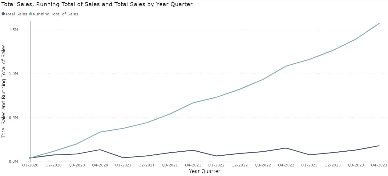
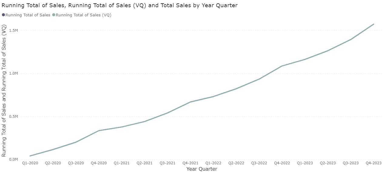
Creating a running total (or cumulative total) on the quarterly sales will allow to monitor that grand total increasing.
We would need to start at the first quarter as a base number and the second quarter would be the sales value of the first and second quarter combined. Technically though, we already used a SUM of Sales to get plot our line by quarter and year so how can we aggregate this again?
The visual in Power BI is already breaking up our underlying sales table by Year and Quarter so technically, the software cannot see the first quarter values in the second quarter.
In order to overcome this, we have to use context transition by utilising the CALCULATE function to allow Power BI to 'increase' it's context at every year and quarter to see all previous quarters and years.
Running Total of Sales =
CALCULATE(
    [Total Sales]
    ,_date[Date]<=MAX(Orders[Order Date])
    )
    //setting the context to all rows up until the current year and quarter for every point on the line
measure
This isn't the easiest to grasp though, unless you have a solid understanding of the underlying processing of Power BI. Especially if you then want to start including more elements to the visual, such as breakdowns by department or restarting every year, etc.
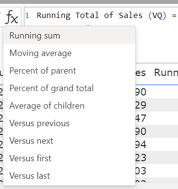
The new Visual Calculations will bring up a table of your current year and quarter sales as a table and apply simpler functions to visually see the result.
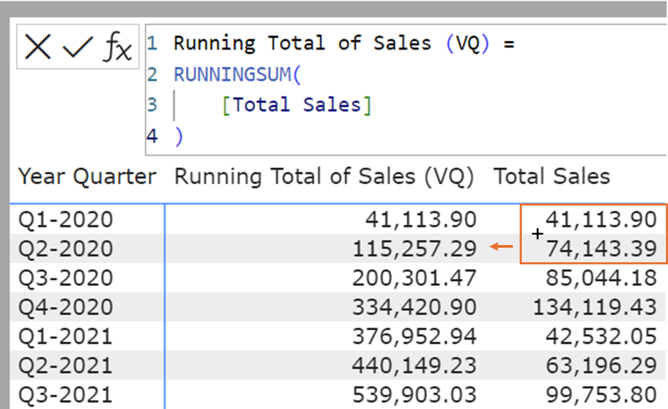
//Visual Calculation
Running Total of Sales (VQ) =
RUNNINGSUM(
    [Total Sales]
)

//DAX Measure
Running Total of Sales =
CALCULATE(
    [Total Sales]
    ,_date[Date]<=MAX(Orders[Order Date])
    )
Visually we have achieved the same as the previous DAX measure, but it was easier to write, understand and definitely easier to explain!
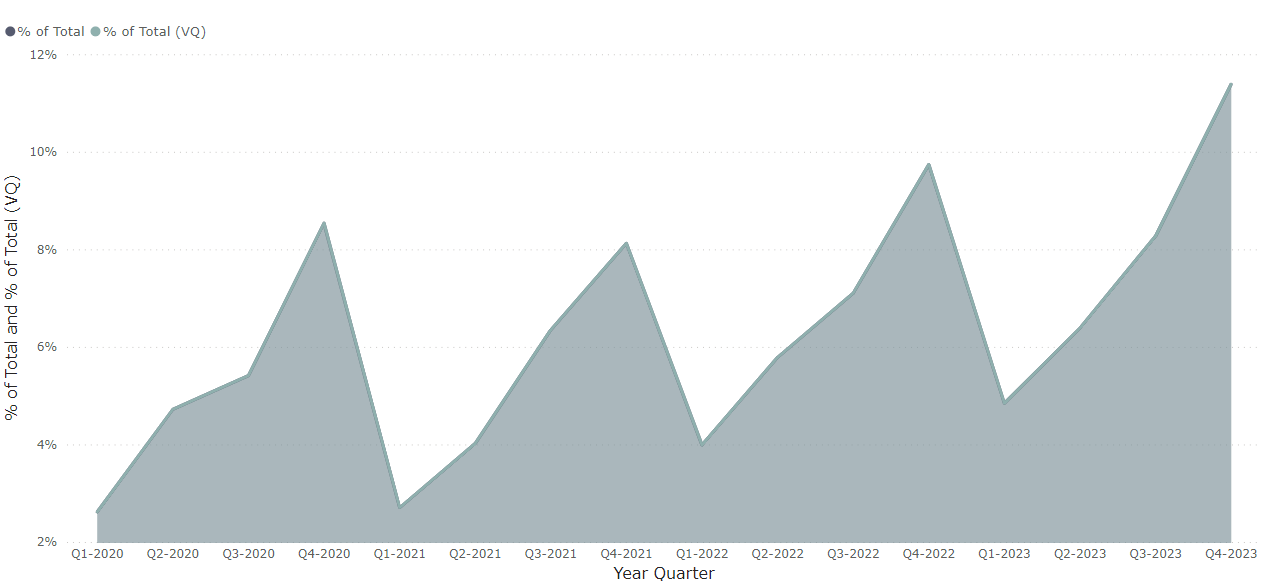
2. Running Total of % of Total
We can add additional relative context to a percentage of total by including the running total on top of it. This won't change the trend we observe with a normal running total but will allow us to see it in a relative context, for instance, over 31% of all our sales came from 2023.
In order to achieve the calculations, we start with the percentage of total.
We achieve this as a measure in DAX using the sum of sales over the grand total sum of sales.
% of Total =
[Total Sales]
/
CALCULATE(
    [Total Sales]
    ,REMOVEFILTERS()
)
measure
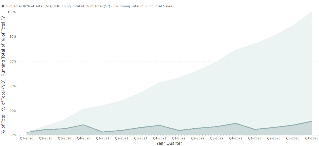
We wrap the same DAX syntax we used in the running total above over the % of Total
Running Total of % of Total Sales =
CALCULATE(
    [% of Total]
    ,_date[Date]<=MAX(Orders[Order Date])
    )
measure
In Visual Calculations, when we select percent of grand total, it automatically populates the syntax that includes the division, and the COLLAPSEALL function
DIVIDE([Field], COLLAPSEALL([Field], Axis))
Like before, we wrap the RUNNINGSUM() function around the % of Total and voila, we have achieved the same result!
% of Total (VQ) =
DIVIDE([Total Sales], COLLAPSEALL([Total Sales], ROWS))

Running Total of % of Total (VQ) =
RUNNINGSUM([% of Total (VQ)])
Visual Calculations
3. Moving Average
Looking at a measure over a high(er) level of granularity, such as monthly, weekly or daily, makes it more difficult to see clear trends or spot seasonality. Introducing an additional measure which takes into account previous and/or future values can help smooth out those spiky featured lines and bring forward the underlying trends.
Let's look at the total sales by month between 2020 and 2023.
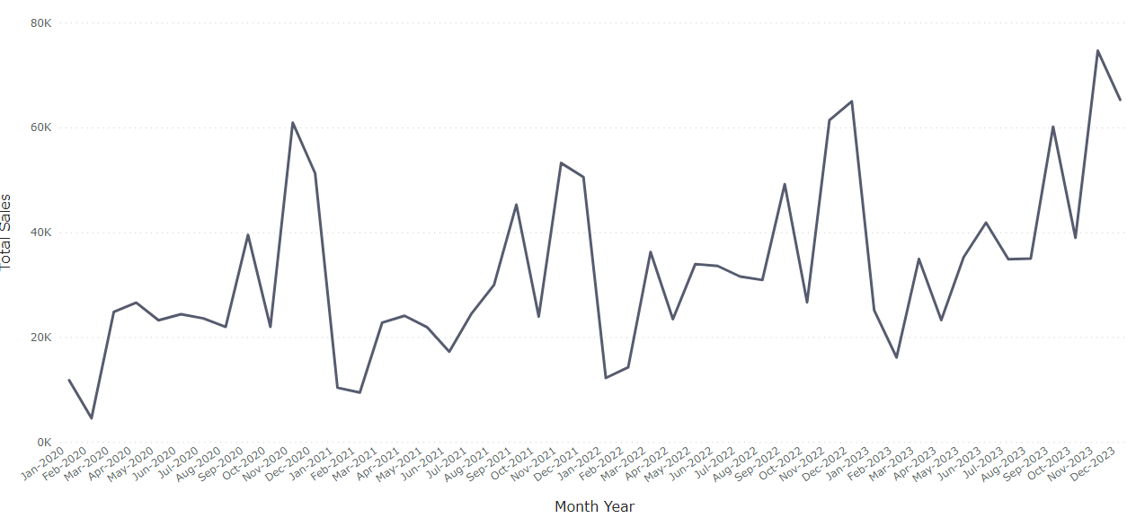
We can see general peaks and downfalls and potentially some seasonality but it's hard to put a finger on it at this stage.
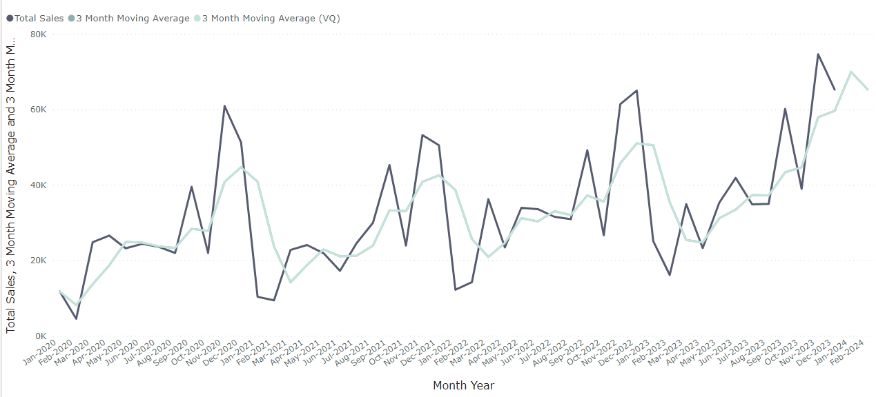
Introducing a three month moving average, e.g. Jan 2023 is the average (mean) of Jan 2023, Dec 2022 and Nov 2022 brings alive those trends. Furthermore we can see that beyond approx. August 2023 we are experiencing out of the normal growth.
There are a couple of ways to calculate moving averages using measures with DAX. One of which is using the WINDOW function, which allows us to look at relative points from a given data point to allow us to create a moving average of a sum of sales.
AVERAGEX(
    WINDOW(
        -2 , REL
        ,0, REL
        ,SUMMARIZE(
            ALLSELECTED(_date)
             ,_date[Month Year]
             ,_date[MY Sort])
        ,ORDERBY(_date[MY Sort], ASC)
    )
    ,[Total Sales]
)
measure
Please note you would have to include the sort by field in the context transition, I would refer you this blogpost by sqlbi for further details on why.
For the Visual Calculation, we use the MOVINGAVERAGE function, where we do not have to worry about the summarization as it directly applies the moving average on the already aggregated Total Sales in the visual.
3 Month Moving Average (VQ) =
MOVINGAVERAGE(
    [Total Sales]
    ,3
)
Visual Calculation
4. Pareto (modified)
Last but not least is one of my favourite checks that I tend to carry out on data; how many individuals/customers/engines etc make up 80% of our values? For instance: what % of customers make up 80% of our sales.
This is translated from the Pareto Principle; "80% of consequences come from 20% of causes". So let's see if this holds true in this data set.
As I didn't want to steer away too much from the Visual Calculations, we used a pre-calculated rank of customer based on their total sales, as it would otherwise require significant chart workarounds as we cannot use a visual calculation on the X Axis. (see .pbix file in github link above for more details).
% of Total =
[Total Sales]
/
CALCULATE(
    [Total Sales]
    ,REMOVEFILTERS()
)

Running Total of % of Total Sales by Customer =
CALCULATE(
    [% of Total]
    ,'Customer Rank'[Customer ID Rank]<=MAX('Customer Rank'[Customer ID Rank])
    )
measures
% of Total =
DIVIDE([Total Sales], COLLAPSEALL([Total Sales], ROWS))

Running Total of % of Total Sales (VQ) = RUNNINGSUM([% of Total])
Visual Calculations
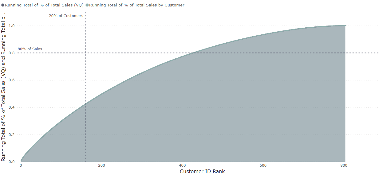
Adding a couple of reference lines to indicate 80% of the sales and 20% of the total customers reveal us that only 40% of our sales comes from 20% of our customer and in order to achieve 80% of our sales we go beyond the 50% mark for customers. Might be a sign of healthy customer diversification!
And this is just the beginning, I'm sure the available functions and functionality will increase over time as this is just landed as a preview feature.