


As we’ve now completed multiple client projects at the Data School, I’ve been building a lot of dashboards in Tableau.
One thing I’ve found is that getting consistent formatting across multiple sheets can take longer than expected. Fonts, colours, borders and spacing all need to match, and doing that manually across every worksheet gets repetitive quite quickly.
At the same time, as workbooks grow, they can also start to feel cluttered and harder to navigate.
Here are a few simple tips I’ve started using to save time and keep things clean.
Tip One: Copy Formatting Between Worksheets
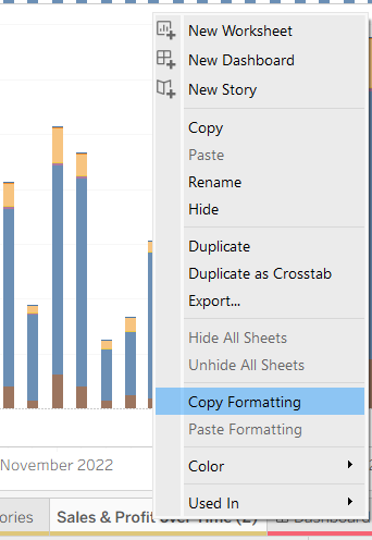
There’s a really simple way to reuse formatting across sheets.
You can copy formatting from one worksheet and apply it to another. If you right-click on the sheet tab that already has the formatting you want, you’ll see an option to copy formatting. You can then go to another sheet, right-click, and paste that formatting to copy it to the selected worksheet.
This carries across things like fonts, colours, shading and borders without needing to redo everything.
I’ve found this especially useful when building dashboards with multiple charts, as it makes it much easier to keep everything consistent without repeatedly adjusting small details.
Tip 2: Hide Unused Fields
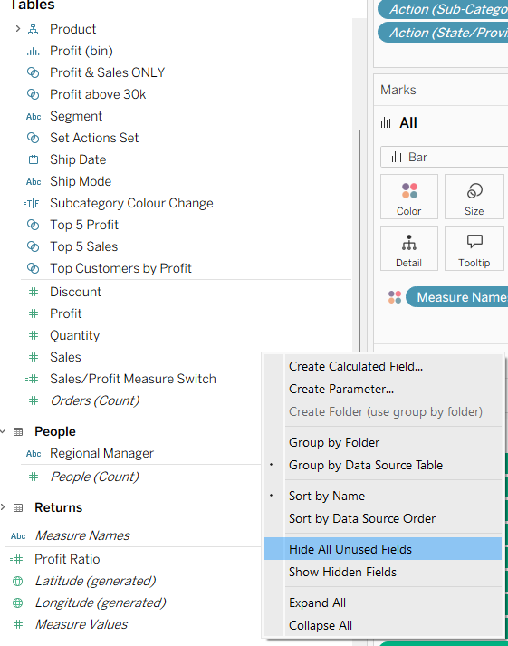
Another feature I’ve started using more is hiding unused fields.
When working with a dataset, you often end up with far more fields than you actually need. Even once your charts are built, those unused fields still sit in the data pane, which can make things feel cluttered.
There’s a quick way to clean this up. From the data pane menu, you can select “Hide All Unused Fields”, and Tableau will automatically hide anything that isn’t being used in your worksheets.
This doesn’t remove anything from your data source, it just simplifies what you see.
I’ve found this particularly useful towards the end of building a dashboard, as it makes the workbook easier to navigate and reduces the chance of accidentally using the wrong field.
Tip 3: Hide Sheets to Keep Dashboards Clean
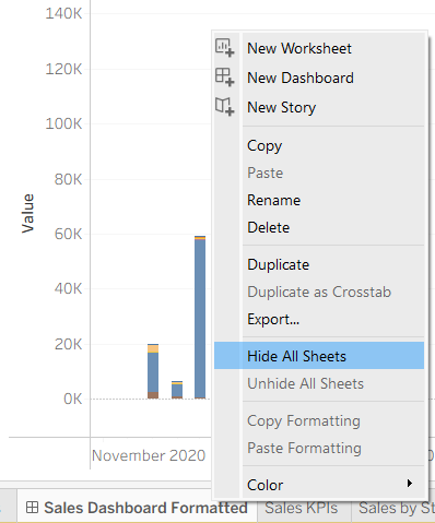
Once your dashboard is finished, there’s also a simple way to tidy up the workbook itself.
By default, Tableau shows all worksheets as tabs along the bottom of the screen. While this is useful when building, it can make the workbook feel a bit messy when you’re presenting or sharing it.
You can hide these by right-clicking on a dashboard tab and selecting “Hide All Sheets”. This removes the worksheet tabs from view and leaves just the dashboard.
I’ve found this makes the final output feel much cleaner and more focused, especially when sharing dashboards with others.
Final Thoughts
These are all small features, but they make a noticeable difference when building dashboards.
Since I started using them, it’s been much easier to keep things consistent, reduce clutter, and focus on the actual analysis rather than repeatedly fixing formatting or navigating messy workbooks.