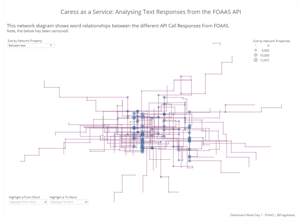
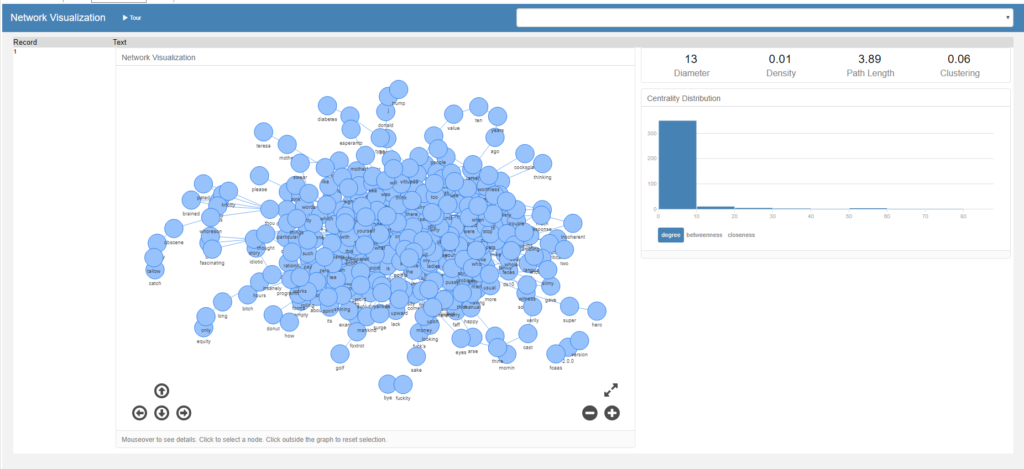
This week is DB week for DS10, in which we all complete one dashboard challenge per day. Our hill start today was a text response API known as FOAAS, which generates profane responses based on parameters in your input query. After some deliberation and some help from newly minted Alteryx Ace Ben, I decided to make a network diagram based on the common relationships between words in the response calls, which you can view below or interactively on Tableau Public.
Part One: Alteryx Flows
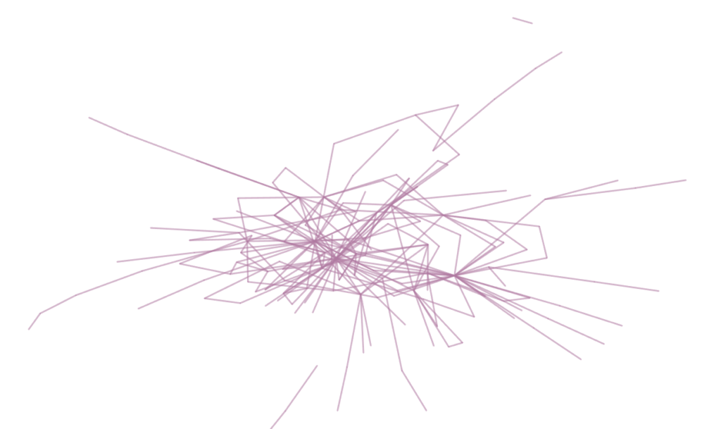
No, it’s not your eyes.
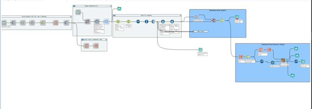
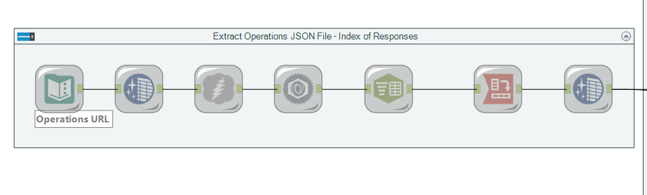
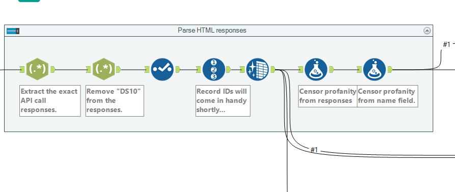
The Alteryx flow for this task can be divided into two pieces, the first of which being obtaining the data and the second being processing it. The first part of the flow extracted the operations JSON file from the API, which listed all the calls which can be made to it.
From there, we parsed this list out into creating individual calls for each response, and substituting dummy parameters for values, which is all achieved in the formula tool (with formulae stacked on top of eachother).
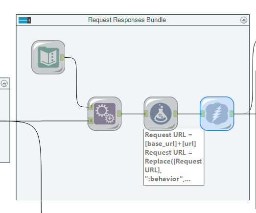
It was then simple to use a regex call to extract the exact API response information required, and censor the data because y’know, we all work here.
The flow now moves into the creation of data sets which are ready to create text analytics from, a frequent method of which is ngram analysis. Ngrams are observations of word sets, which are a n number of words joined together – they provide more context for understanding and are the basis for predictive text engines (e.g “Red”, “dress” and “alert” have independent meanings, but “Red dress” and “Red alert” have very different meanings as pairs). A common ngram is a bigram (two words paired together) which here we executed in Alteryx using R code, based on tidy data principles as applied to text mining by Julia Silge and David Robinson. You can also create trigrams, groups of three words, which you can see I’ve closed in a container in my Alteryx flow.
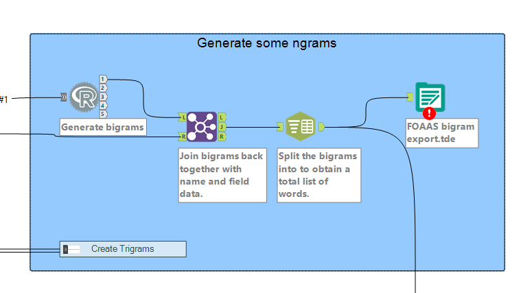
Creating the bigrams with R code means the output from it is pretty much just a list of words, so to get any contextual meaning back into those pairs (i.e. the calls they came from) they must be joined back together with the censored input, ready just before the R code. Our bigrams provide us with the basis to create relationships between words within our data, which are the foundations of a network. From this output, we can move towards creating the nodes and edges which are the basis of a network graph.

I was assisted in this by the previously completed hard work of Ben (as mentioned above) who had created a macro to calculate the nodes and edges, once node and edge data had been properly formulated as inputs. This is quite a complex field of maths in its own right, but essentially we need to create coordinates for each word (the nodes) and paths between those words to indicate where they were next to each other (and over the whole data set, close to one another), in order to provide Tableau with sufficient information to generate the graph, which it doesn’t readily do of its’ own accord (but if you want it to, please vote for it!).
If your eyesight is really good you may be able to tell this isn’t the censored version.
Now that the data is ready, it’s time to start working with it in Tableau. What I am aiming for is something similar to the network diagram the macro itself generates, which looks like a knotty cluster of dots. Language data often renders quite differently to social network data (the other frequent subject of network diagrams, and the one used in the macro demo) as language analysis can sometimes string itself into long tails, for example if someone goes off on a tangent on a specialist subject.
Part Two: Tableau
Loading the data into Tableau, you will notice that you have gone from a few API calls to a large data set with a lot of numbers in it, most of which relate to important things within graph theory. As an overview, all these numbers relate to different ways of measuring how well connected a network is, which are summarised in this article. But how do we go from these coordinates to a network graph?
The main thing to remember when creating the graph I found was to create the lines first. I did this by using the X and Y coordinates of the field known as “Name” which in my data, was the name of the API call – it’s important to use coordinates which can be grouped so Tableau knows which points to connect next. Having plotted the Name X and Name Y coordinates, I have one point on my grid – make sure that the pills are aggregating the coordinates as MIN and not SUM!
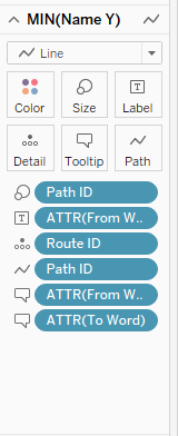
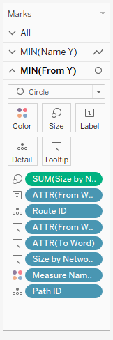
The marks card show on the left now represents all the data that you’ll need to put into your card in order to generate paths (and create coherent tool tips!). The Route ID is the individual path of each word to each other word that it is connected to, and the Path ID is the number of that path between those two rows – here we only have one relationship, but if you were analysing another kind of data set, there might be multiple paths depending on if the network graph was directed or not – Path ID is also on size here in case there is more than one instance of a bigram, but as this is a very small dataset in text analytic terms, this doesn’t matter much. The ATTR (attribute) fields are those which we can use to differentiate word pairs in pieces of lines, and to add to tool tips to ensure the line makes sense to a user hovering over it, and you should end up with something like the below;
This isn’t particularly helpful to anyone, so I changed my path type to right angles for my own amusement before getting around to overlaying the nodes onto the diagram, which you’ll need to do with a dual axis chart where the second value on the rows is another MIN, this time of ‘From Y’, with the marks as circles. This is another marks card with an abundance of stuff on, but for me this is because I’ve added a parameter where you can change the size of the nodes based on your preferred measure of centrality. So, for my dual axis, here’s my marks card;
There is a considerable amount of tweaking that you can do in order to amend the graph to look in the way that you want, but I would recommend keeping it as simple for your viewer as you can – as we have discussed, networks and graphs are quite complicated, so you don’t want to lose your viewer in too much maths or too many lines. For mine, when set on ‘Betweenness’ as the centrality sizing, it’s clear to see where common words appear because they form lines in the coordinate pattern, such as ‘a’ ( on the right hand side) and ‘caress’ (near the middle but towards the left).
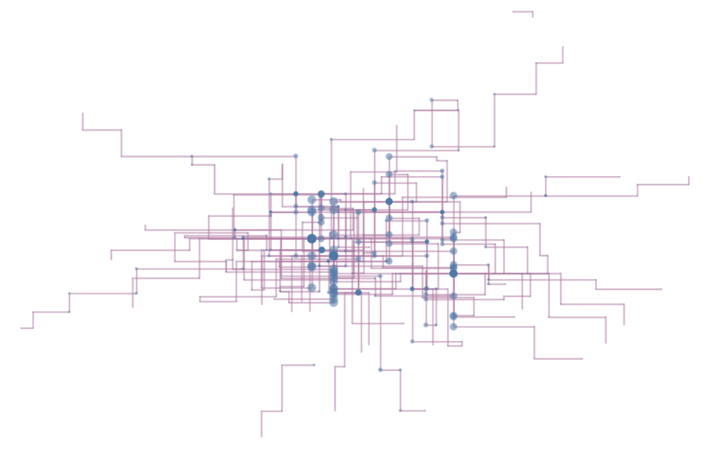
Finally, I added in some word highlighters to allow the viewer to cut through some of the complexity near the centre of the graph, where ‘caress’, my chosen censor word, starts to feature very heavily. It’s a lot of effort for quite simple interactivity in a chart but network diagrams are one of the best ways to represent relationships between words, and can be quite captivating as a variation on the theme “everyone loves maps”.
I wonder what is tomorrow…?
