


When I was doing my application to the Data School, containers were an absolute mystery to me. It was a case of chucking a container in and hoping for the best - and the best was often not what happened.
Even when we started learning them properly during training, I still found them confusing and slightly counterintuitive. I’ve realised that containers are something that just take a bit of getting used to - and writing blogs definitely helps t00...
So, this is my way of helping myself understand them a little bit better, and hopefully helping you too.
What are containers?
Containers are probably one of the most powerful layout tools in Tableau - but also one of the most confusing when you first start using them.
In Tableau Desktop, containers help you organise objects on a dashboard. They allow you to group items together so they behave as a single unit when you resize or move them.
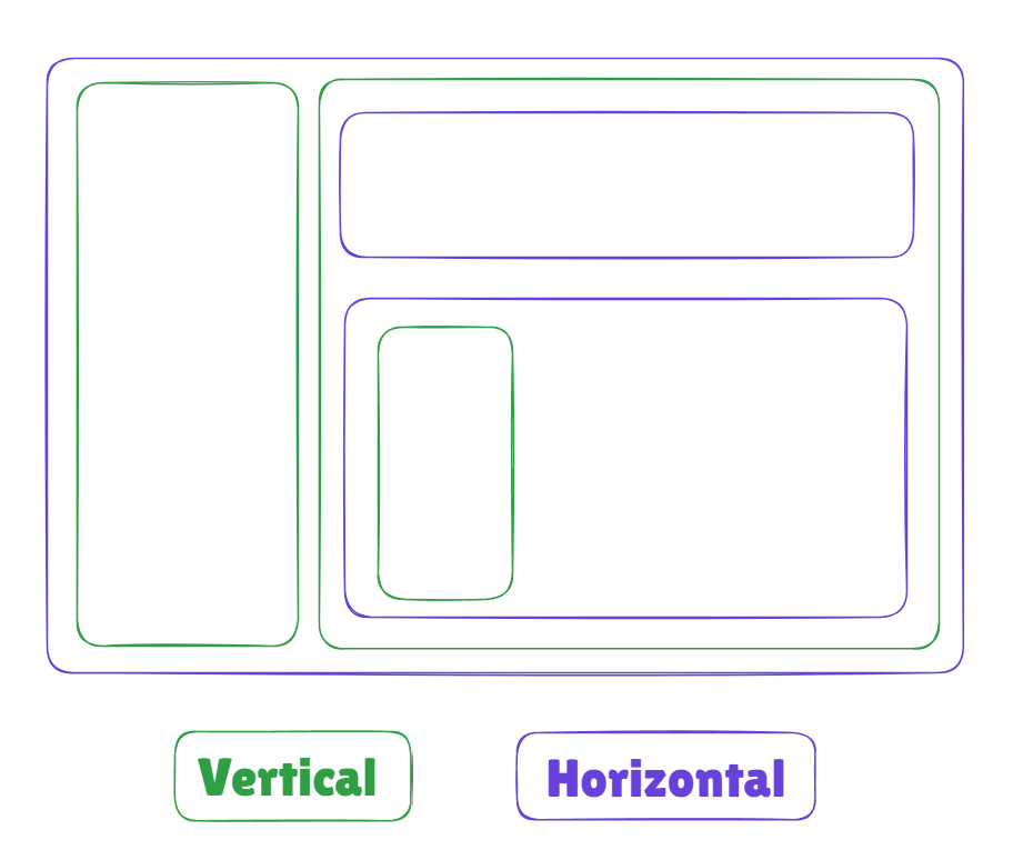
There are two types of containers in Tableau Public:
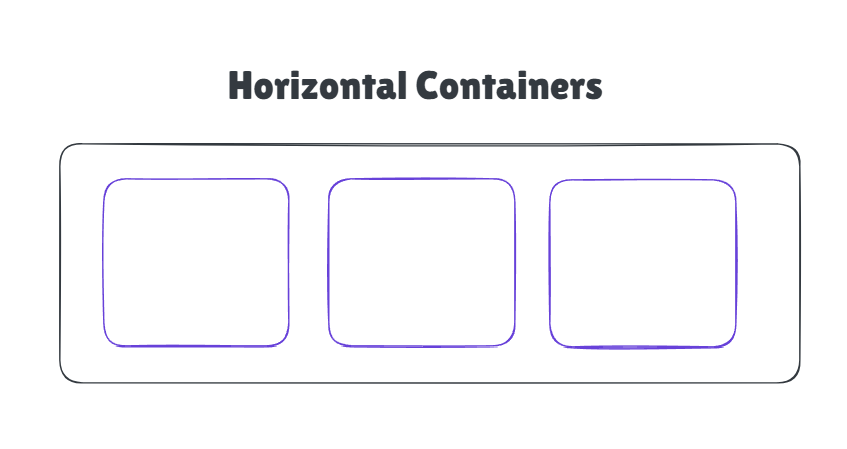
Horizontal - objects sit side by side
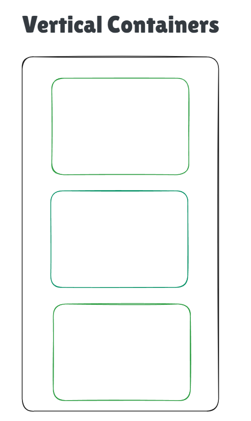
Vertical - objects stack on top of each other
Instead of positioning every chart individually, containers let you control layout much more easily.
How should you use containers?
There are two approaches that we were taught using containers in tableau. The first approach is the retro method.
With this approach, you start by adding all your charts to the dashboard first, without worrying too much about containers.
The process looks something like this:
1. Add all of your sheets to the dashboard.
2. Arrange them roughly where you want them.
3. Start introducing containers around them.
4. Move charts into containers and adjust the layout.
This can feel more natural when you're starting out because you're focusing on the visual layout first. Once everything is roughly in place, containers help tidy things up and control spacing.
The downside is that it can sometimes get a bit messy. As you start adding containers afterwards, objects can jump around or become nested in unexpected ways.
The second approach: the container-first method
This method flips this around completely.
Instead of adding charts first, you start by building the container structure of the dashboard.
The steps look like this:
1. Add the containers you think you'll need.
2. Structure the layout of the dashboard.
3. Nest containers inside each other if needed.
4. Drop your sheets into the containers.
This approach feels a bit like building the framework of a house before putting the furniture inside.
Once the structure is there, everything tends to snap into place more predictably. It can feel slower at the start, but it often results in cleaner, more controlled dashboards.
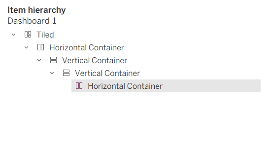
The downside that I found with this method is that, as the containers are blank, it is hard to see which containers you have in there already, so you can lose track pretty quickly. However, you can use this section of the dashboard layout on the left hand side as a ‘sense-check’ for where your containers sit.
So which approach should you use?
The honest answer is: whichever works for you.
Some people prefer the retro approach because it's quicker and more flexible when you're experimenting with layouts. Others prefer the container-first method because it gives them more control and avoids layout chaos later on.
Personally, I really wanted to like the container-first approach. In my mind that makes much more sense, and I thought it would be a lot cleaner. In actual fact, when I started playing around with containers, I found the retro approach worked better for me. Get everything on the dashboard, then arrange it as you like.
A Few Quick Container Tips
A few things that helped containers finally click for me:
- Use the Layout pane to see exactly where objects are nested.
- Rename your containers so you know what they’re controlling.
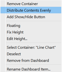
- Use “Distribute Evenly” to clean up spacing:
If you click on the container, and click the ‘more options’ arrow, you can select this ‘distribute contents evenly’ option to space your graphs out evenly within your container.
Another good tip for understanding containers: draw it out first.
I like using excalidraw - choose 2 different colours for vertical and horizontal containers, and sketch out the containers you think you will need for your dashboard. It helps to gain a little bit of confidence in what you're doing, and eliminates the feeling of going in blind and just taking a guess.
Final Thoughts
Containers can feel confusing at first, but they’re essential for building polished dashboards in Tableau. Once you understand how they control layout - and find the workflow that suits you - they become one of the most useful tools in your dashboard-building toolkit.
If you’re struggling with them, you’re definitely not the first or the only one. But with a bit of practice, containers start to feel a lot less mysterious and a lot more powerful.
Have fun!!