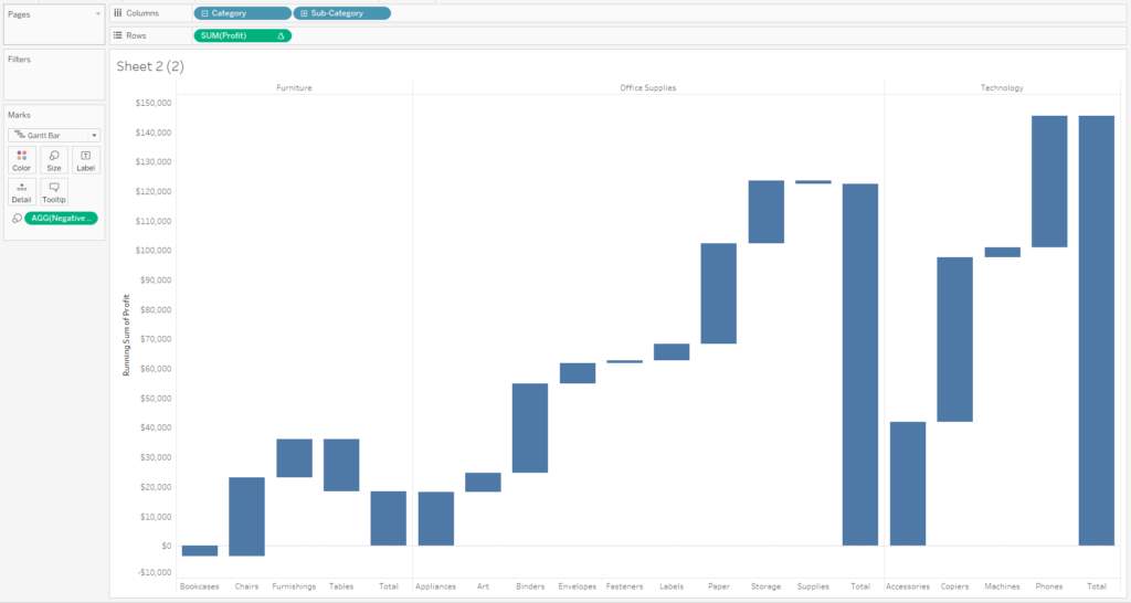
Back in my old job, I often saw waterfall charts being used to explain which factors were contributing to growth/decline in a particular area. I always thought these were a great visual representation of positive/negative influences, but never got around to creating one myself. Until today!
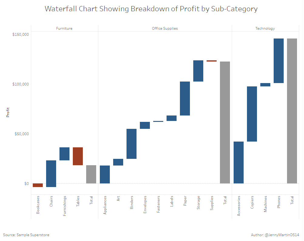
I built the above chart using the infamous Sample Superstore Data. It shows the total profit for each category in grey, with a breakdown of each subcategory profit building up to it. You can clearly see which subcategories are having a positive/negative impact by the colouring, whilst also seeing the magnitude of the impact by the length of the bars.
Let’s see how to build this…
Step 1:
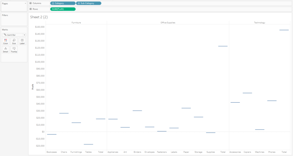
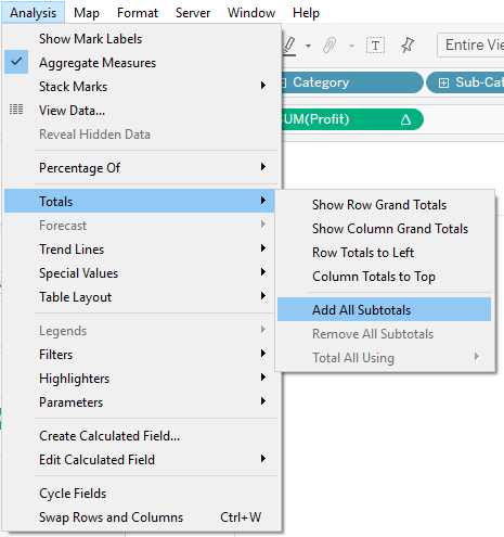
First off, you’ll want to drag Category and Subcategory onto the columns shelf and Profit onto the rows shelf. This will give you a classic bar chart. To get the above view, you’ll want to change the Mark Type to Gantt Bar and ensure that in the analysis menu, you turn on all subtotals, as below.
Step 2:
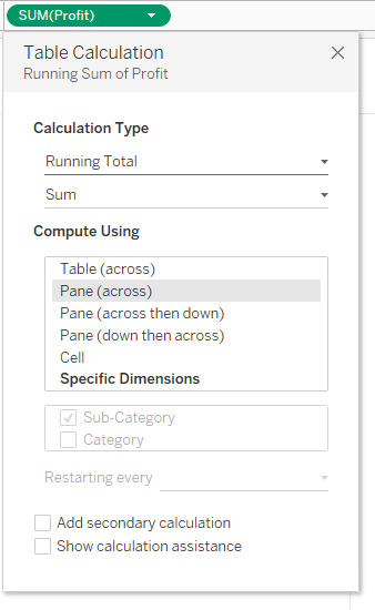
Next, we’re going to add a table calculation to the sum([Profit]) on the rows shelf. We want this to be a running total, across each pane (i.e. for each category).
Step 3:
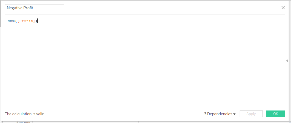
Next we want to create a calculated field which takes the negative of the sum([Profit]). When we add this onto the size card, we will get the view below. This calculated field seems quite magical, as it works by filling in the gaps between the lines, from one subcategory to the next.
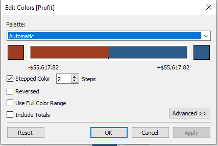
Step 4:
Finally, all we have to do is drag Profit onto colour and ensure the colour is set up as below:
By now, you should have the view I showed at the start of this blog. It’s that simple!