The first part of the task today made me very happy – I love working with APIs and I like astronomy too. The second part of the task… not so much. Read more about our challenge today in Andy’s blog.
The Sketch:
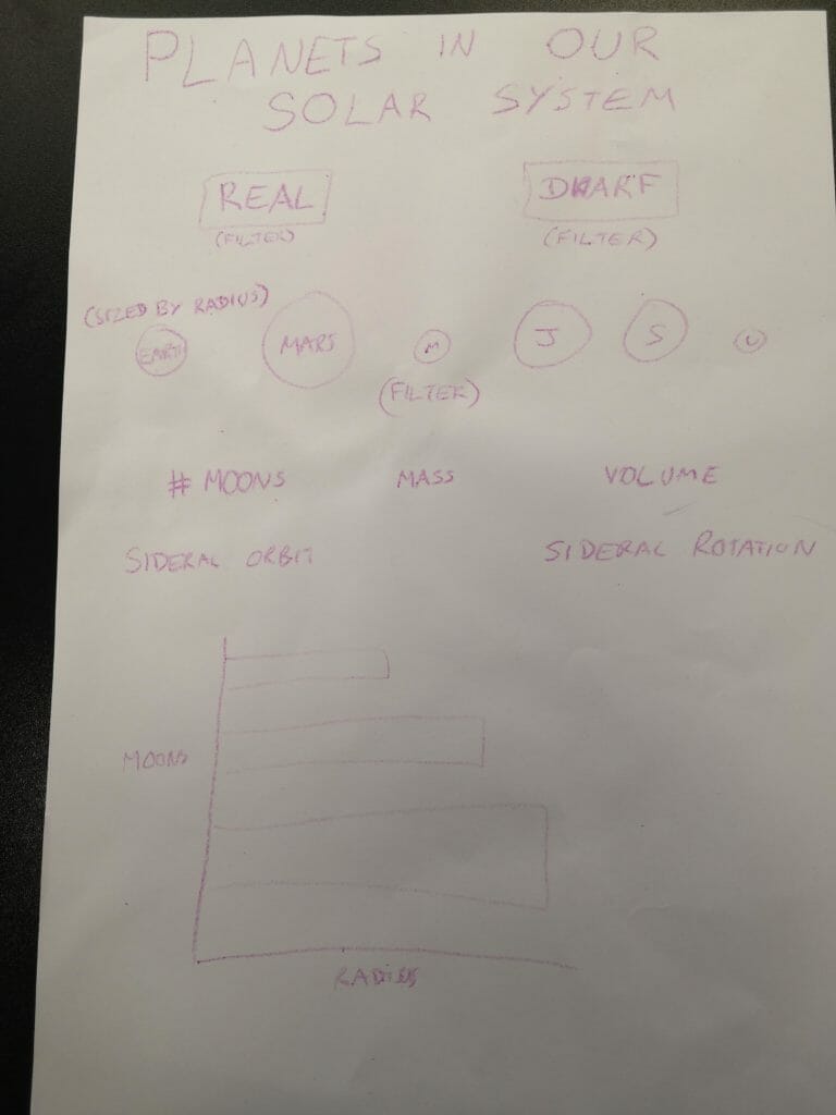
I thought it would be essential to sketch out my ideas today. Since I was unsure of the functionalities of Power BI, I decided to keep things simple (seems to be a theme for my thought process this week!)
I’m glad I took the time to sketch today, as it made me look at what fields were included in the data and helped me to decide which ones I would like to use. We had plenty of measures to play with, so it was a case of selecting which ones were most interesting to each of us.
At this stage I also thought about the structure that my data would need to have to allow this filtering. Essentially, what I needed was a row for each moon, meaning that the information for the planet/dwarf planet would be repeated for each moon related to it. Of course, I also had to be careful not to lose the information for planets/dwarf planets without moons!
Alteryx:
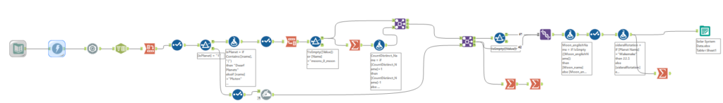
Since we were working with an API, the workflow is much simpler today. After following the classic steps when working with APIs, I then split the data into planets/dwarf planets and anything else. I cleaned this data up a bit, and added a column for total number of moons before joining it back with the “anything else” data. 55 records fell out of the join at this point as they weren’t associated with planets. The sun was one of these and since I wanted to focus on planets and dwarf planets, I didn’t worry about waving goodbye to these records.
There was a little bit more tidying up of the data before exporting it to an excel file. I did notice some errors in the data here, so I corrected some of the values with a little bit of help from Google.
Power BI:
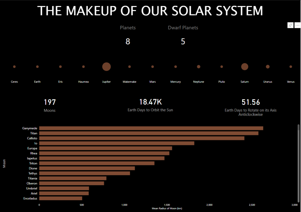
It’s back to a dark dashboard for day 3! It looks pretty similar to my sketch, but it definitely took a lot of effort to get it to this point. I know that I’m very Tableau biased, but I tried to keep an open mind. Here are a couple of likes and dislikes of Power BI:
Likes:
- I like that when you are trying to align things, the familiar Microsoft guidelines pop up, that’s useful
- It’s handy (in some cases) that all charts filter one another without you having to set them up (but less intuitive to work out how to change this)
- I really like the way that BANs are formatted, that’s super easy and intuitive
Dislikes:
- As I alluded to, it took me a long time to work out how to change the way that charts interact with one another. My bar chart would be highlighted by default, whereas I wanted it to filter
- Formatting. Editing Aliases. Anything like this has to be done in the right hand formatting tab. I lost count of the number of times I tried to right click on an element of the chart to try to change something. It’s just not intuitive to have to search through all the formatting options to find what you want. Also the inability to format tooltips was frustrating too
- It may not be clear from my sketch, but I wanted to be able to sort the circles for my planets. Either by distance from the sun or in size order, but the only option was alphabetical order
- New measure/new column – I don’t understand the difference
- To change the data type of a field isn’t easy. Even when I had changed data types in Alteryx, these did not carry through to Power BI
- etc
In summary, it’s safe to say that I’m still a Tableau fan. I hope to find the time to recreate my viz in Tableau in the near future!