


When it comes to designing your dashboard, a key decision you need to make is what colour palette you are going to use.
The colour palette you choose will be dependent on many factors but primarily it is reliant upon the purpose of your dashboard (e.g. copying the branding of the client). However, even then you need to consider the colour saturation, brightness, accessibility, contrast ... the list goes on.
Generally speaking, you will need 5 colours: your main colour for your background, a colour to signify the positives and negatives, as well as two additional colours for highlighting key insights.
This blog post is a collection of a few resources that are helpful in choosing colour palettes for your dashboards. I have labelled this blog as a work in progress so that it can be a growing resource that people can contribute to by contacting me with any helpful links and I will add them in!
Colour Palette Inspiration:
This website can generate new colour palettes and also shows lots of trending colour palettes.
https://www.pinterest.com/cereusart/color-palettes/
A collection of colour palettes on Pinterest for if you need some inspiration or want to try something new.

A great website with loads of resources by Shreya Arya. Here you can find lots of very useful Tableau guides, helpful tips and tricks as well as a great featured talk from a Tableau User Group event called 'Using Colour to elevate your data visualisation designs'.
A website that uses AI to create unique color schemes based of your branding, website or a graphic.
Accessibility Tools:
https://color.adobe.com/create/color-contrast-analyzer
This website can create colour themes and gradients from an image, and has an accessibility tool to show if two chosen colours will be accessible based on the Web Content Accessibility Guidelines.

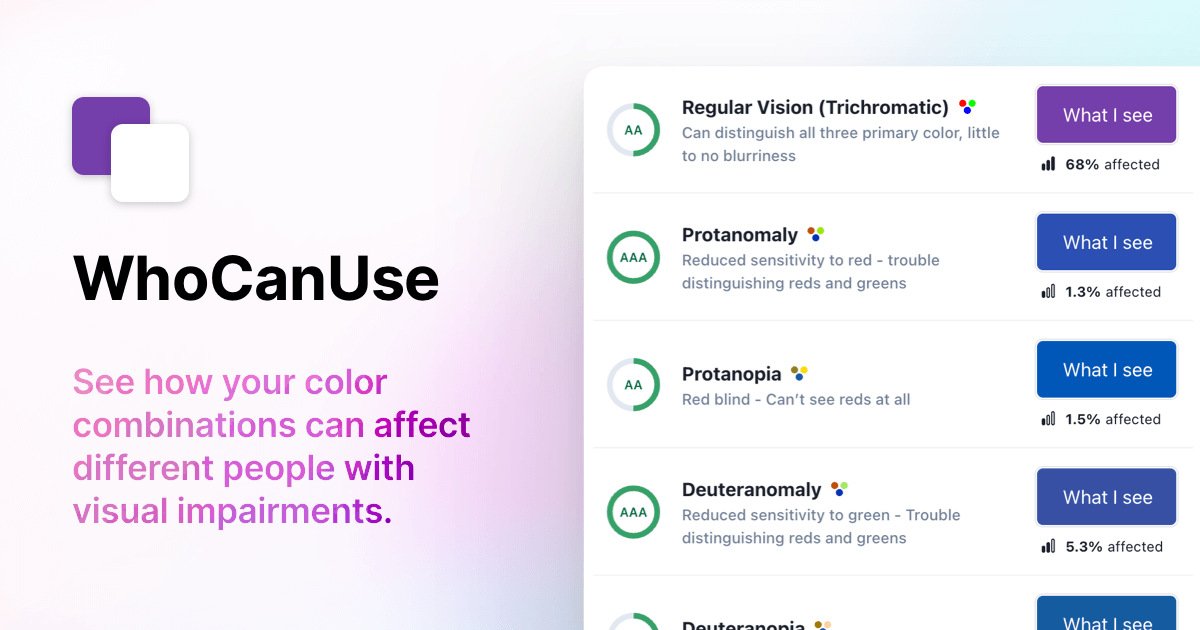
A website that allows you to see how accessible different colour combinations are for various visual impairments.
Inspirational Tableau Public Profiles/ Dashboards:
https://public.tableau.com/app/profile/p.padham/vizzes
https://public.tableau.com/app/profile/ellen4268/vizzes
https://public.tableau.com/app/profile/fergus.smith/viz/TheCarbonClean-Up/Dashboard2