In the first week, one of the most important concepts we learned is the ‘data analytics pipeline’, which refers to a series of steps that are followed to process raw data into useful insights and information. The process of building a data analytics pipeline involves several stages, including:
1. Data Collection: Raw data is collected from various sources such as databases, APIs, and sensors.
2. Data Preparation: The collected data is cleaned, transformed, and merged to make it ready for analysis. This stage involves data quality checks, missing value imputation, and data normalization.
3. Data Analysis: during this stage, exploratory data analysis and more advanced data modelling are performed to generate insights.
4. Data Visualization: The results of the analysis are visualized in a clear and concise manner to make it easier for stakeholders to understand.
We are required to use our own example to show our understanding of the data analytics pipeline and here is what I did:

Imagine there is an education consulting firm whose main clients are college graduates who want to pursue a master program. The company’s consultants are expected to use analytical data and visualization to help clients answer the question: ‘What is the best graduate school program for me, given the priorities such as academics, location, career opportunities, school culture and people?’ when they are doing the consultation sessions.
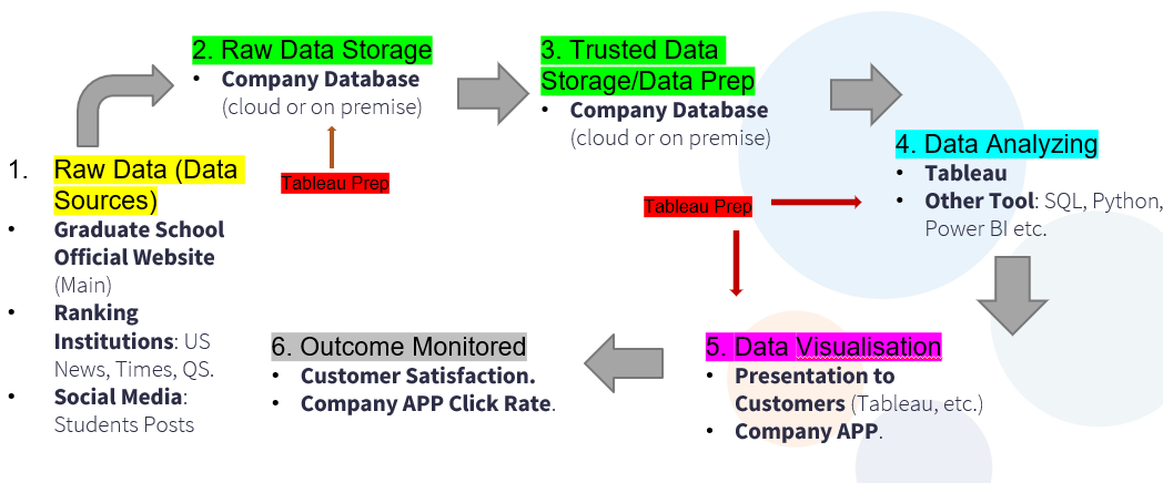
In this situation, the data analytics pipeline can be shown in the following graph:
First of all, the raw data may come from different sources such as the graduate school official website, the public data of the ranking institutions and the post data of different social media platforms. Then, the collected data which may largely be done by web crawling techniques would be stored on company’s database either on cloud or on premise. We can then use tableau prep or other tools to clean the raw data for future analysis. The cleaned data would again be stored in company database.
After that, the consultants in the company can use data analysis and visualization tools to customize the reports and presentations for their customers. They may also want to create an App for graduate school comparison to attract new customers. All the results could be monitored for future improvement.
