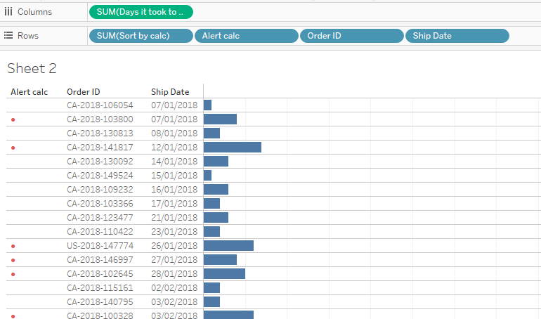
In this blog I will show you how to add a red dot in the begging of a horizontal bar chart. I will use a bar chart I created for my previous blog. For this example I will indicate what orders it took above the average days to ship.
Lets get straight into it!
Step 1: Create a calculated field the average days it took to ship an order across all years and all orders
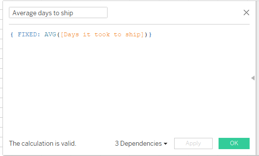
{ FIXED: AVG([Days it took to ship])}
Step 2: Create a calculation for an alert flag:
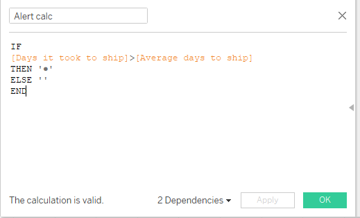
IF [Days it took to ship]>[Average days to ship] THEN '●' ELSE '' END
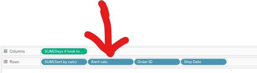
Step 3: Drag the Alert Calc to the rows shelf. It is important to place it after the Sort by calc blue pill.
Now we have a dot for each order that took more than the averae it took to ship. It would be nice to colou’r this dot red, won’t it? Let’s do it!
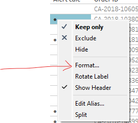
I right click on the dot itself and select Format from the drop down menu.
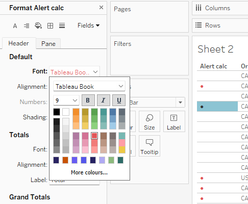
Then from the Font drop down I choose a color that I fancy. It this case this is red.
And Voila! We have a red dot to show what orders took longer to be shipped than the average.