


Its 2022 and it's all about the looks, isn't it?
I got inspired by the WOW2022 week 23 challenge from Lorna Brown. There Lorna shows an interesting way to show a colour legend on the dashboard. In this blog I have shown how Lorna did it and I have expanded to show a few more shapes. This is the first time I write about something I tought myself and I am feelng a little proud with myself. Thank you Lorna!
Let’s begin!
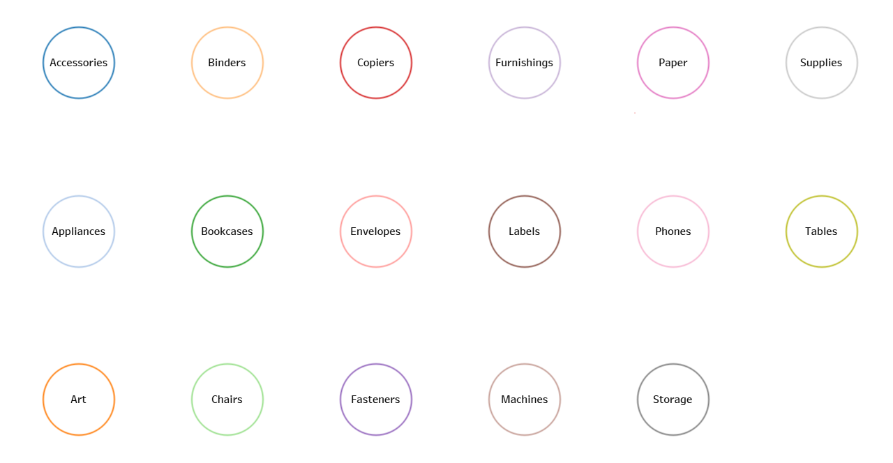
Step 1: Count the number of colours and decide how many rows and colomns you would like to have. In this example I am using the old favourite Sample Superstore and the sub-category in particular. There are 19 sub - categories, so I decide to make a 6 x 3 grid and I will have one blank at the end.
Step 2: Create a calculation for the rows and put in on the column shelf
INT((INDEX()-1) / 3)
Step 3: Create a calculation for the columns and put in on the rows shelf
(INDEX()-1) % 3
Step 4: Add sub-category to the marks card on text and on colour. For the color I used Tableau Classic 20. It is important to choose color palette that has at least the number of colous as needed.
Step 5: Format the text to fit the circle and here is the result.

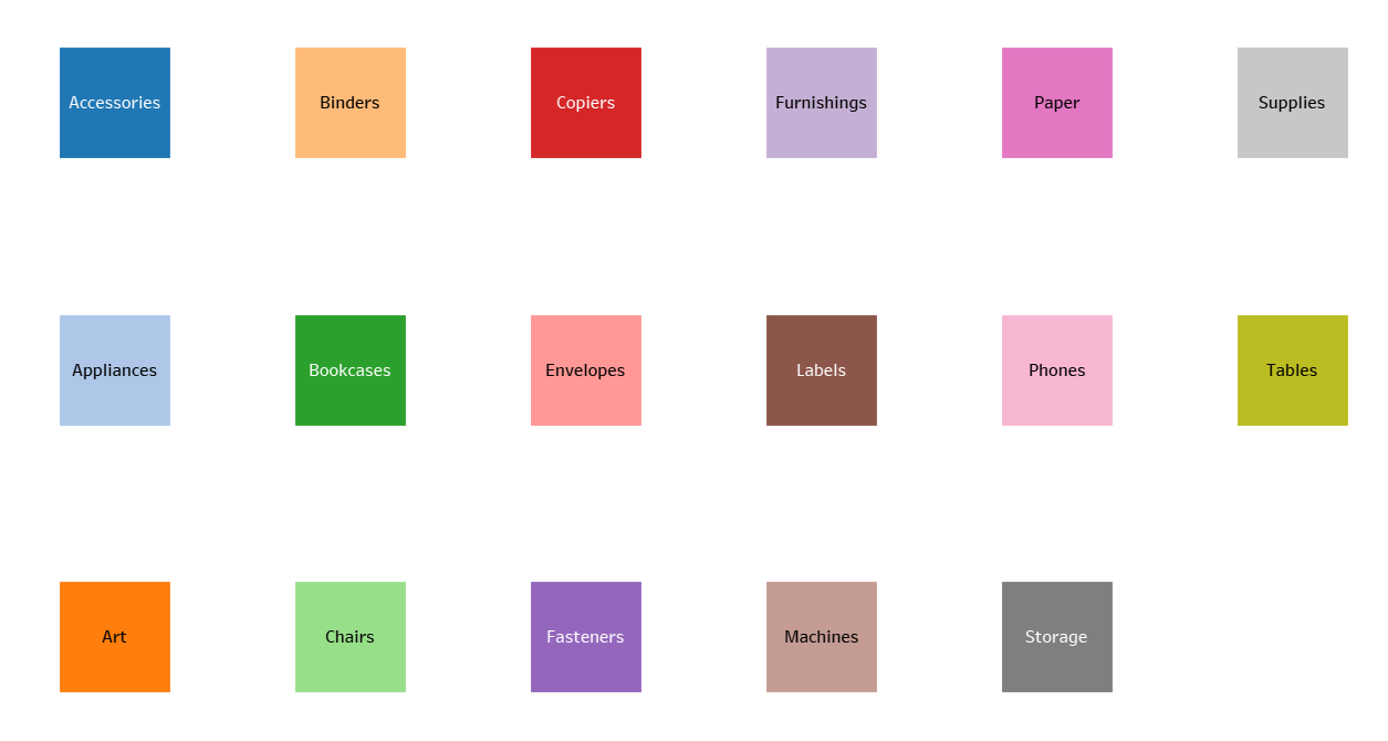
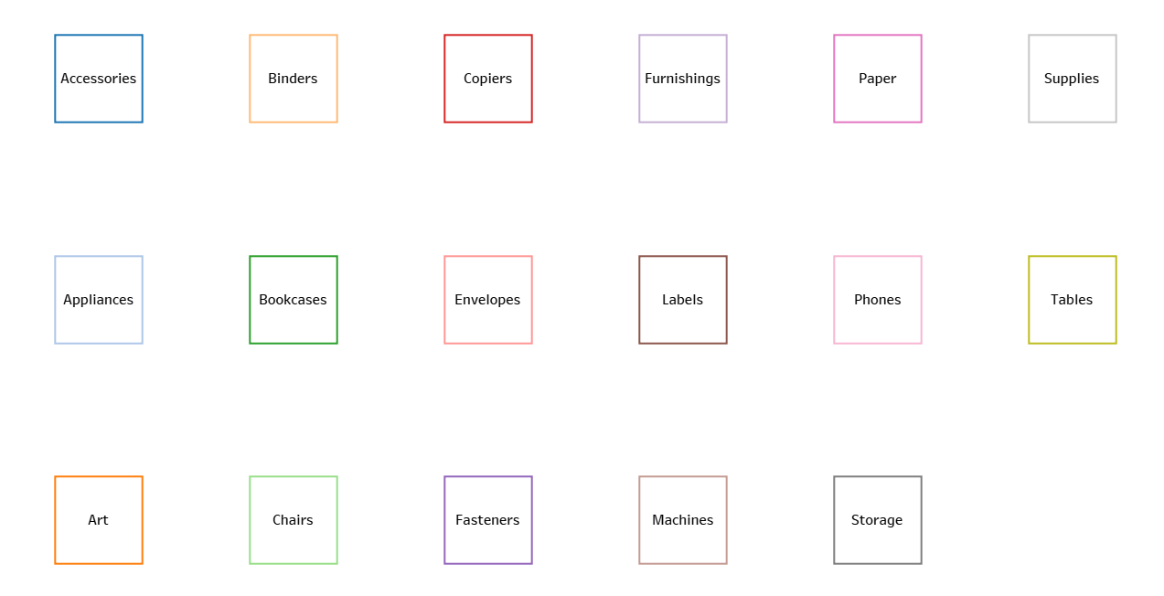
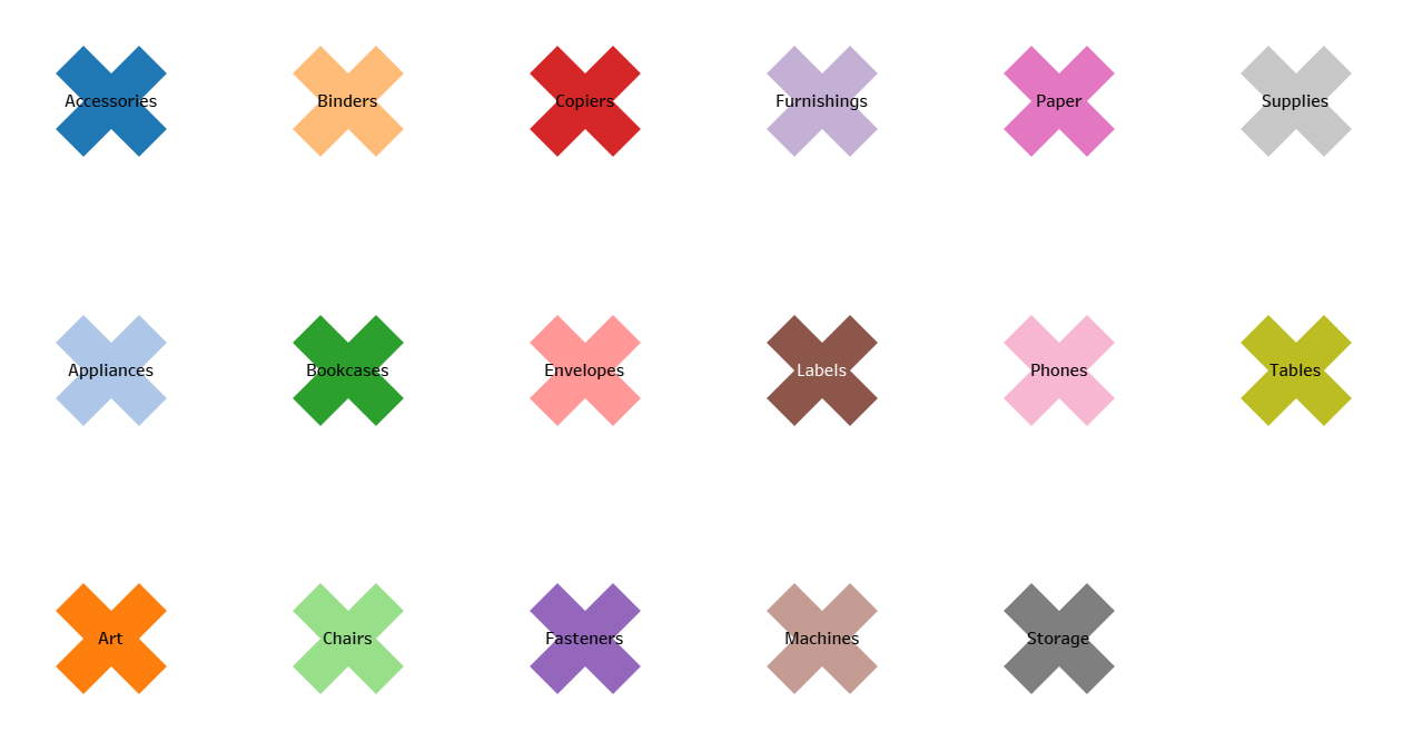
Bonus options: We can choose a selection of shapes from the shapes option. Here are some examples:
Circles:
Filled squares:
Square borders:
Filled crosses:
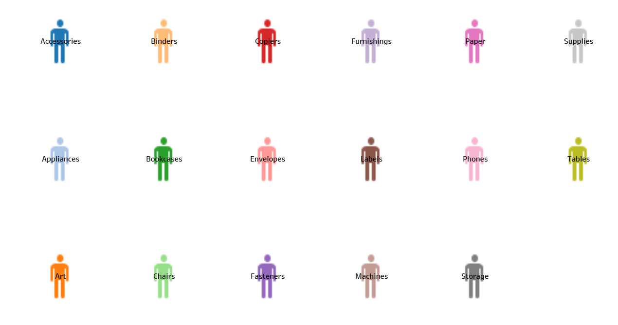
Persons:
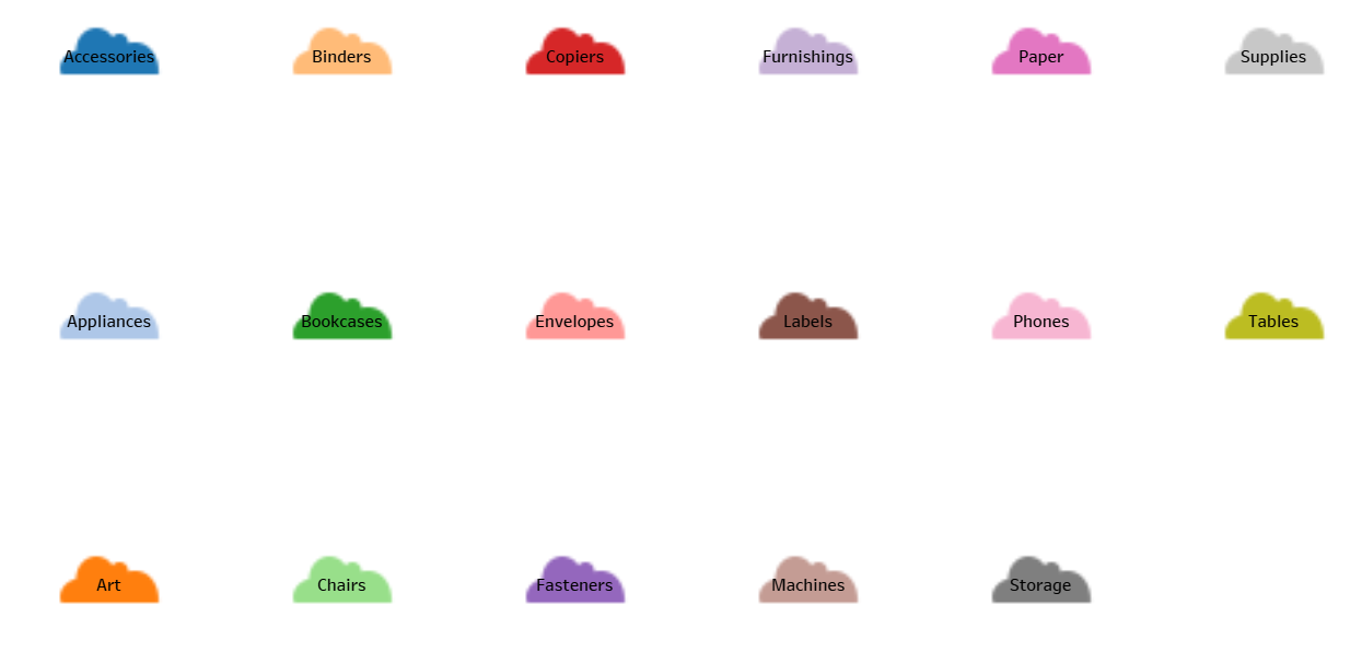
Clouds:
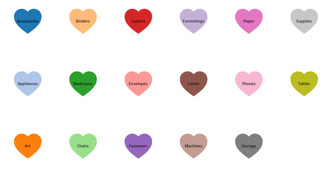
Hearts:
Or a custom shape of your choice! Enjoy your new unique custom Tableau colour pallet!
Voila!