It's Friday again, it's Saturday, Sunday, what? Friday brings not only our final challenge of Dashboard week but the conclusion of DS39 Data School Training. Four months of learning, taught by the best coaches in the business with support from other amazing colleagues at The Information Lab, ready to go forth to secondments with a mega toolkit and the hive mind.
Our fifth challenge of the week was a 3-hour dashboard build on a dataset of the World Happiness Report. A simple dataset in terms of preparation, as it required no cleaning or manipulation and we could bring it straight into Tableau Desktop. What a dream.
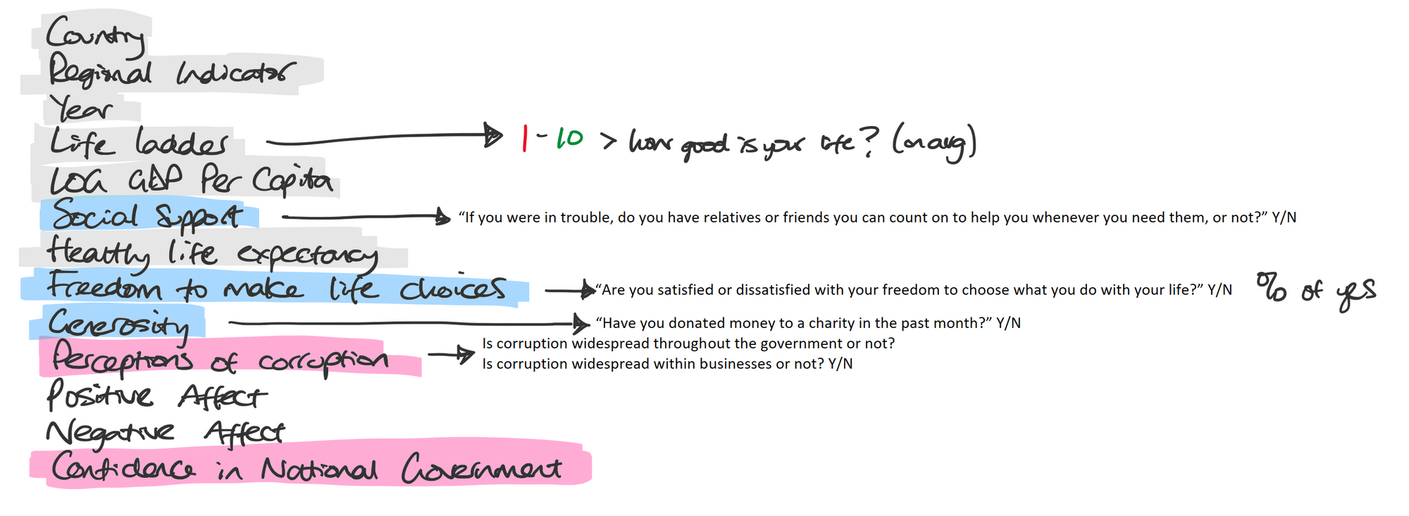
First step - look at the data itself, understand the size of the data, the fields within it and start to consider any areas of interest that could be compelling to tell a story with. I quickly recognised the positive and negative Q&As that could relate to one another; the positives including ratings for social support, freedom to make life choices, and generosity. The negatives included ratings for government corruption and confidence in government too. I wanted to correlate these values to some other objective metric, including 'life ladder' - which ultimately meant a happiness rating – in addition to LOG GDP per capita or healthy life expectancy.

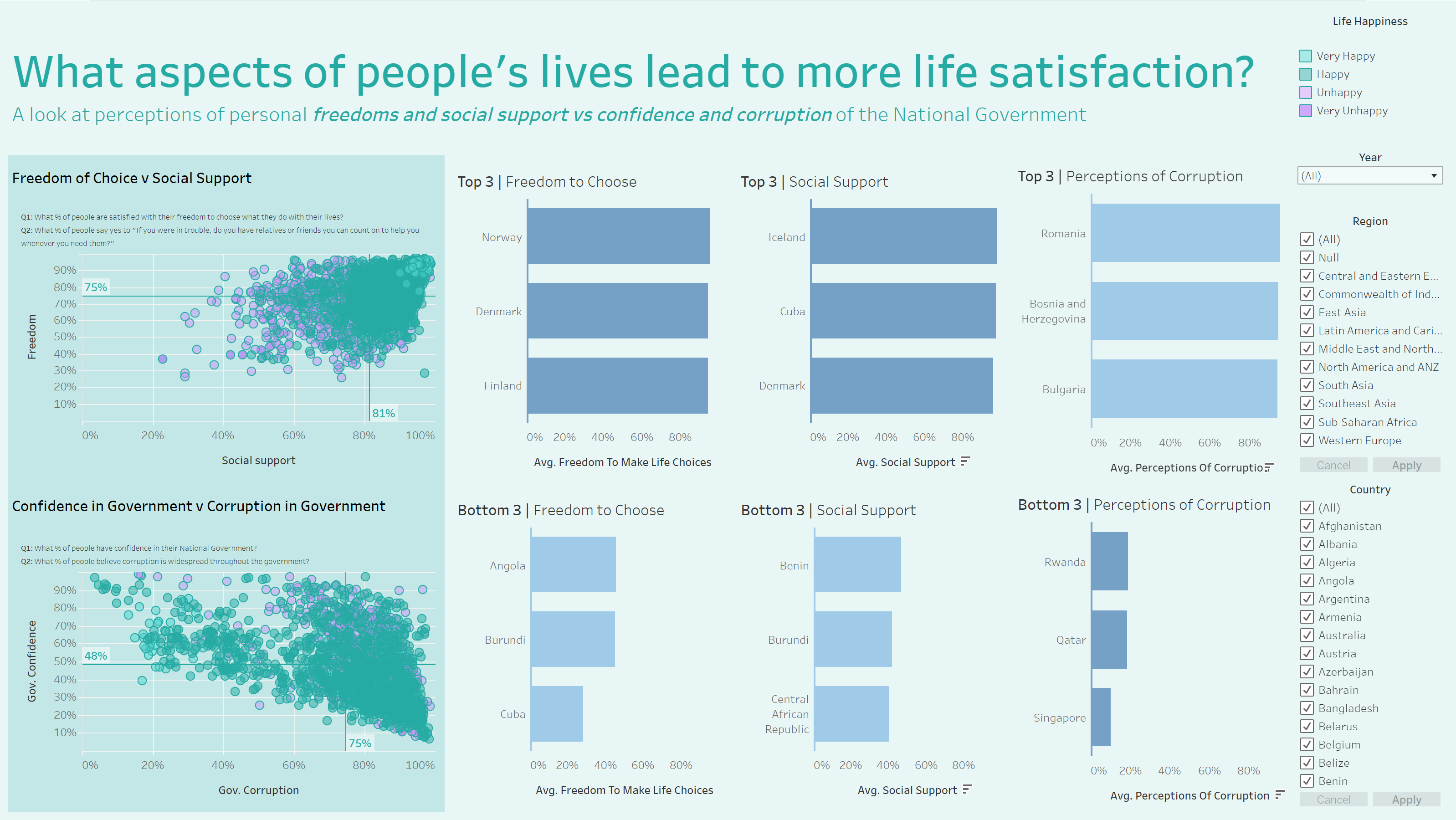
I opted for drawing connections to life ladder, and comparing these positive and negative attributes to see what trends appeared. I started to build out charts in Tableau based on these specific areas then realised there would be value in highlighting the top and bottom 3 countries for some of these fields. This leads individuals to interacting with those countries on show and seeing what comparisons there are to be made across the freedom, social, gov confidence and gov corruption scores. I also layered on filters to focus on specific regions or specific countries too.
A few interesting areas of note include those who are considered ‘very happy’ (grouped life ladder scores from 0-2.49, 2.5-4.99, 5-7.49, 7.5-1) scored high for freedom of choice, social support, had high confidence in government and low perception of there being government corruption. For those who were ‘unhappy’ highlighted a variation in freedom of choice and social support scores, although were overall positive; there was variation in those who had confidence in the government but it was clear that these countries all perceived to have corruption in government.
Two other standout notes were Rwanda and Iceland. Rwanda had positive scores for government and freedom/social support aspects, however their life ladder scores rated as unhappy, indicating other aspects in the data that weren’t shown in my dashboard could be influencing this rating. Iceland were scored happy and very happy on the life ladder yet their 64-76% of people believed there was/is corruption in government.
Final dashboard feedback was overall good. Good critique around having to fish around for insights rather than it being an explanatory dashboard, which would’ve helped to answer my dashboard title more easily. A solid finish though, so I was pleased! Have a look at the countries you are most interested in by viewing my final dashboard on Tableau Public here!

