Day 4 already! Our Thursday challenge was to utilise a Kaggle dataset of the incredibly popular Eurovision song competition. Today's specific nuance: to build an explanatory report utilising Microsoft PowerBI, with any data preparation to be completed in PowerQuery. Having spent four months in Alteryx and Tableau, with one day of PowerBI classroom training and one day of PowerBI self-learning, this was a great challenge to tackle. It felt like learning Spanish for 16 weeks then tackling a task in Italian - pretty similar, feels familiar, quite different!
Initial steps were to look at the variation of data. There were a heap of files in the zipped folder, covering topics including Jury v Public voting information; polls from a range of sources including Discord, EuroJury Poll, Eurovision World Poll and My Eurovision Scoreboard Poll; as well as data on the host countries and song data too. The Jury v Public voting took an initial interest alongside the Song data, however for the sake of time I opted for the latter as I felt there were clearer stories to tell from the beginning.
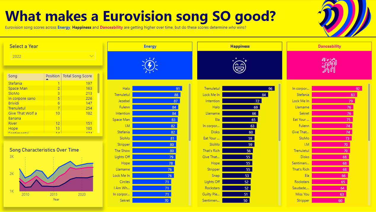
Scanning through the document I noticed a few fields relating to characteristics of the song. These were ratings across topics like energy, happiness, danceability, instrumentals, loudness, key and more. I liked the idea of seeing whether the positive subjective qualities of a song related to positional success – does a more energetic or happy song win you votes? It is well recognised about the tactical or political voting across the Eurovision years, so I set out to challenge this perception with this angle.
I opened the Songs file into PowerBI and opted to Transform Data (rather than Load it straight in) to see if I needed to adjust any data types or remove any data from my data model. There were a number of fields that required cleaning (e.g. they had a hyphen ‘-‘ instead of a null) and after the clean, I changed the data types too (text to whole numbers). I needed a date field and dealing with that became a little funky; I duplicated my Year field, which only contained a year value with a text data type. For an unknown reason you cannot switch the data to a date straight away as it produces an error or all dates switch to 01/01/1905. Instead, I changed the locale from UK to USA and then amended the data type – this worked perfectly so it was time to move on.
I knew that I wanted my dashboard to be very bold in colour, synonymous with Eurovision itself. I utilised the logo from Eurovision 2023 to set the theme for my dashboard and created a quick design in PowerBI itself with logos, banners and icons to build out my theme and layout. I should’ve sketched this out beforehand but in the moment I felt the dashboard would be quite simple to produce and iterate, potentially a mistake. I bought in my areas of interest – energy, happiness, danceability scores – to generate my bar charts and look at the total scores over time to provide context. The scores over time were on the rise and so my first area of note was born – Eurovision songs are increasing with Energy, Happiness and Danceability each year! I wanted to investigate the relationship between winning (or high positions) and scores in the bar charts. I created a filter for Years but my goal to show this relationship was to produce a table that you could order by finishing position or by total score, to then click and highlight where that song came in the ratings.
I then used the dashboard to pull out interesting findings from winning songs or songs that scored highlight on the three characteristics. This then formed my presentation more broadly too. Feedback from my presentation highlighted the values within my table could have been displayed as a scatterplot – bit of a oversight there – and when watching my peers present, I probably could have incorporated a gauge chart to show the average score for the each of the three values and then an average mark on the gauge chart for winners, to show their score relative to the average. Ultimately this, along with some nice annotations, would have been much closer to the brief of an explanatory dashboard, whereas I had delivered a dashboard that couldshow insights, if you explored it – brief missed. Annoyingly.
I will look to recreate this dashboard in Tableau too as a small side project. For now, you can view and interact with my PowerBI dashboard here.