Today's challenge was to call an API via balldontlie.io. The website had APIs for a range of data areas including Players, Teams, Games and Stats. Each segment varied in detail and size, making it important to quickly understand what was contained within each area and then to think about a story that we wanted to tell with the data at hand.
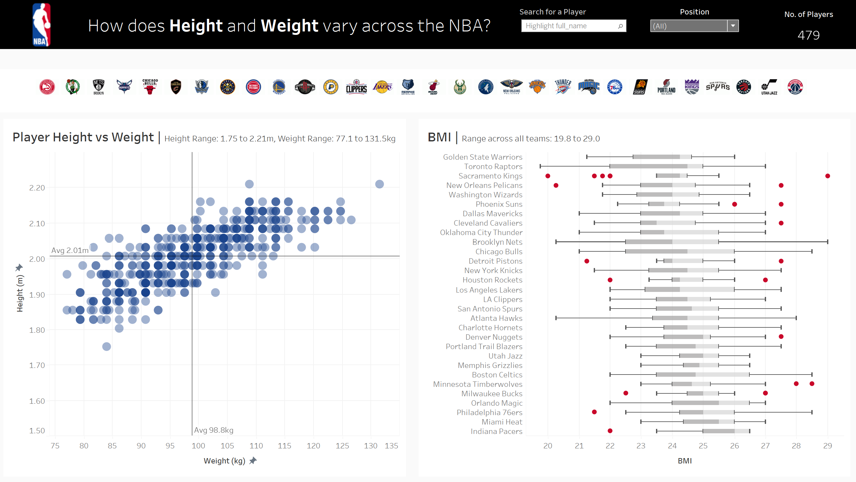
I started by scanning the documentation on the website and running the APIs through Postman to see the variation of information across each dataset before starting my process in Alteryx. The volume of data across each topic varied significantly, from 2 pages with 45 total rows of data (All Teams), to 61,985 with 1,549,613 total rows of data (All Stats). Considering the time for the task and wanting enough information to do something interesting, I opted for All Players (206 pages, 5130 total rows) as this was a good size of data, however more importantly, I noticed detail on a player height and weight. Knowing that all Basketball players are tall, I wondered the variation of these physical characteristics across different players and teams, gearing towards a question of ‘how does height and weight vary across the NBA?’, or a stretch target of ‘does height and weight affect winning performance?’. The latter is definitely a question to answer with more space and time to bring in additional stats into the dataset!
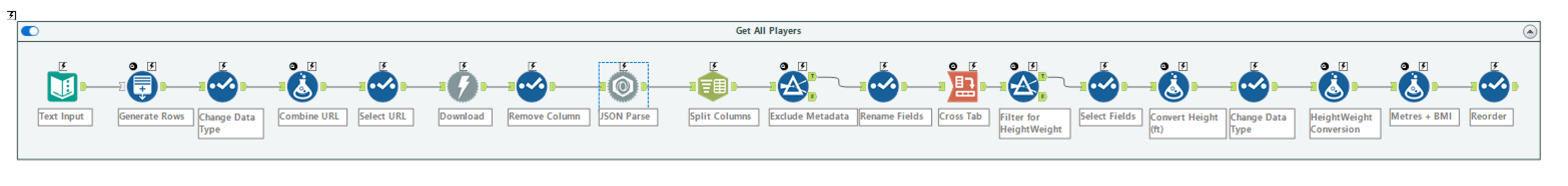
Once I knew what data I required for my dashboard I started the process in Alteryx. First I needed to call the API and in that process, generate multiple URLs to cover multiples pages of data required. I used the Download tool and performed a JSON parse to get the data into a tabular format, before splitting the data and pivoting (with the Cross Tab tool) to organise the data into the table structure I required. Throughout that process and after the Cross Tab, there were a few cleaning steps with data types and renaming. To finish the workflow I converted the Height (initially separated in ft and inches) into metres, in addition to creating a BMI score too. It was not until my presentation that it became apparent I had made an incorrect calculation with my height conversion, which is a huge lesson learnt in checking these formulas and sense checking with peers (someone else in my cohort had gone down a similar route and got it right) before stepping into presentation mode.
The Alteryx workflow concluded with a .hyper file export that bought me into my Tableau build. I wanted to follow the NBA website style (black banner at the top with a light grey background and a white background for objects) and I wanted to utilise the team logos as a filter/tooltip function too. I downloaded images for each team and created a shapes folder to utilise later on, then started to build out my scatterplot for height/weight, BMI box plots to show the distribution for each team, and the functionality of logos across the top banner.
The dashboard was a pretty simple dashboard in its design. I would like to have built more components to the dashboard to draw more intriguing insights and interactivity with how height and weight correlated to a variation of factors or utilising a scatterplot drill down to see the average across a team and then to click into a team to show the player distribution, however for now, I am comfortable with this! Feedback in general was good, the obvious issue with my calculation was highlighted (which is now rectified in my workflow and subsequently my dashboard!) and I had constructive feedback on my scales for BMI, as I originally kept it to the full 10-65 BMI scores possible; this is now amended to be an automatic axis to focus in on the range specific to the NBA players. Great challenge and one I am sure I will come back to and evolve. Check it out here!