


This week is our final week of training, which means it's Dashboard Week!
Day 1 began with a session from our colleague, Tara Robinson. The topic, building Accessible dashboards. This session focused on key design elements that accommodate non-traditional/non-normative users, to ensure that as many people as possible can use, understand and have access to our visualisations.
It is an important consideration for many reasons. 18% of the working age population in Britain have a disability (as defined by the Equality Act of 2010). There are economic, moral, legal and goodwill reasons to ensure your visualisations are more accessible. General principles from the Web Content Accessibility Guidelines focus on dashboards being perceivable, navigable, adaptable and distinguishable. Furthermore, you should consider your design for those using assistive technology, such as Keyboard Navigation or Screen Readers.
Today's challenge: redesign a Tableau dashboard with Keyboard Accessibility in mind. I paired with Lorenz. Our first step was to look at the dashboard within Tableau Server and try to navigate throughout the dashboard, including filters, without a mouse. If you have not done this before, try it - it is surprising how difficult it can be when a dashboard or website does not consider how a keyboard-only user will navigate around. We unpicked the key flaws, for example, when tabbing we moved from a filter to a chart and then down three filters, then back up again, and so-on. Then it was time to re-design the layout.
Tableau sets the default order left to right and top to bottom, when uploaded to server. This change happened in version 2021.3.
Once re-designing the layout, we started to layer on key functionality. Do we want to use an 'Apply' button alongside our multi-select filters? Yes! Should we add icons and text to direct the user around the dashboard? Yes! Should we move our filters from a left-hand column to a toolbar at the top? Yes! Here is our final sketch before entering our build phase:
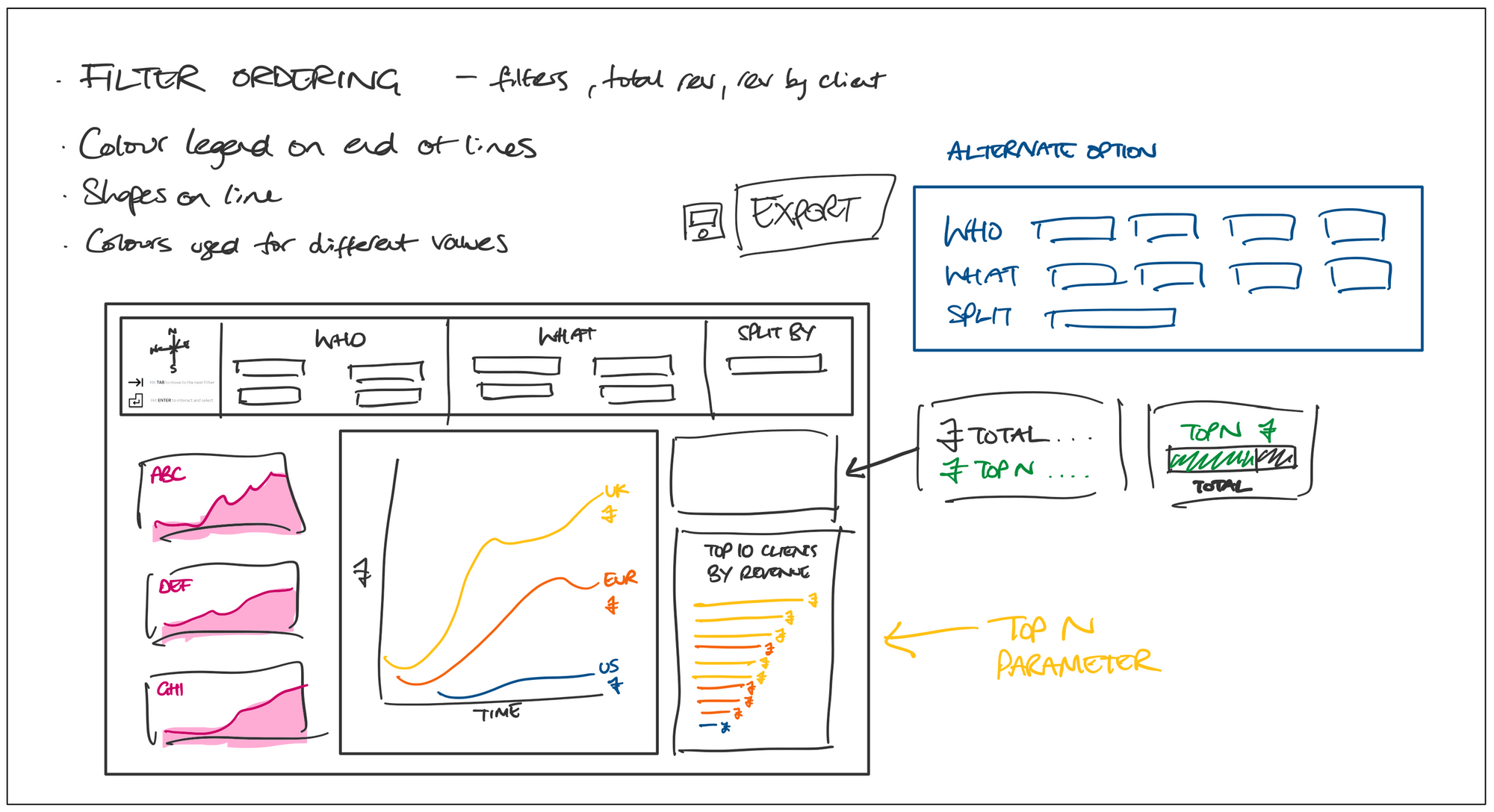
One further functionality we wanted to add was to create an export button. It is likely that dashboard users want to see the granularity of the data. You can view all data within Tableau that sits behind a graph, but it is also possible that a user is more comfortable downloading the information to use in other tools, like Excel. Making this download process easier is important.
Once we had our ideas locked in, we started building out the dashboard. Whilst I cannot share the final output (sensitive data used!), we managed to build almost our entire design. Unfortunately we faced technical issues with server, meaning that the iterations we had planned to make, through testing online, could not be achieved. This is definitely a key consideration when building accessibility of any kind into your dashboard - allow time for testing and iterations, as it is unlikely your dashboard will function as you want on your first go.
Give it a go, try to build it into your current and future dashboards, and good luck!