


When visualising your data there are use cases where you want to highlight specific metrics within your chart to bring stories to life. We can use do this simply with quick manual tools including sorting, filtering and manually editing colours, however you may need to introduce more dynamic or detailed components within your visualisation. This is where Sets come in.
Within Tableau Desktop, Sets are custom fields that are created based on dimensions from your data source. Sets can be computed or created manually. When creating a Set you are establishing criteria for your data to meet. Your datapoint can fall within that criteria (in) or outside of that criteria (out). We can also create multiple Sets and then combine them too.
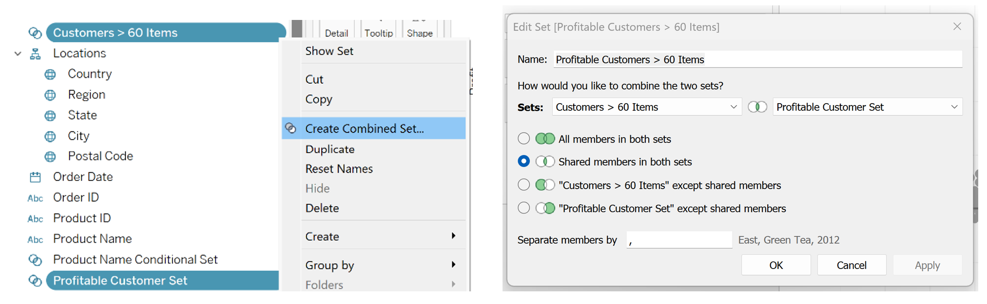
Once you have created your original Sets, you click on the Sets you wish to combine, right-click and select 'Create Combined Set...'. A pop-up window will allow you to name your new Combined Set and edit how you want it to behave based on the conditions, as seen in the right-hand image below. Your options, that look like Joins, allow you to choose what data will be included in the new criteria - whether all members from both sets, shared members in both sets, or one set with exceptions of shared members.
Tip - a member is a category or subset of data within a larger group.
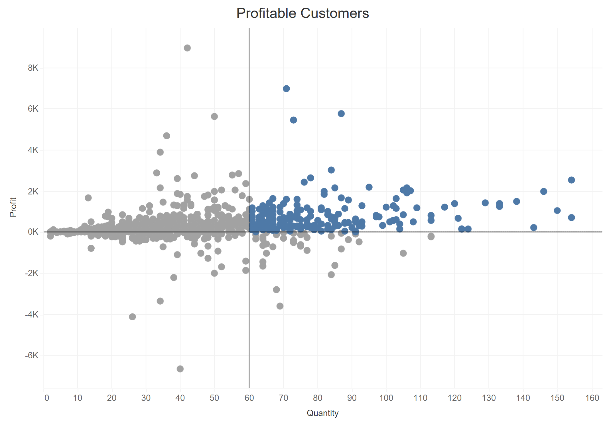
Once we have created our new Combined Set, we can utilise this within our visualisation. A good use case is to apply it to colours that highlight data points that meet the newly created criteria. This scatter plot example below highlights customers that have ordered more than 60 items and are a profitable customer for the business:
Another way to utilise an individual Set is to create a single drill down visualisation. This is a great feature to use as it improves the visual components of your data and furthermore, allows the end user to have interactivity with your chart without using a filter. Here is an example:
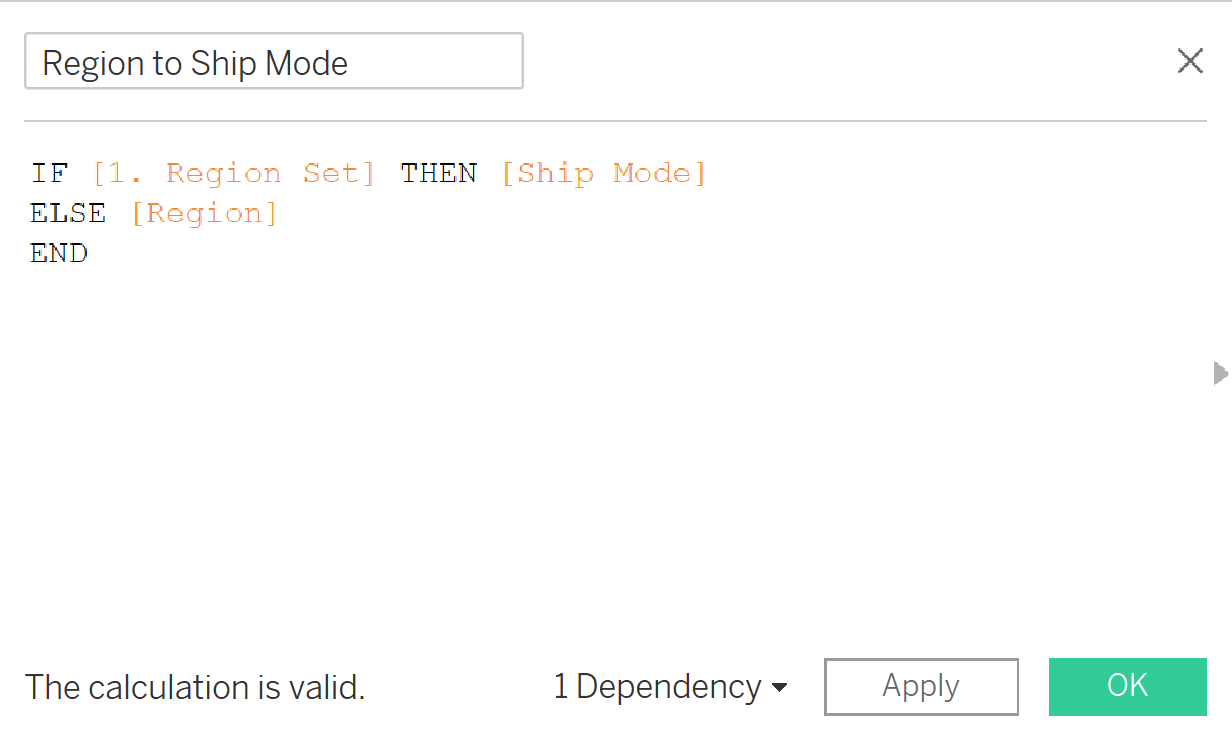
To achieve the visualisation above, we have to build out a few components on top of the normal bar chart with Sales in the Columns and Region in the Rows. To follow along, use the 'Sample - Superstore' data found in your Tableau Repository if you use Tableau Desktop, or via Tableau Public Resources. After creating a Hierarchy of locations (Country, Region, State, City, Postal Code), we right-click Region and select Create > Set - lets call this Region Set. Here we are filtering a single Region, e.g. South. Next we create a Calculated Field that will allow us to drill-down into specific regions as we click on our bar chart, seen here:
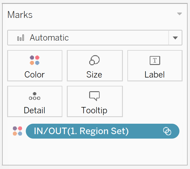
We move our new calculated field (Region to Ship Mode) across to our Rows, beside Region, then drag our Region Set to the Colour marks:
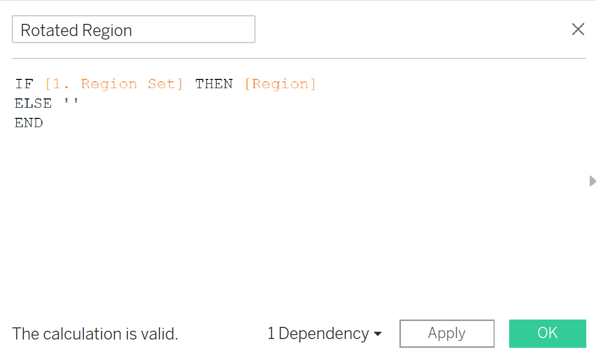
Our next stage is to create a Calculated Field named Rotated Region. This allows us to have a title of the Region on the side of our filtered elements. In the video above, it is the Central, East, West, South on the left hand side that changes as we select different bars on our chart. We create a new Calculated Field with the calculation below, then drag it to our Rows in-between Region and Region to Ship Mode.
We have now built the main components of a single level drill down. The remaining steps are to enhance how the bar chart looks by rotating our Rotated Region field (right-click > Rotate Label), selecting our Region and uncheck 'Show Header', and finally, amending the colours however need be. Now, as you click across the bar charts from different regions, each single region will expand to highlight the breakdown of sales for each shipping mode!