


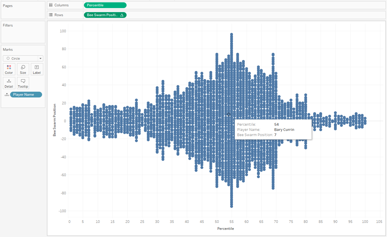
A Bee Swarm Chart is a great visualisation and a nice alternative to a histogram when we want to show the distribution of data points. It can also be helpful to understand the quality of your data by seeing the variation of scores and whether the actual values or their distribution are expected.
In this guide we will build the chart utilising percentiles of each metric, however this will work for any value. if you are switching between metrics that have a wide variation of value sizes (e.g., from two decimal places to numbers in the thousands), it is possible to also create dynamic bins. For now, we will stick with a single value axis. You can download the original data file below and download the Tableau workbook here.
Step 1
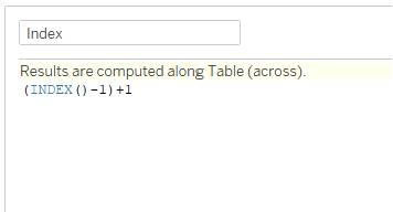
Create an ‘Index’ calculation.
(INDEX()-1)+1
Step 2
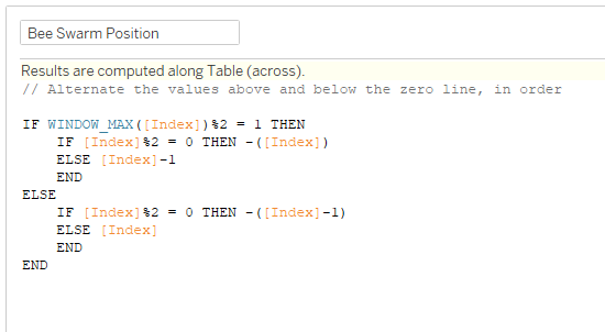
Create a ‘Bee Swarm Position’ calculation.
IF WINDOW_MAX([Index])%2 = 1 THEN
IF [Index]%2 = 0 THEN -([Index])
ELSE [Index]-1
END
ELSE
IF [Index]%2 = 0 THEN -([Index]-1)
ELSE [Index]
END
END
Step 3
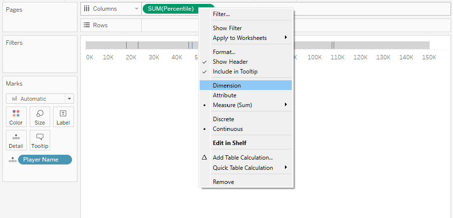
Move ‘Player Name’ on to Detail then ‘Percentile’ onto Columns. This will appear as SUM(Percentile), change this to a Dimension.
Step 4
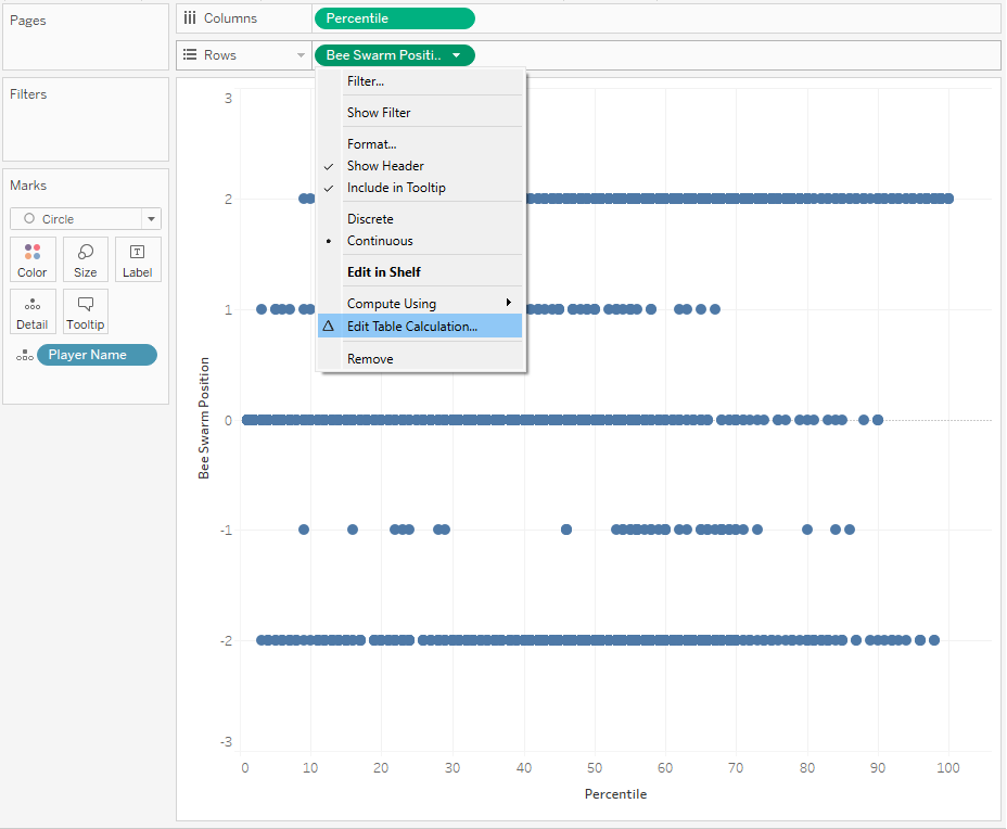
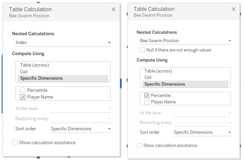
Move ‘Bee Swarm Position’ on to Rows. Edit the Marks to a Circle. Select Edit Table Calculation.
Step 5
For the ‘Bee Swarm Position’, select Specific Dimensions and tick ‘Percentile’. For the ‘Index’, select Specific Dimensions and tick ‘Player Name’.
Step 6
You have now built your Bee Swarm Chart and can format how you see fit!
If you have any questions, reach out on LinkedIn!