


Hopefully the theme of Die Hard films isn't being lost on anyone.
Our task for Dashboard Week today focused on Museums within the UK. Continuing yesterday's focus on analysis, we were to look at the museum data provided to us by MappingMuseums, with taking into consideration the feedback we received from Andy yesterday. Prioritising the likes of digging further and asking why, a more dedicated focus on adapting your analysis to the user story you come up with and acknowledging the value of your dashboard to your audience - and making sure there is a value there to begin with.
Learning from yesterday, after a quick glance at the data and a general idea of the direction I wanted to head in with my analysis, I quickly wrote my user story to help direct me in my data investigation and eventual chart creation. This helped a ton and I definitely more confident in my work already at that point in the day, compared to yesterday. In addition to this, I drafted up some questions in line with that user story that I wanted to ask of the data, and with good analytical capabilities (and some luck), I'd be getting those answers.
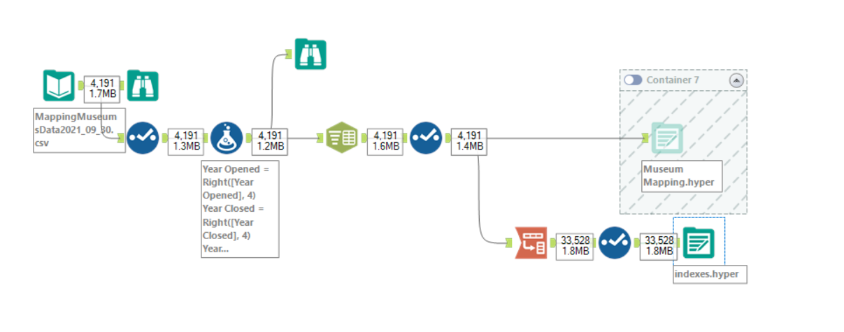
Starting off with data prep, it didn't take long at all. Simple dropping of some un-needed columns and splitting some columns before then transposing some specific data surrounding indices.
At this point I threw the data into Tableau and got onto attempting answer those questions I had - they were, as follows:
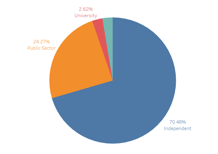
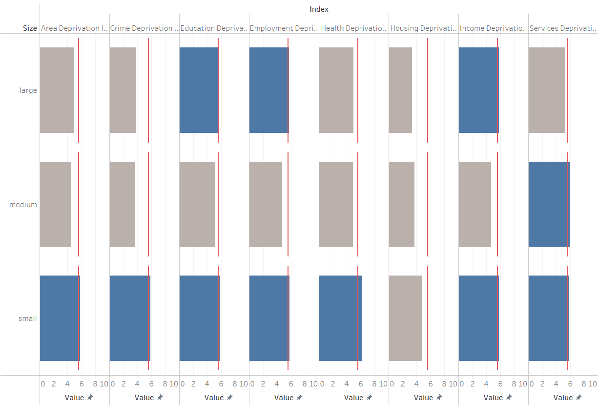
- Independent Museums vs Public Sector Muserums - which are more predominant, why is that the case?
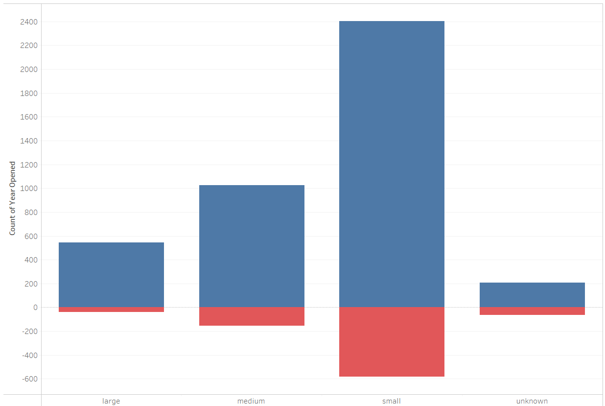
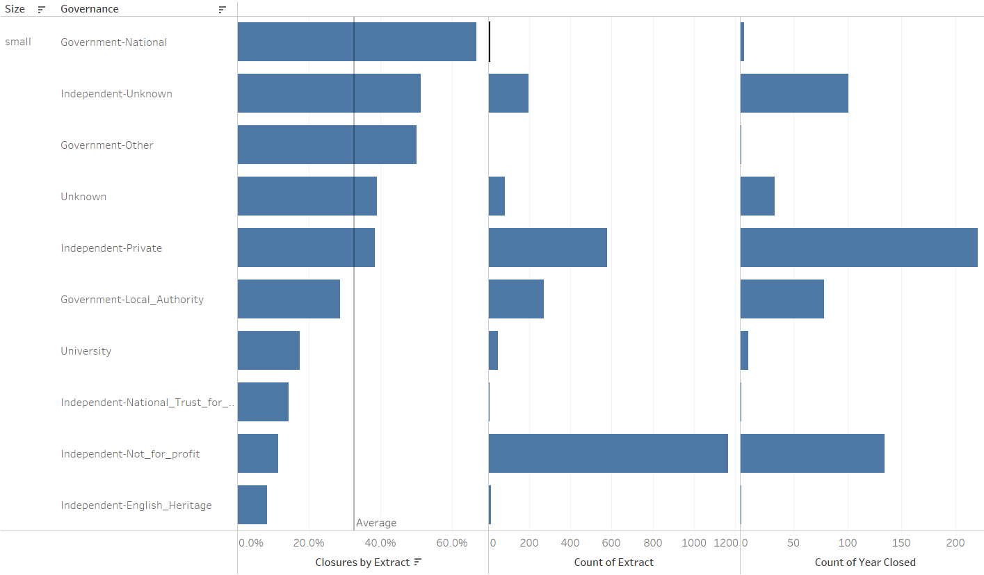
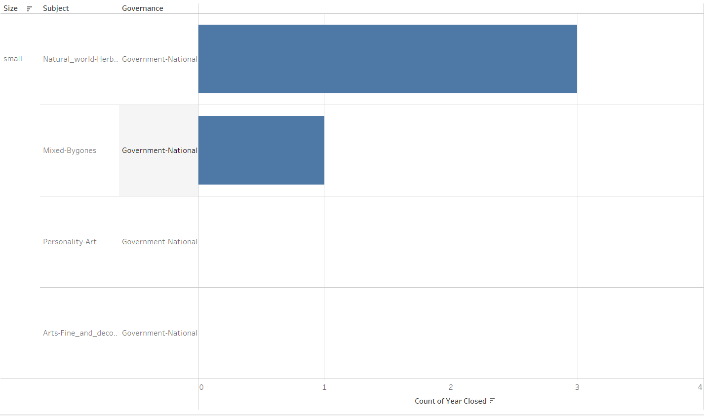
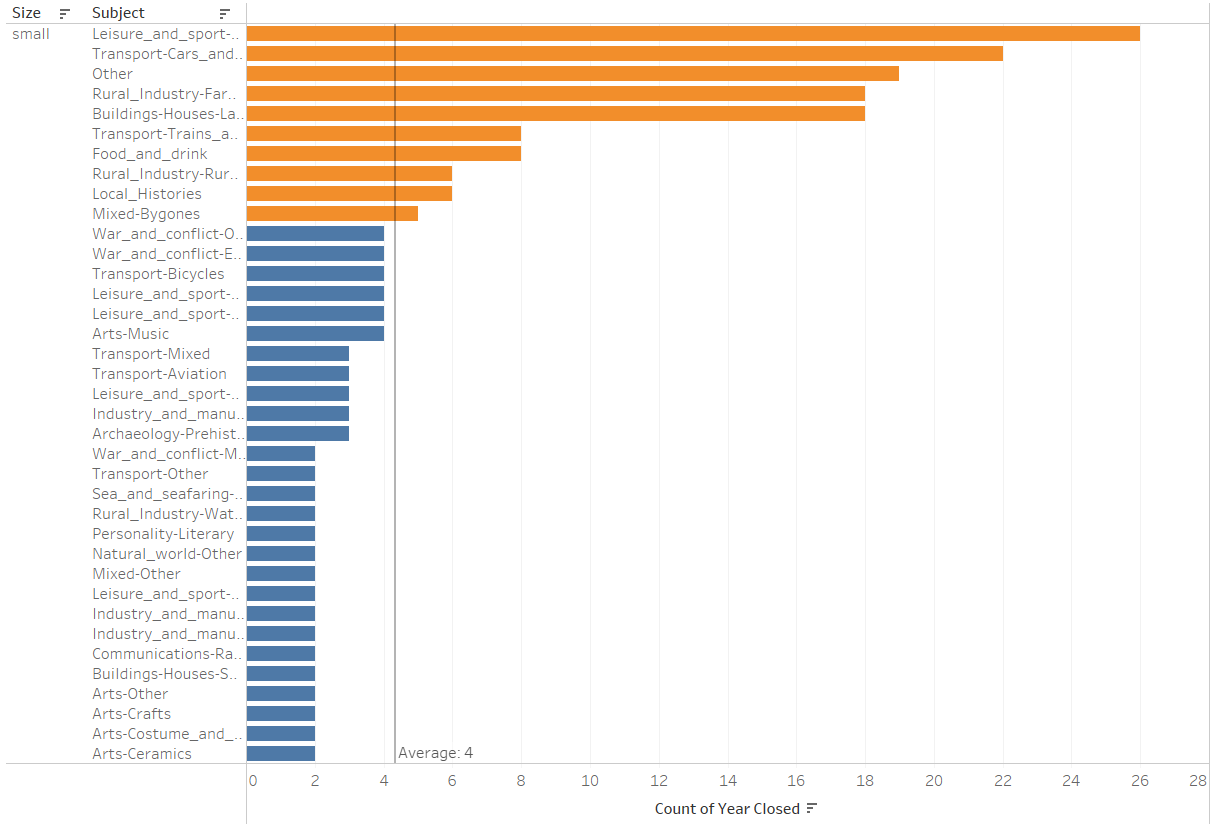
- Small Museums = 56% of the sector yet most likely to close - why? - if this is the case, how could they remain as the majority Museum type on the market?
- Is the increase in the number of museums over time warranted? Was there public demand there or a case of wanting to make a quick buck or a want for recognition of some local history?
Unfortunately for the last question, I got thrown down the rabbit hole of the second question and found that I was constantly asking 'why?' when I was building charts come Tableau time. I'll be posting some of my charts here, with descriptions of my thought process and what they are showing as well.
Overall, in terms of analysis and chaining those 'why?(s)' you get, I did way better today. I found an interesting point in the data, and further expanded on it and really got to the root of why that was the case, and that reflected in my confidence when presenting it. Although I didn't get a dashboard up, the individual charts are there and while chart choice may be something to consider next time, the principal elements of analysis were there and I was happy - to an extent - with what I produced. An almost surface-level analysis was there and with more time, I could've dug deeper and would've had some really interesting and cool stuff to tell people about.
So I'll be attempting that for tomorrow and hopefully end dashboard week on a high!