


Picture this: You have a dataset rich with sales figures, but the true story lies in the regional breakdown of those numbers. How do you go beyond the raw data and present a comprehensive view of your sales performance? This is where the magic of table calculations comes into play. In the upcoming sections, we will guide you through the process of grouping percentage of total sales by region using table calculations, turning your data into a visually compelling and informative tableau. Whether you're a seasoned data analyst or just dipping your toes into the waters of business intelligence, this guide is designed to equip you with the tools to elevate your data visualization game. Let's embark on a journey to unravel the insights concealed within the numbers and empower your decision-making process.
Let's begin by examining the raw data in tabular form before delving into visualizations. This initial step allows us to validate the data's integrity and accuracy, ensuring a solid foundation before moving on to the creative process.
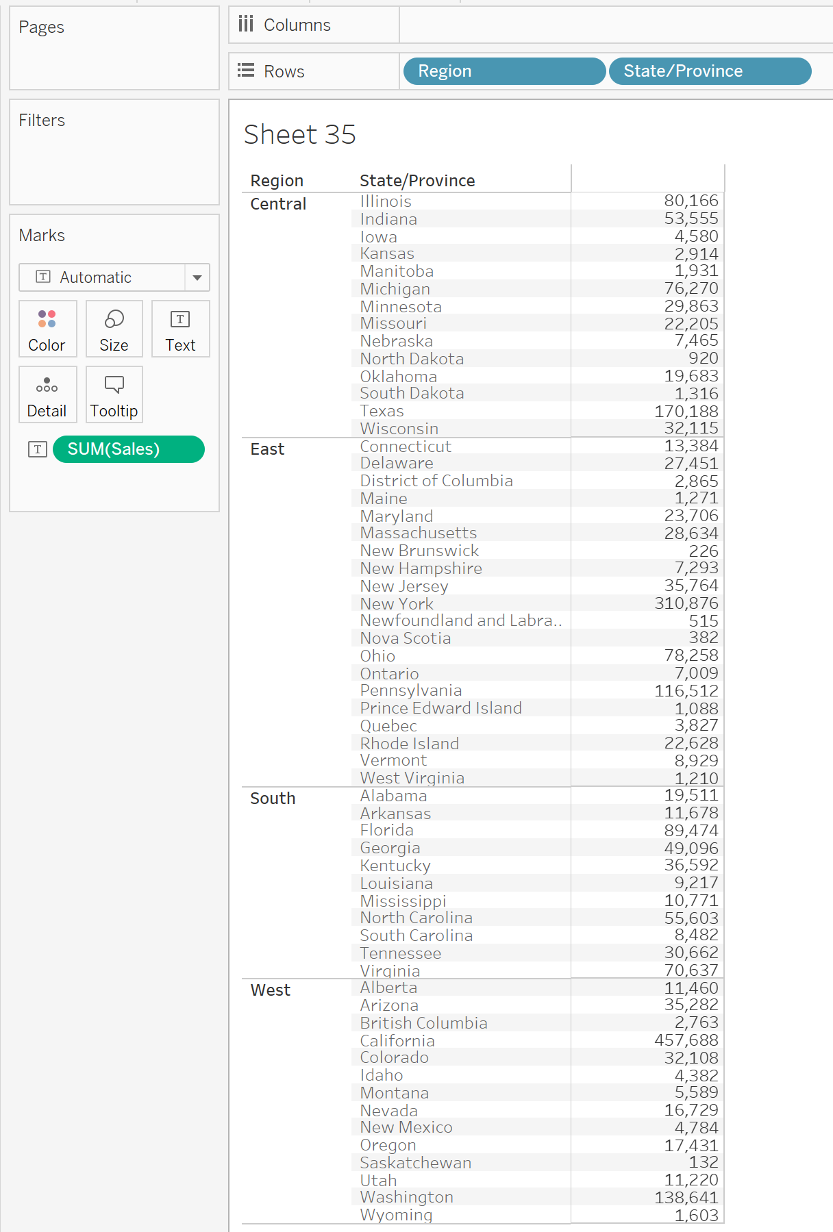
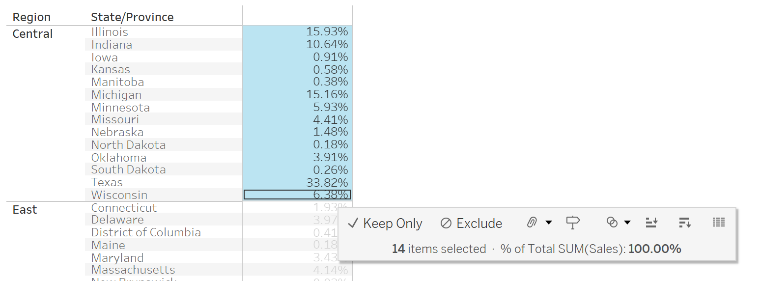
Here we essentially have a group by Region and State/Province which returns the total number of sales.
What we're aiming to see is how much each city contributes to the total sales in its region as a percentage.
To do this we're going to use table calculations which make this very easily achievable.
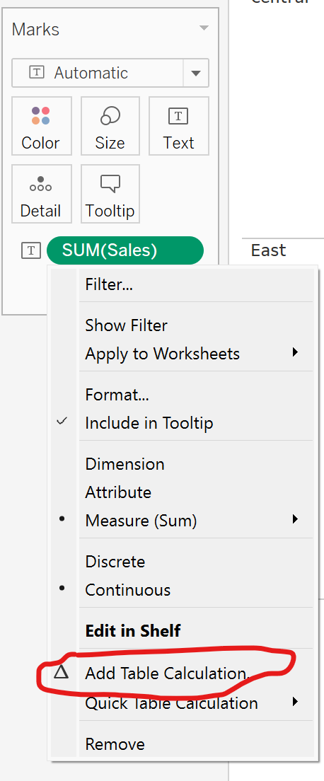
First go to your SUM(Sales), right click and click "Add Table Calculation"
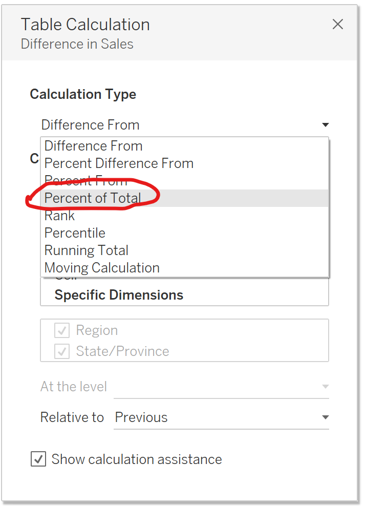
In the window that pops up, click on the first drop down and click "Percent of Total".
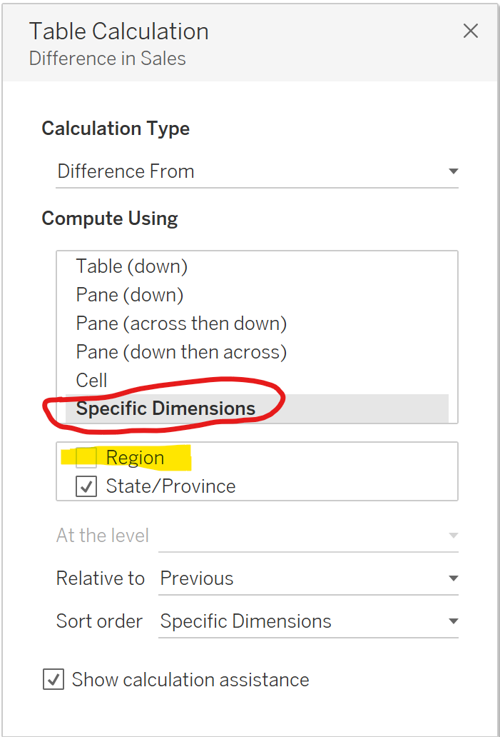
Now we need to set what we want to consider our total through "Compute Using", select Specific Dimensions and then uncheck Region, as this is what we want the calculation to be grouped by.
You can check you have done it right by lassoing the values for a region and the total should be 100%
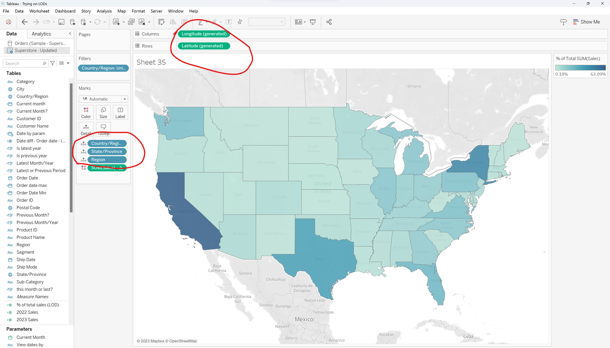
Now that we can clearly see our numbers are correct, let's transfer this into a map.
By adding:
- To the details mark:
- Country/Region
- State/Province
- Region
2. Longitude and Latitude to columns and rows respectively
3. Your table calculation to the colours field.
You'll generate a map.
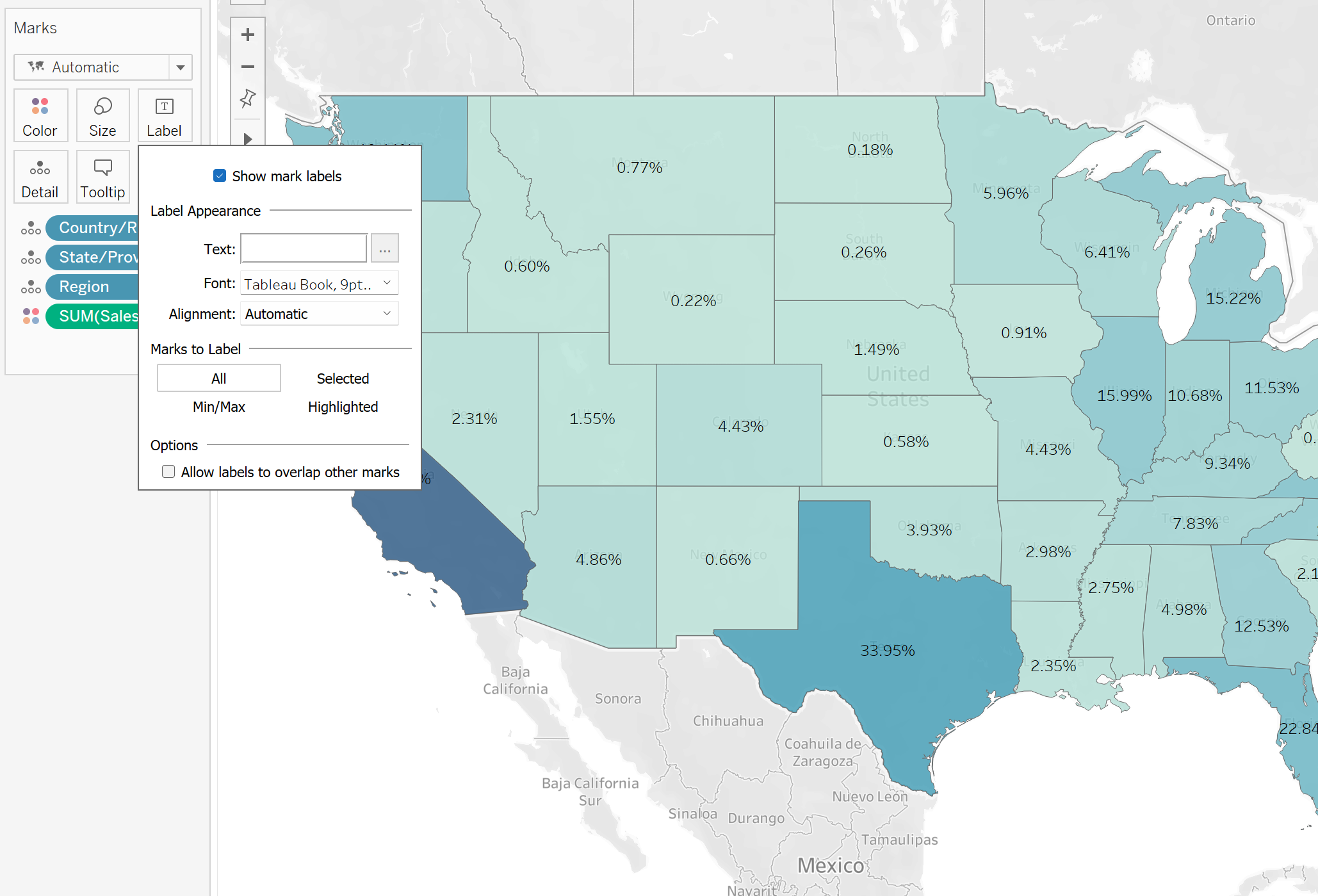
And finally so you can see what percentage of their region they make up, simply click label and check Show mark labels, to reveal the percentage of total grouped by Region!
If you're interested to learn more about Table Calculations, I recommend this overview from Andy Kriebel: https://www.vizwiz.com/2017/02/table-calcs.html