The aim of this blog is to allow me to review the work I produced for an internal project whilst at TIL, with hopes of using this to improve and replicate the Power BI based work onto Tableau.
The task we were set was, to investigate why a company, which had been experiencing success online, wasn't seeing the growth it expected in it's physical store expansion.
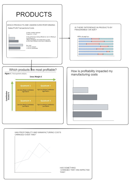
Within the operations team, I oversaw products, hoping to discover anywhere I could suggest improvements and add value to the client. Below is a rough sketch of the key questions we wanted to answer of the data that we had.

Once I had gotten the chance to explore the data, it became clear that the antibacterial range (which was introduced in the pandemic), significantly changed the business' landscape, as shown below. The sudden rise could be attributed to the pandemic but it didn't account for the continued success of the range, far after the pandemic had been over.
So, naturally, I wanted to find the underlying reasons behind this sustained success and explore the possibility of replicating these conditions to bolster sales across the company's entire product range.

Notes for improvement: It is quite hard here to easily identify which line signifies which product.
The next question was to have a closer look at the products to see if there were any inherent differences between the anti-bacterial range and the rest. I was intrigued about the pricing margins and wanted to explore whether there would be a relationship between popularity and profitability.

Notes for improvement: Looking back, I'm not sure this was the best question to try and characterize why a product is popular.
Profit is a measure which would influence the behavior's of a company more so than a customer, as this information is often unbeknownst to them at the time of purchase.
A better question might be... What is the relationship between the price of a product and it's popularity?
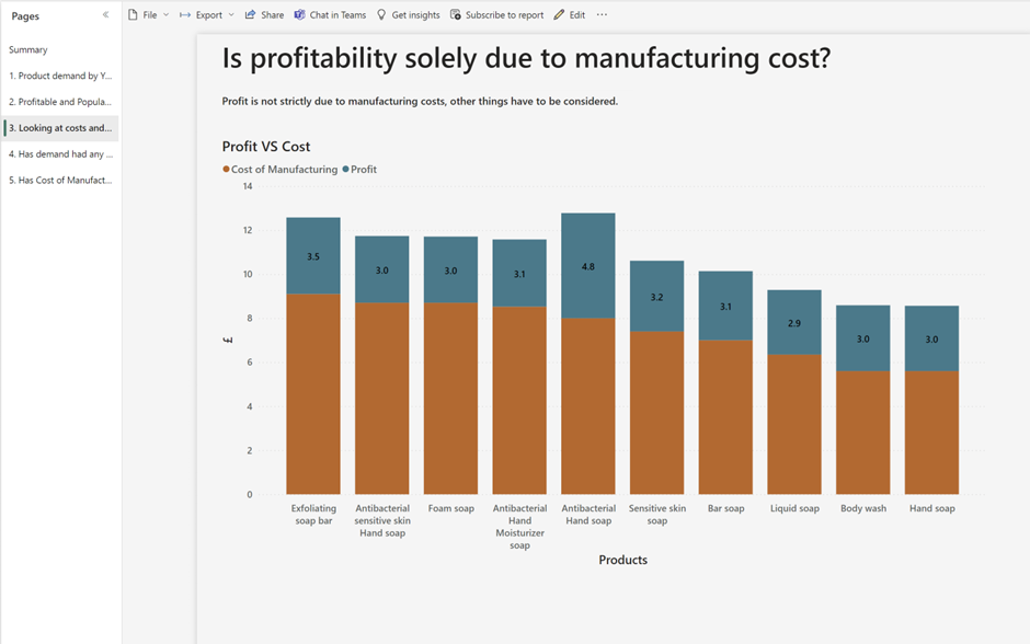
Following on from my investigation on profit and popularity of product, I then wanted to have a look at whether there was any pattern or strategy with regards to pricing based on manufacturing costs.
I found that there was not.
Most products apart from "Antibacterial Hand Soap" were simply marked up by, on average, £3. When I brought this up with the stakeholder, he confirmed that they indeed don't have a pricing strategy and have simply been basing their prices on their competitors.
If the pricing strategy were more dynamic, it could increase how much profit is garnered from each sale/product.

Notes for improvement: I don't think this visualization shows what I want it to as efficiently as it could. I want it to be immediately visible that products that cost different amounts are all priced with the same profit margin which is not the most efficient pricing strategy.
Now that I had done some digging and gotten some answers as to what needs to be overhauled with the client's products I started to have a go at creating a usable data lead solution.
I wanted to start to investigate the principle of price elasticity which refers to the extent to which changes in price effect demand for a product. This is normally calculated as a ratio but due to certain limitations this wasn't possible in my report, so I pivoted and had a look at the absolute values.
Below we can see that using information we've gathered up to this point patterns do start to emerge. The hugely popular anti-bacterial range has a close grouping between RRP and demand, but this brings us to the limitations of this visualization as the relationship between the two lines isn't immediately apparent, which one effects the other? Do they effect each other? etc. So it is hard to determine a sensible action based off of the data shown.

Notes for improvement: the context of the products popularity and profit margins, which play a big part in the identification of patterns, are lost here.
Furthermore, the axis do not have a one to one relationship, the general movement across time can be estimated but with no real accuracy.
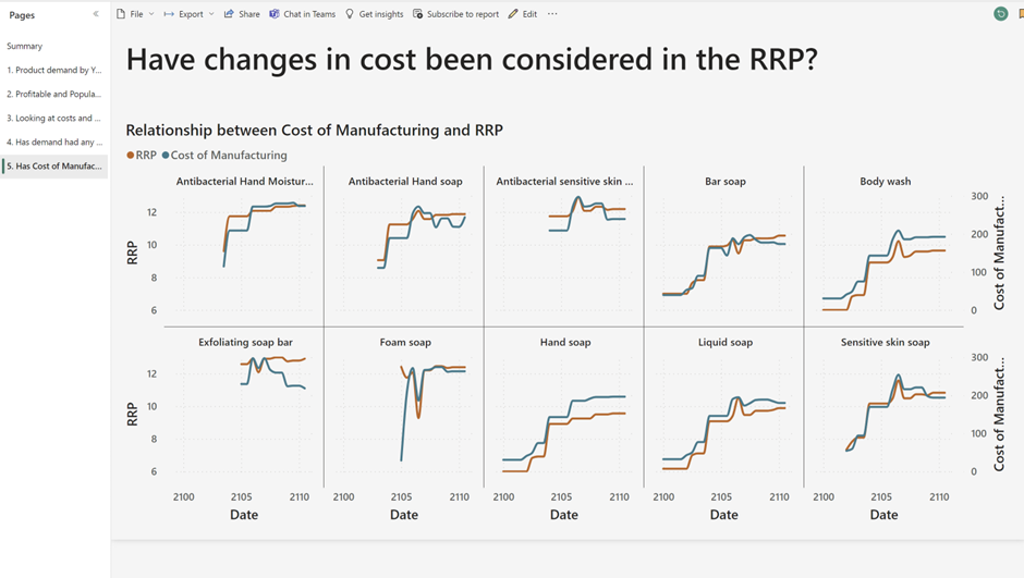
The final visualisation in this exploration of product pricing we will look at investigates whether the manufacturing costs have had any baring on the RRP. I hoped to find if there were any instances were the business was mispricing their products in a way which was also costing them money. I found that they did.

Notes for improvement: Here again the axis' are not synchronised so it seems that in some instances the cost of production is higher than the RRP. I believe the cost of manufacture here is aggregated rather than a row by row value.
Besides the unsynchronized axis' if the manufacturing costs exceed the RRP it also isn't immediately visible which, considering the importance of such a finding it definitely should jump off the screen.
Evaluating your own work whilst in the fast pace of the data school is quite hard to do despite all the support and feedback we do get.
This has allowed me to have a closer look at my proposed solution and I hope to replicate and improve this using the skills I have learnt since and Tableau rather than Power Bi.
If you have noticed any improvements or limitations in the work I haven't highlighted I would love to hear from you.
You can reach me on linkedin: https://www.linkedin.com/in/yoancaboste/
