Storyboard in Tableau is a powerful tool for storytelling. In the blog post, I'm going to guide you through a personal story of mine based on my Spotify streaming history (storyboard available here). Some of story types I used are explained in this video.
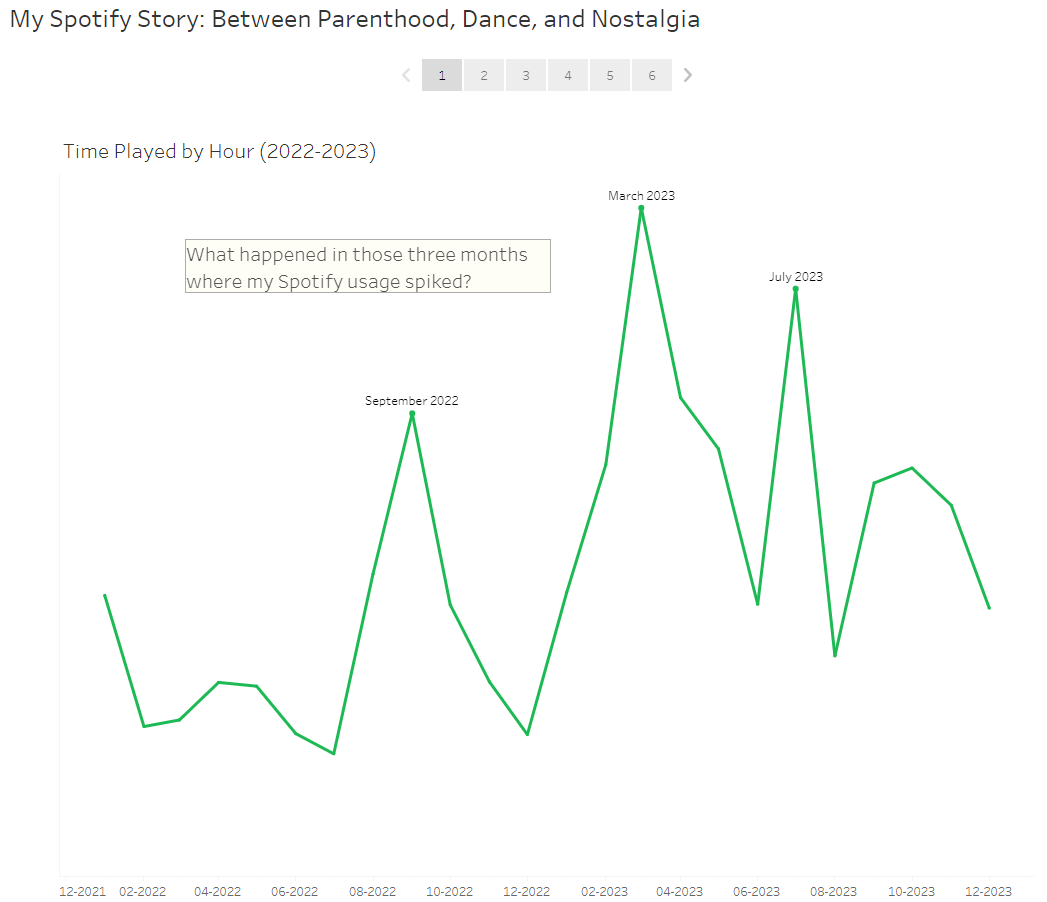
First, I made sure to give the storyboard an interesting title that also captures the essence of the story. Using a line chart showing change over time, I introduced the main question of the storyboard: I want to find out what led to the three spikes in my monthly Spotify usage from 2022 to 2023.
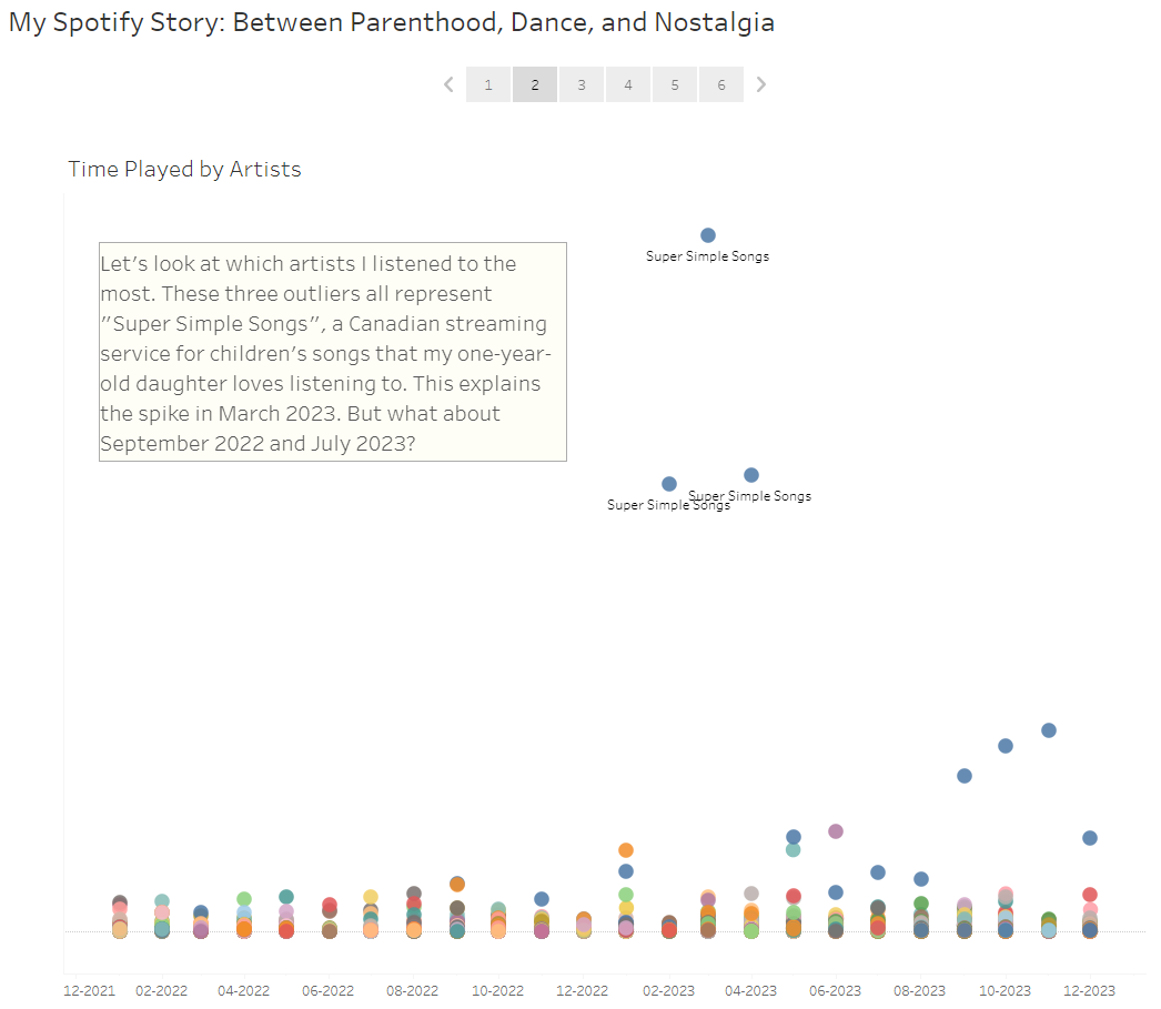
Then I moved on to looking at playtime by artists, which shows me three outliers. Outliers particularly draw our attention and pique our interest to ask further questions. Here, the highest data point explains the increase in playtime for March 2023.
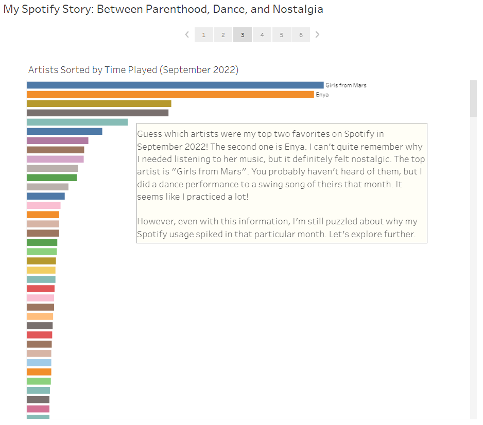
In the next story point, I zoomed in on the artists I listened to in September 2022 and traced back to two personal stories behind the top two artists. After being a bit sentimental, logic dictates that this chart still can't explain my total Spotify usage in that particular month.
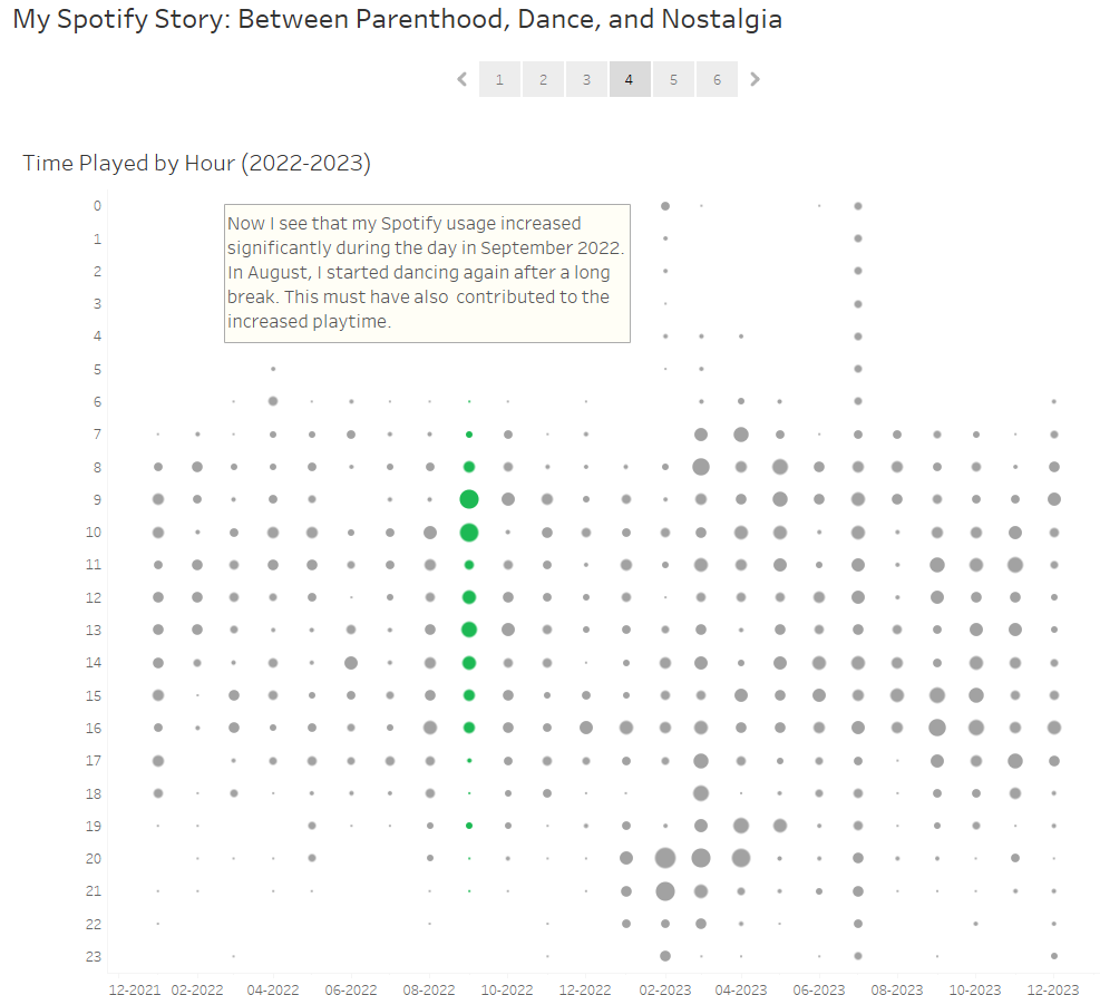
I then switched to a circle timeline to look at my hourly Spotify usage. And voila, we notice two distinct patterns for September 2022 and July 2023. In the former, I listened to Spotify a lot more in the daytime, while in the latter, I seemed to have forgotten to turn off Spotify during the night. And why is that?
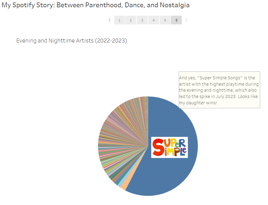
This leads me to my last story point. It turns out that my daughter has had a big influence on my Spotify usage, especially during the evening and nighttime. Her favorite artist definitely pops out again in the last pie chart.