


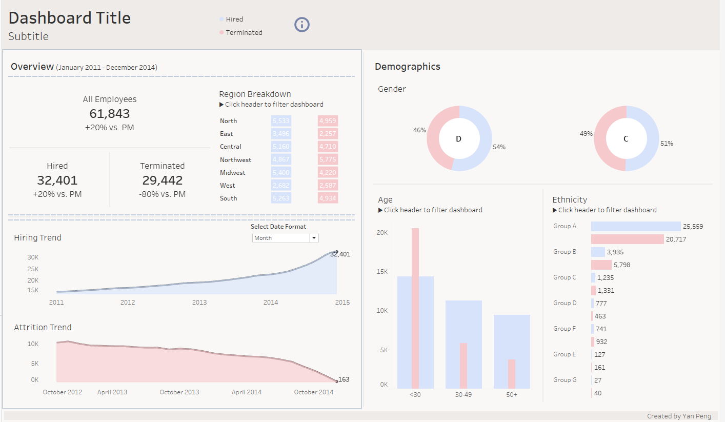
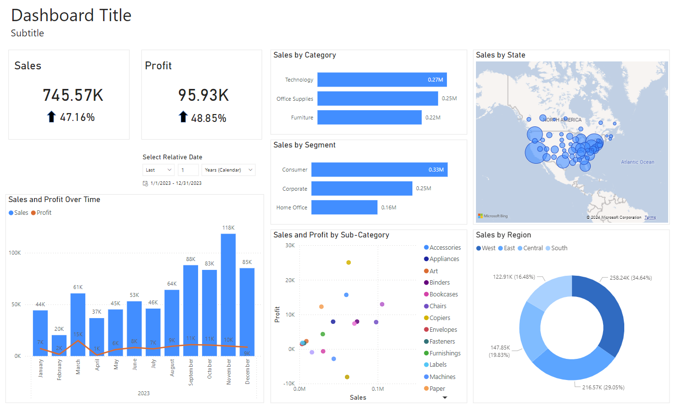
Today marked the second day of Dashboard Week, a challenging and exhilarating experience. Our task was to create two business dashboard templates using Tableau and Power BI. We worked with a mock HR dataset and the well-known Superstore dataset. The time pressure was huge, as we had to familiarize ourselves with a new dataset, create dashboards using two different tools, and ensure our templates were both useful and insightful. The process was stressful, especially before starting the second dashboard, but I'm pleased with the results:
Embracing "Steal Like An Artist"
What significantly helped me complete this task was the concept of "Steal Like An Artist," inspired by the popular book often read at the Information Lab. To avoid starting from scratch, I searched for dashboard inspirations on Tableau Public before planning and sketching my dashboards. For a new topic like HR, it was incredibly helpful to see which metrics are essential, how others structure their dashboards, and the types of charts they use.
Finding Inspiration Without Overwhelm
While looking for inspiration, it can be overwhelming due to the abundance of excellent dashboards available. To manage this, I recommend finding a few favorite creators and saving the best dashboards to your favorites. Currently, I am drawn to the pastel color style, and my favorite Tableau creators are Shreya Arya and Ellen Blackburn, among others.
In conclusion, resorting to existing creative work and adapting it to your own needs can be a game-changer. It not only saves time but also provides valuable insights into effective dashboard design. By "stealing like an artist," you can develop dashboards that are both functional and visually appealing.