


Switching between KPIs in a Tableau chart typically requires a parameter control. However, there are times when you might want to introduce another layer of interactivity, either because your dashboard is already loaded with filters or to make it more versatile.
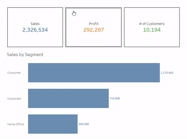
In this post, I'll demonstrate how to use KPIs cards as action buttons to switch between categories. In the following example, the metric displayed in the bar chart is selected by clicking on a KPI card. (Tip: To better understand the instructions, it's helpful to first learn how to use a parameter control to switch between KPIs. )
The logic behind this interactivity is as follows: The clicking action needs to pass the exact metric (e.g. Sales) to the parameter control. This won't work if we simply use the sum of Sales on the Text card to create the KPI card.
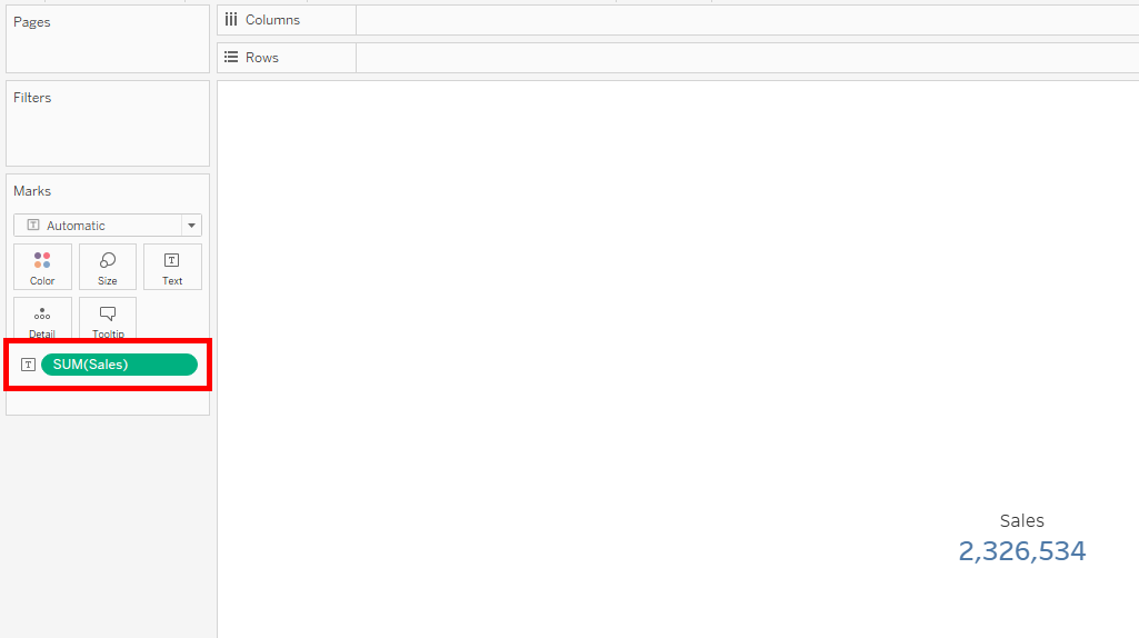
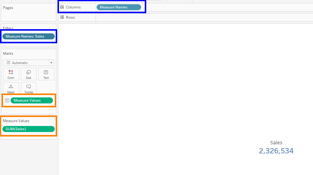
Instead, we need to use the Measures Names and Measure Values fields, which Tableau automatically creates for building views with multiple measures. Since we are building the KPI cards separately, we filter Measure Names to the the desired measure in question - in this case, Sales.
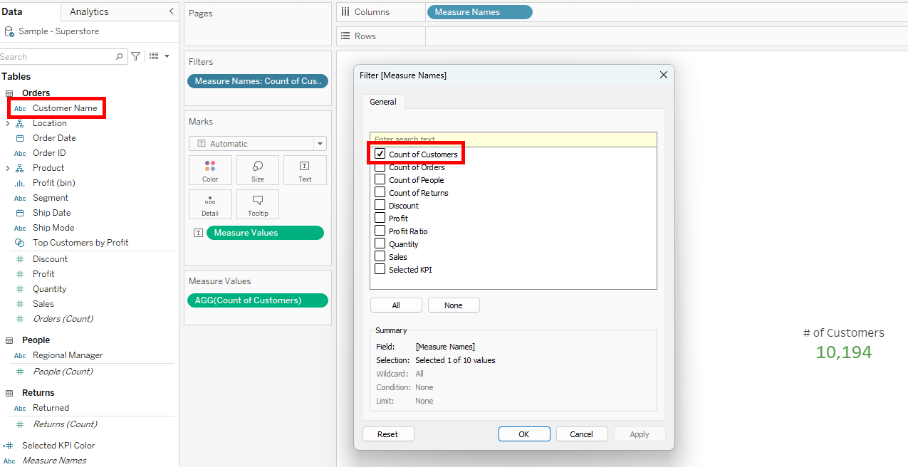
If a metric isn't in the original data, a calculated field has to be created for the metric to appear under Measure Names. In the current example, "Count of Customers" is derived from the "Customer Name" field.
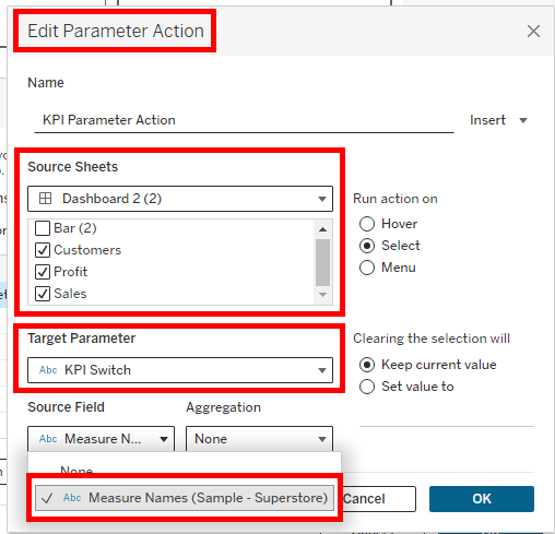
The final step is to add a parameter action in the dashboard. The settings are highlighted in the image below. Note that by using Measure Names in the KPI sheets, the field now appears under the Source Field section. When a KPI card is selected, its Measure Name is passed to the parameter control, updating the bar chart accordingly (see first image).
While it's possible to build all KPIs in one sheet using this method, creating them separately is advisable if you want to add more detailed information, such as year-over-year comparisons.
Using KPI cards as action buttons enhances user interactivity and dashboard versatility. This method is particularly useful when you want a clean and intuitive way to switch between different metrics without cluttering your dashboard with too many controls.