


Today was the first day of our dashboard week. We got a dataset we've never seen before in the morning and were asked to choose a story, make a sketch, and build a dashboard in Tableau within five and half hours.
To succeed in such a stressful task, having a plan is crucial. I started by creating a precise time schedule, detailing when each sub-task should be completed. Then, I made every effort to stick to the plan as closely as possible.
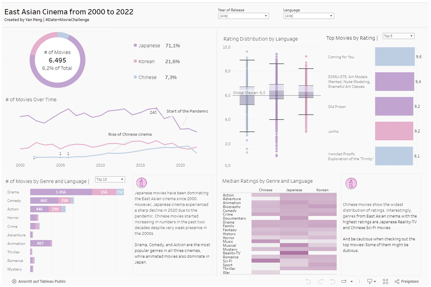
When getting a dataset, it's always tempting to explore it in Tableau. While it's important to understand the basic structure of the table(s) and what a single row represents, data exploration can become a rabbit hole if it's done without a concrete goal. Writing out the rough topic or story you want to tell with data at the beginning is thus essential. It helps focus on certain parts of a dataset, especially when you're dealing with a large one. Our dataset is provided by IMDB for Tableau's Data + Movies Challenge and contains movies and actors from 2000 to 2022. I decided to analyze the East Asian cinema because of my cultural origin.
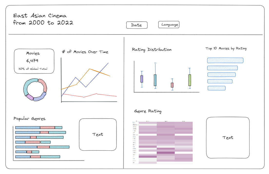
My idea was to visualize relevant metrics to show trends and perhaps unexpected insights. It's a fine balance between having conjectures about a topic and exploring the actual data with an open mind. In my final sketch, I divided my dashboard into two parts, with the left half based on numbers of movies and the right half based on ratings. I like to already start building some of the charts before finishing the sketch to get a better feeling for the layout.
I then had two and a half hours to build the dashboard in Tableau. The clock is ticking... Spoiler alert: I made it! Below is an image of the final result published on my Tableau public profile. Four months ago, I wouldn't have dreamed of completing a polished dashboard like this (it's not perfect but nearly). So, what have I improved to achieve this?
- Experience. Building a lot of business dashboards for student and client projects has honed my Tableau skills.
- Deliberate practice. I like to reflect on past projects and try to build things that didn't work out. I also practice charts I know but couldn't build intuitively.
- Learning from others. Watching videos of skilled Tableau users like this one helped me learn about details and little tricks no one else could have shown me.
- Focus on my own style. I think about what defines my own style: the deliberate use of color, a clean design, and a keen analytical mind.
Feel free to check out my first fast-built dashboard and leave any comment!