


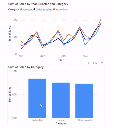
In this article, I will demonstrate a quick workaround for highlighting series in a line chart in Power BI. This is a common limitation in the Microsoft tool. When we try to use a bar chart to highlight the same "Category" in a line chart, as showed in Figure 1, the corresponding series is filtered instead of highlighted. What if we don't want the other lines to disappear?
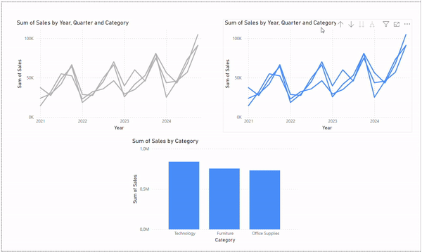
First, create a duplicate of the line chart (Figure 2). Then, change the color of the series to grey and blue (the highlighting color), respectively.
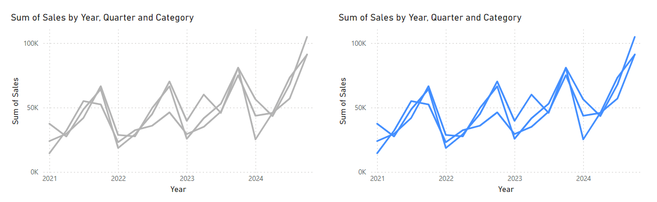
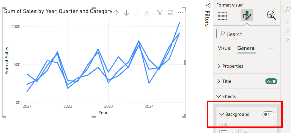
Turn off the background of the chart with the blue lines (Figure 3).
Next, select the bar chart, go to "Edit interactions", and turn off the filter on the grey line chart (Figure 4).
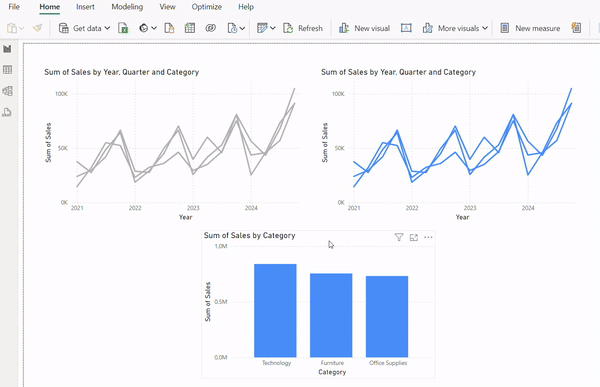
Now, drag the two line charts on top of each other (Figure 5). When you click on the bar chart, you will see a highlighting effect with the selected "Category" colored in blue.
Final tips:
- Make sure the two line charts are formatted exact the same in terms of title and axes. Otherwise, they won't overlap perfectly.
- Fix the range on both axes, as the values can vary when a different category is highlighted.
By following these steps, you can effectively highlight series in a line chart without losing the context of the other data.