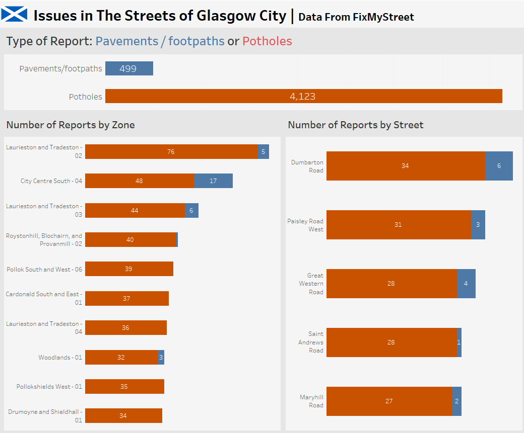
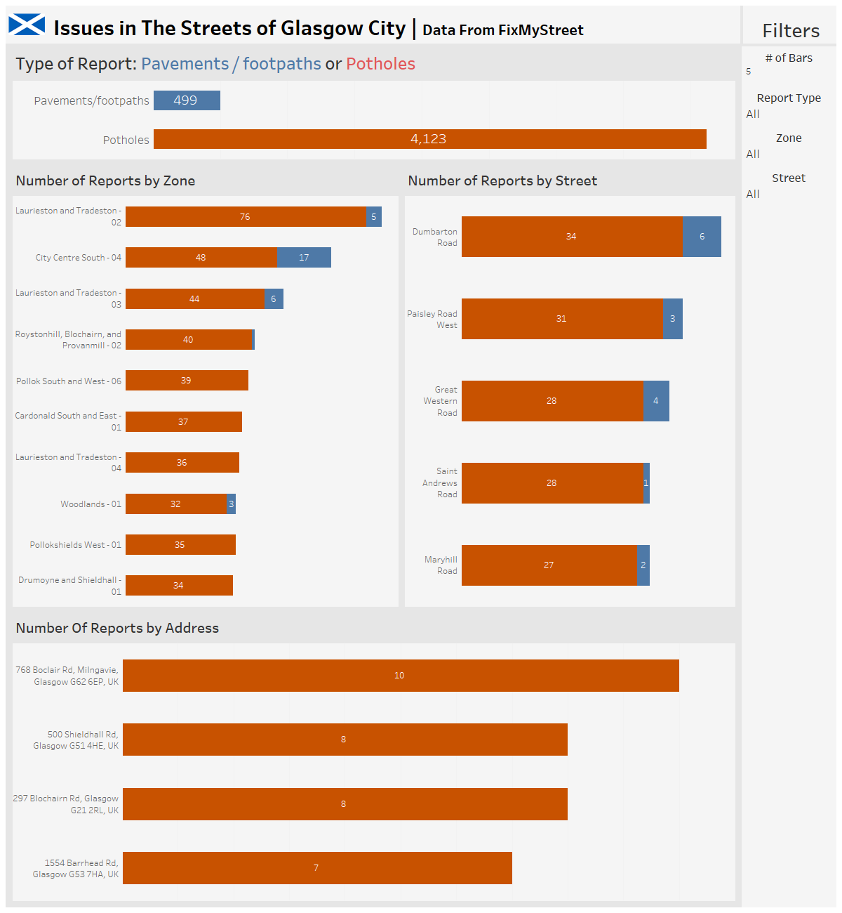
Allow more water to get in so more flowers can grow
Accessibility is more important than it has ever been. Inclusivity is a topic spoken about many but exemplified by few.
Colorblind colors still have yet to be adopted by most fortune 500 companies, which is the most simple and first step in making data Vizzulizations accessible to a broader audience.
Usability.gov says "ensuring that all of your potential users, including people with disabilities, have a decent user experience and are able to easily access your information." Data analysts are in the business of taking information and then sharing it with everyone who asks for it. So following accessibility design rules we are maximizing our usage.
By using universal design rules you increase the ease of use for every user.
Colors - Can be used to express reactions to information and draw attention
Typography - Fonts that make it easy to identify imposter characters. alignments help navigate the flow of the product.

Unity - Only showing what needs to be shown based on a certain ask.
Space - reduces noise and allows information to breathe, resulting in readability

Hierarchy - Placement of groups of ideas or graduality. Helps navigate the eyes through the product.

Contrast - Emphasis on what is most important and helps increase legibility.
Scale - Creates interest and viewability.

Similarity - Making sure certain elements are consistent throughout the product.

