


Hello, everyone!
It’s been quite a bit of time since I’ve written one of these blog posts – after dedicating myself fully to Tableau and Alteryx I invested some of my time in other projects these past two weeks – but boy am I back with something special for you guys. My fellow teammates and I have finally begun what is probably the most dreaded week here at the Data School: Dashboard Week. What is it, I hear you ask? Well, each morning, Andy assigns each of us a particular task centered around a particular theme. Our job is to scrape the web for some relevant data, build a viz, and write a blog about it every night. And yes, I mean night. Finding data that’s interesting and useable, cleaning it up and Alteryx, and building an interesting visualization out of it is as time-consuming as that sentence just made it sound. However, dashboard week is also the ultimate challenge for us data geeks, an amazing opportunity to practice all the skills we’ve been taught over the past two months and to really get a chance to put ourselves to the test. Even though I already feel mentally tired after spending a whole day typing a way and building calculations, I have to say I can’t wait to see what Andy has in store for us! That being said, let’s dig right into what I had to work on today: comparing the legendary basketball players Stephen Curry and Larry Bird (I did not know the latter existed before I started this project this morning, full disclosure).
Let’s Scrape Some Data!
As soon as we were given our tasks this morning, each and every one of us started with the same strategy: use Alteryx to access one of the internet’s many sport data websites, clean it up, and build a dashboard from there. Andy being Andy, however, the website he shared with us didn’t actually really have an API we could pull data from. After struggling with online guides on how to change my payload settings on the download tool to call an API using the POST method – going down the Internet rabbit-hole can be very time-consuming – I decided to use a nifty little trick we were given recently: using the IMPORTHTML function with Google Sheets. This tool allows you to directly pull any HTML data packaged in tables that you find on pretty much any website. To use it, simply open up a Google Sheet, go into a cell, and input the following code:
- =IMPORTHTML(‘URL’, ‘table’, ‘1’)
- Replace URL with the website you are interested in (keep the quotation marks), and change the last digit to pull the table that you want.
In my case, I wanted to obtain performance statistics from Curry and Bird from the following website:
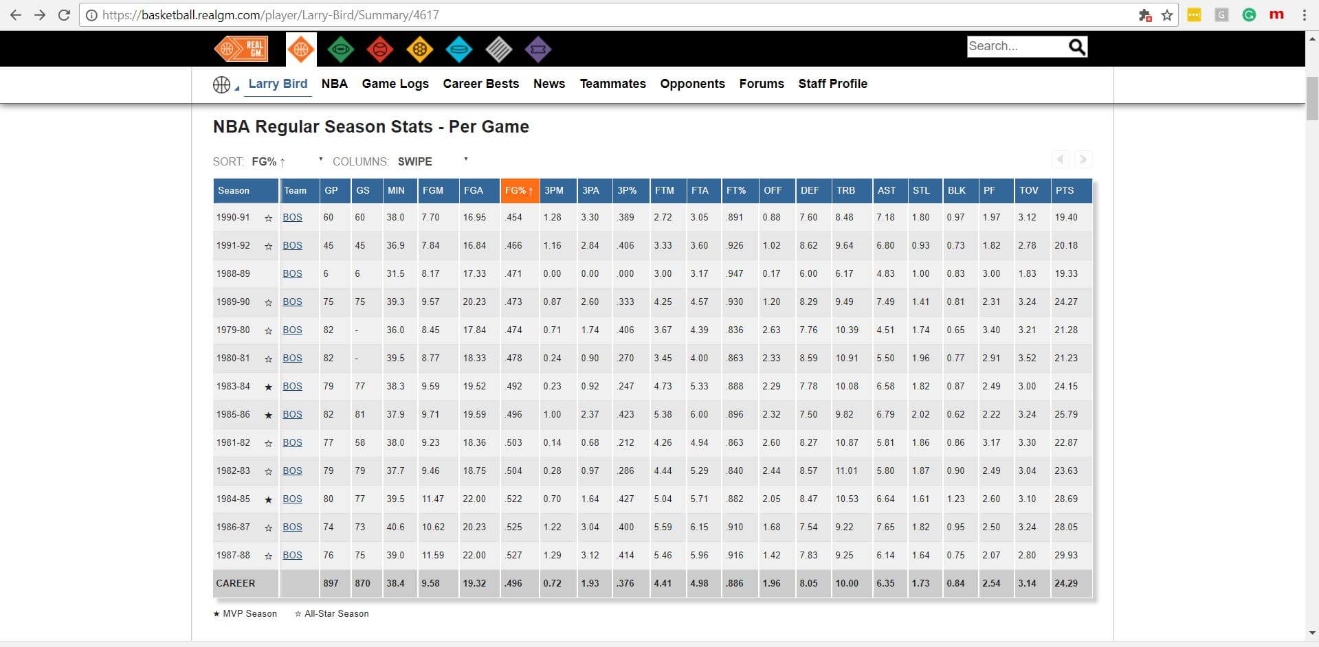
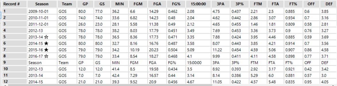
After going through multiple iterations to pull the data from the tables I was interested in, I ended up with something that looks like this. You can see what the function looks like in Google Sheet in this screenshot too. I separated the data into multiple sheets to make the rest of my cleaning simpler. Who would’ve thought getting high-quality sports data from the internet would have been this easy?
Let’s Get This Data Ready For Analysis!
Luckily enough, the data I obtained using this method was already very “clean” and required little more preparation. Here’s what the data looked like when I pulled the sheets into Alteryx:
As you can see, all I really have to do is:
- Remove some rows (The one that begins with Season),
- Remove unnecessary symbols (The stars)
- Change Some column names (3PM got changed to 15:00:00 automatically by Alteryx)
- Adjust my dates (I want to keep only the year and not the digits afterward).
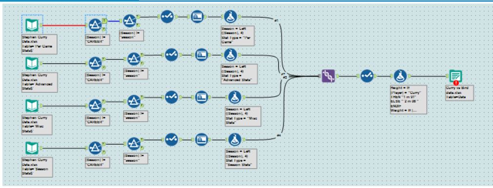
To do this, I simply used a few Filter, Select, and Formula tools. I repeated this process four times for all my sheets – which Alteryx made a ridiculously quick process by allowing me to copy-paste parts of my workflow that were already done. Here’s what the full workflow looks like:
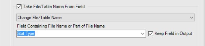
Now, in order to make building a visualization out of all this data as simple as possible, I wanted to make sure I could export all the sheets back into separate sheets. The Alteryx Output tool makes this extremely simple! To do this, simply setup the bottom-part of the configuration window on the tool as I have done it in the screenshot below. You will need to select a field that will be used to separate your data into the different sheets. In my case, I created a new field called Stat Type that indicated which tables the data originally came from. A few clicks later, and voila! I’m ready to start vizzing.
Let’s Build A Dashboard!
By this point, I must admit that I was feeling pretty strong. I had a nice, clean dataset to work with, a clear objective, and a whole afternoon to finish up my work. And then I quickly realized that I had absolutely no idea how to turn this information into something interesting, let alone visually stimulating. The thing is, I abhor watching sports on television, I’ve never followed any sports teams whatsoever, and I simply have no idea what people are looking for when they are trying to compare players. I find that the only way to building a great dashboard is to enter a state of flow so as to engage in an effective iterative process of trial and error where you can quickly decide which avenue to go down and which ideas to kill outright. This afternoon, however, I was completely stuck.
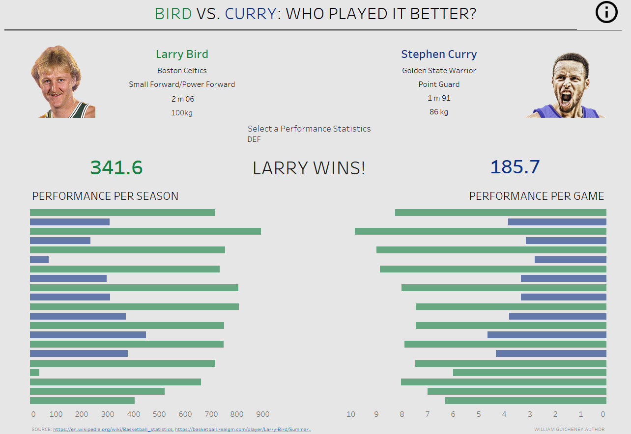
In these situations, I find the best thing to do is the following: figure out what others have done before you. Even though it might lead you away from your own gut instinct, it’s a great way to get started and simply get a feel of what a polished and useful finished product should look like. I started googling away and looking up all types of sports related vizzes, taking my time to try and understand what worked in each of them and what didn’t. I ended up deciding to go with something a little less intense and professional with what you will commonly see online, and with something that I would actually take the time to play around with if it came up on one of my social media news feeds. The idea is to build some kind of mini game out of the player comparison and check if the old timer would have had a shot against the new legend. I also really wanted to go as far away from an intense table full of statistics as I could but still retain the key information that they hold. Here’s what my final viz looked like:
And there you have it! From a task about a theme I still know very little about, to scraping some online data using Google Sheets, cleaning it up with some simple tools in Alteryx, and building a simple and visually aesthetic dashboard out of it!