


When I applied for the Data School and got stuck into Tableau I knew that the mapping features would be something that I would always be drawn to. I tried to cram in as many maps to my application vizzes as possible and although they weren’t that insightful I enjoyed making them and I could see the possibility of what they could be used for.
Over the last week and a half we have been learning a lot about Tableau and different charts, although something we haven’t touched on yet is the mapping features. I understand that in time we will get to that point but I thought it would be great practice to try out some new techniques in my spare time (especially when there are train strikes!).
I downloaded the Stop and Frisk data from the NYPD for 2014 and noticed that the Geographical fields were given as X and Y co-ordinates rather than Latitude and Longitude. I tried to just use the generated fields to map the data however nothing would work. A few Google searches later I realised that the coordinates were given in a different format, New York-Long Island State Plane Coordinate System. After reading another blog about the issue, I realised I would have to run the data through another program to get the data format that I wanted for Tableau.
The software I used was called QGIS, open-source, and although it was daunting at first I managed to get the hang of it in a couple of hours. I will run through a quick step-by-step guide for changing the geographical fields in the data we have.
The first thing to do after opening QGIS is to go to Layer > Add Layer > Add Delimited Text Layer. It should bring up the box below:
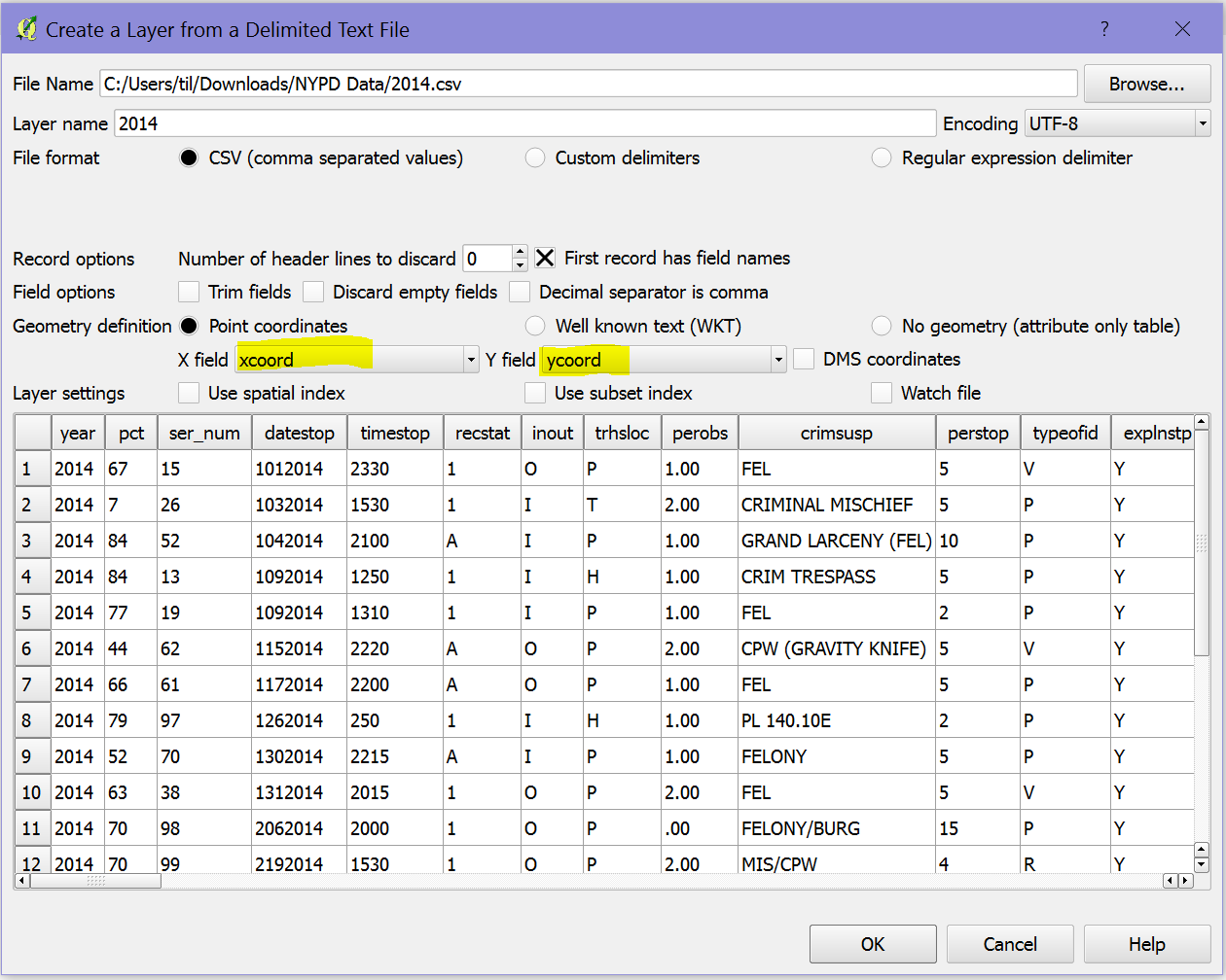
Add Layer Dialog Bxox
Once you have selected the file the 2 key fields to enter are your X and Y coordinate fields into the appropriate highlighted boxes as seen above. This is telling QGIS what to look for in your data. The next box that pops up will be asking for what CRS (Coordinate Reference System) the current data is using.
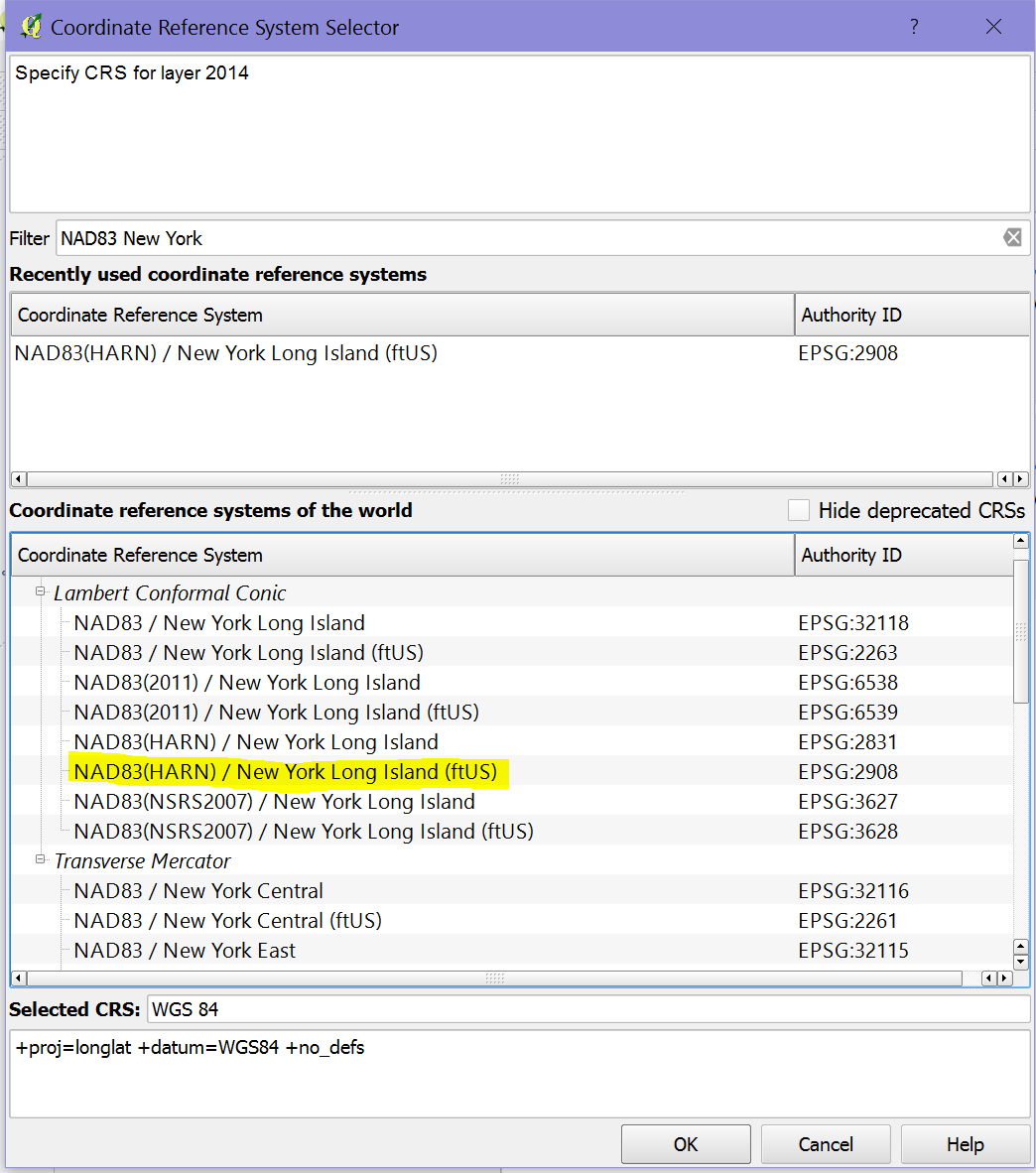
CRS Selection
For this dialog box you must select ESPG:2908 which relates to New York Long Island. Once you select this and click OK it will start mapping out all the data points and you will (hopefully) end up with something that looks like this:
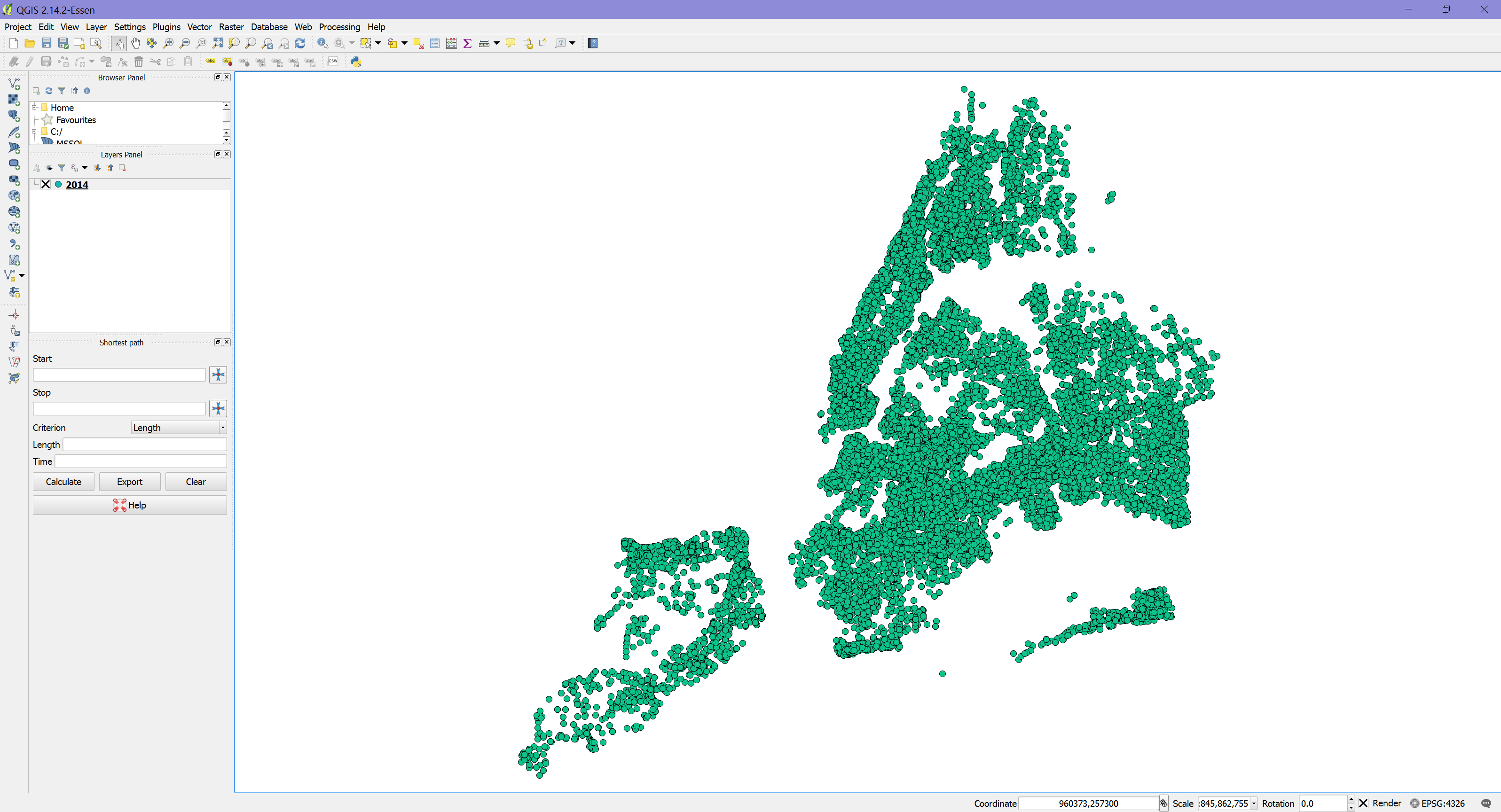
Mapped Data Points
All that is left to do now is to save these points in a new format. To do this select Layer > Save As and it should bring up the dialog box below:
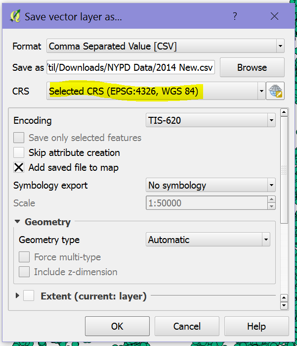
Export Data
The key here is to select the CRS that you want the data to be mapped in. For Tableau we should select EPSG:4326 / WGS 84 as this is the standard for Longitude/Latitude. Once this has finished saving the file you can just open it in Tableau as you would with any CSV and use the newly created X and Y fields to map out the data.
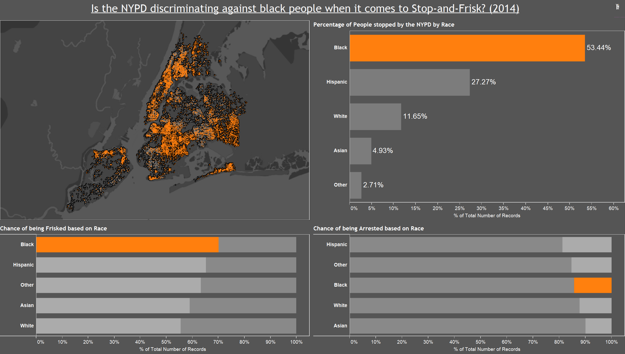
I used this data to create a simple visualisation that looks at the discrimination towards black people by the NYPD performing frisk searches. I tried to use as many techniques that I have learnt over the last few days, such as Sets, Shapes, Sorting and Others. Feel free to click the image below and it will take you to the full visualisation on my Tableau Public.
http://public.tableau.com/s/profile/will.griffiths#!/vizhome/NYPDWorkbook/Dashboard1