In the field of data visualization, attractive design plays a critical role in effectively communicating information and engaging the audience. Here we'll look at a set of tools that can help you improve your data visualization design.
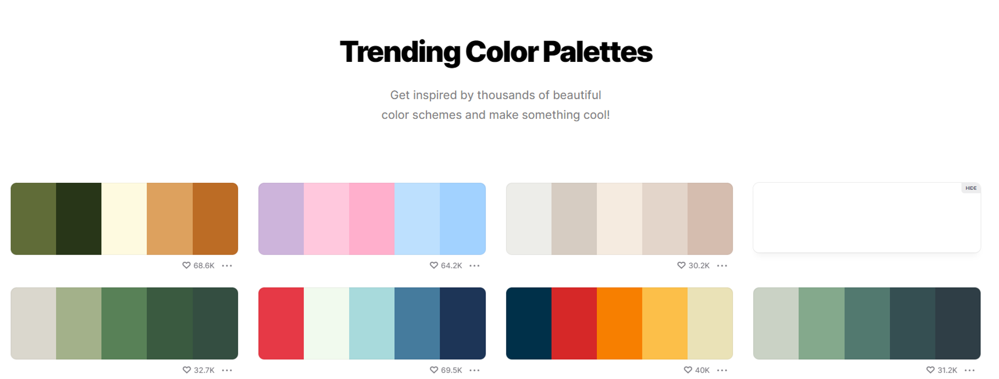
1 Coolors
Coolors is an online platform that allows users to generate color schemes and palettes for design projects. It provides a simple and intuitive interface for creating harmonious color combinations****.**** Users have the flexibility to lock specific colors they like while experimenting with others. Coolors also features trends and curated collections, offering users a source of inspiration based on popular color combinations within the community.
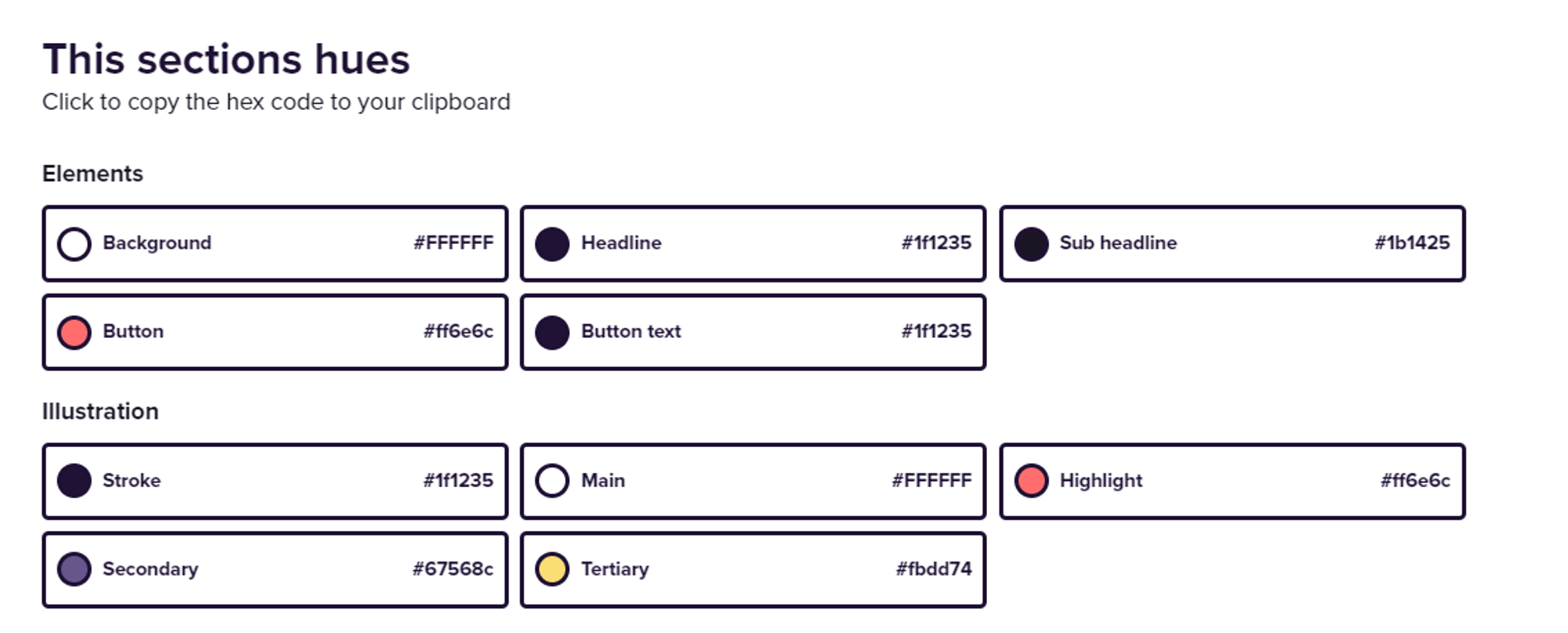
2 Happy Hues
Happy Hues is a tool much like Coolors that allows users to explore and select pre-made color palettes.
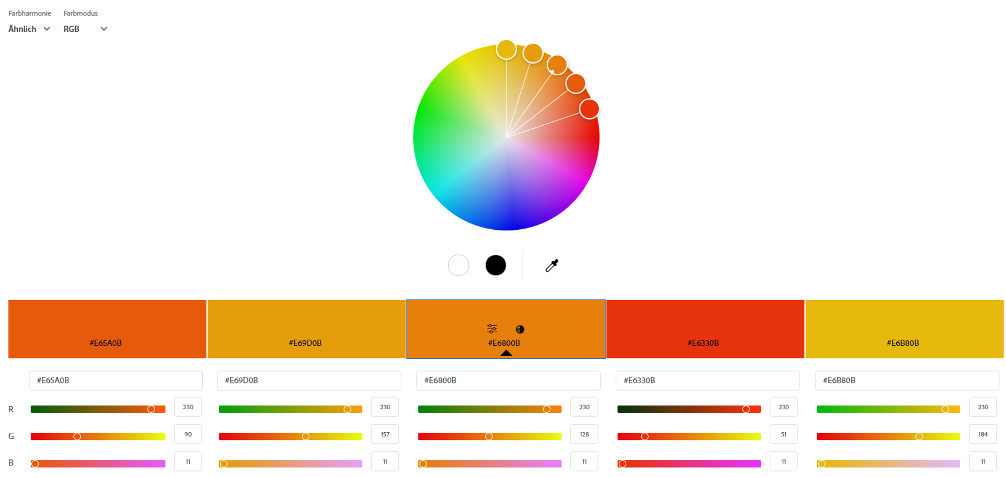
3 Adobe Color
Adobe Color, or Adobe Color Wheel, is a specific feature available within Adobe's Creative Cloud suite. It's an online tool that helps users create and explore color palettes.
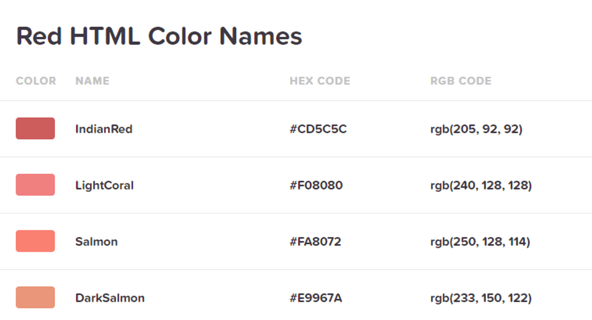
4 HTML color codes
The website htmlcolorcodes.com offers a variety of tools, including a color picker, color chart, and tutorials on working with HTML colors.
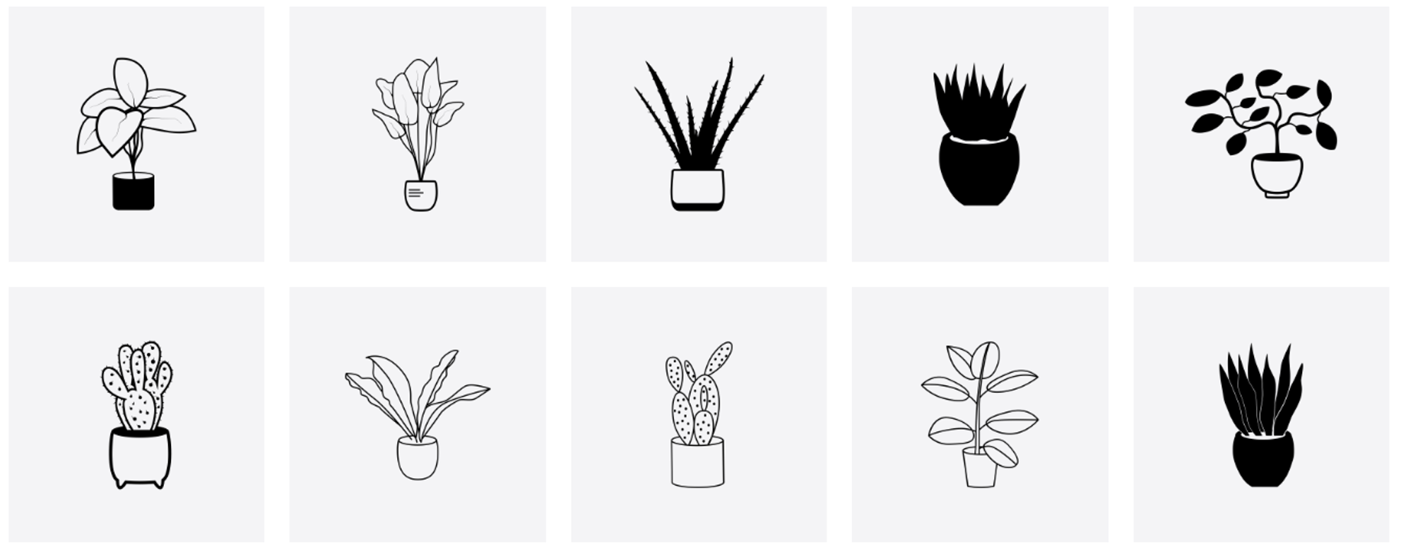
5 The Noun Project
The Noun Project is a website that serves as a vast online collection of high-quality, customizable icons and symbols. It was created to provide a platform where designers, developers, and individuals can discover and download a wide range of visual symbols for use in various projects, such as graphic design, presentations, websites, and more.
On The Noun Project, icons are often presented in a simple, minimalist style and cover a diverse range of categories and themes. Users can search for specific symbols, browse through various collections, and download icons for free or with a premium subscription.
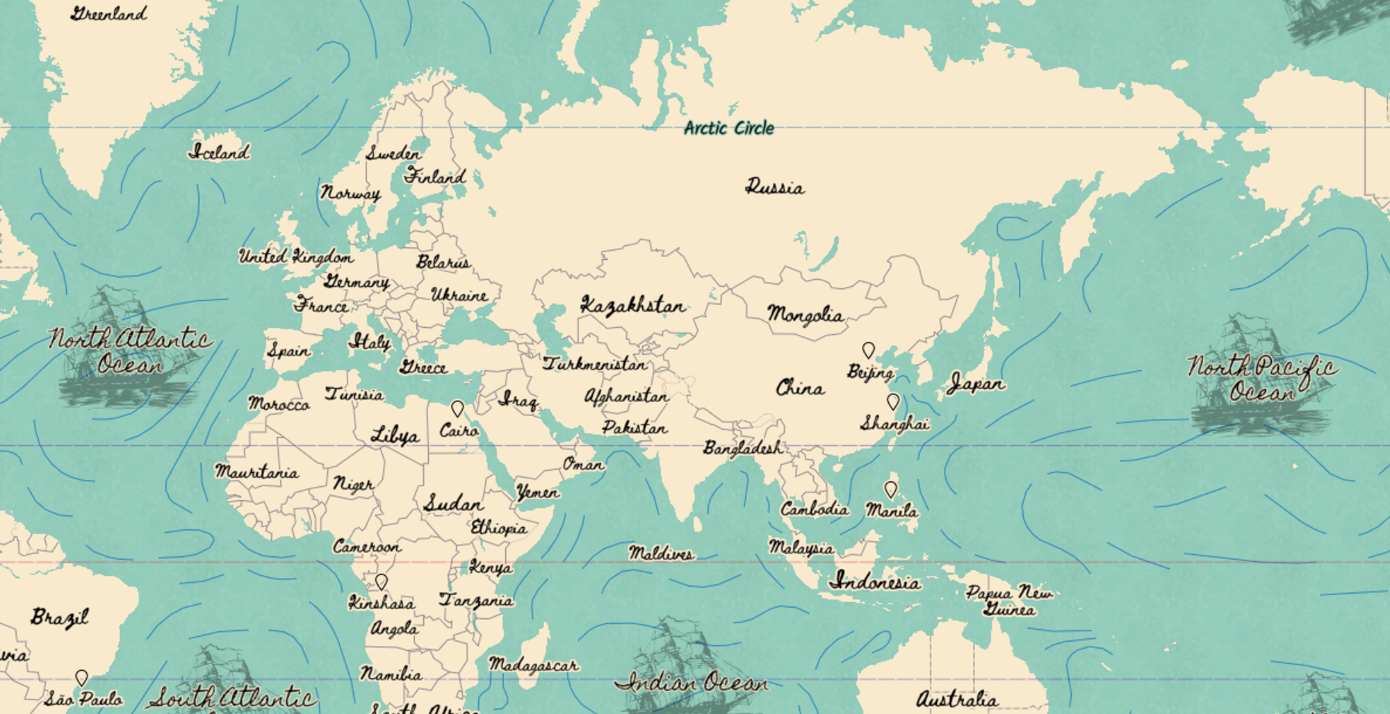
6 Mapbox
Mapbox is a mapping platform that provides developers with tools and services to integrate customizable and interactive maps into their applications. It offers a range of mapping and location-based services, enabling developers to create dynamic and visually appealing maps for web and mobile applications.
You can even discover a pirate map here!