


Today was the second day of Dashboard Week, and our task was to create a dashboard in Power BI using data about worldwide happiness. You can find the data here.
The World Happiness Report is a significant study of global happiness levels. It started in 2012 and has been published annually since, gaining recognition worldwide. It ranks countries based on happiness levels, using data from the Gallup World Poll. The report helps governments and organizations make informed decisions.
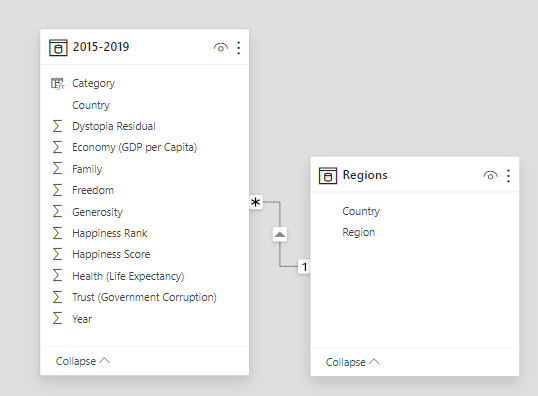
This project involved some data preparation due to differing column names. Ultimately, my data model look like this:
And here's the dashboard:
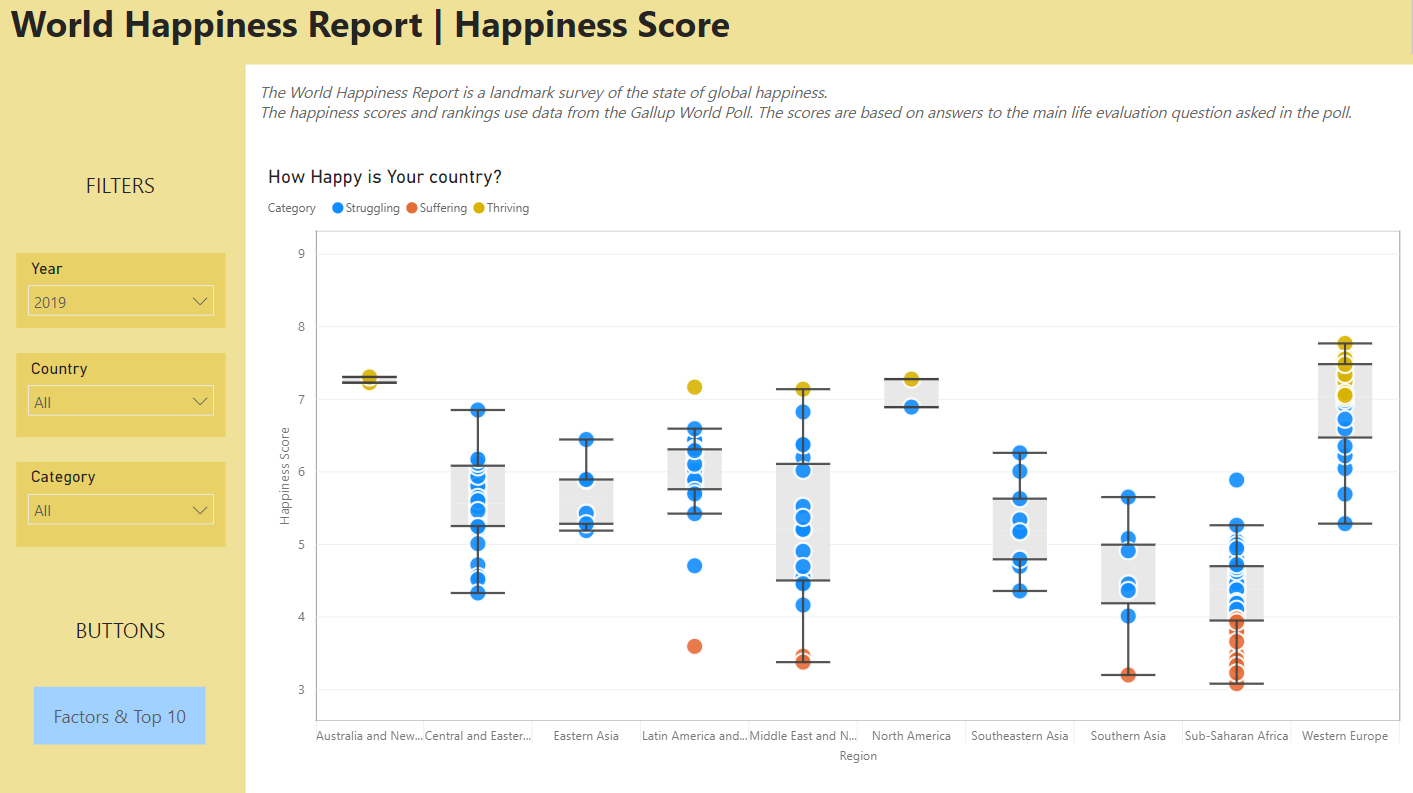
Page 1:
Page 2:
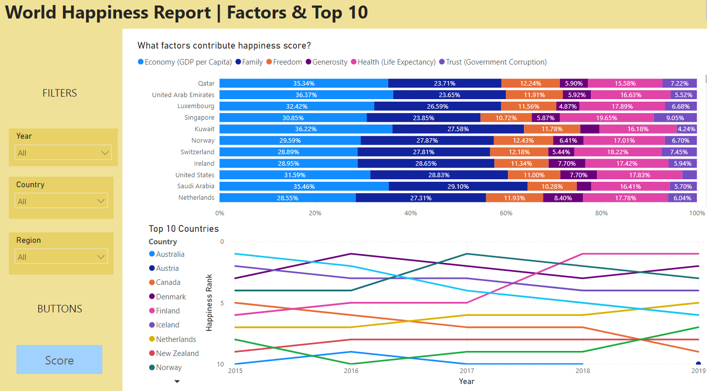
What went well: I used cheerful colors (yellow), created navigation, included a box plot chart, explored various factors, and enabled drill-down functionality.
Room for improvement: I could have highlighted the country on the first page and to filter the stacked bar chart based on ranking.