


Yesterday kicked off Dashboard Week. Our goal was to make a business dashboard with Real World Fake Data #RWFD, all in Tableau.
As we made the dashboard, we aimed to answer these questions:
- Who's our client?
- What's their issue?
- How can this dashboard help them?
- What projects or steps could be next?
For data, I picked the Hospital ER dataset, available here: link.
My user story was: "As a hospital emergency room manager, I want better patient coordination, resource insights, and real-time ER performance."
Here was my day plan:
- Write user story: 9:00 - 9:10
- Get inspired: 9:10 - 9:30
- Sketch: 9:30 - 10:30
- Dashboard time: 10:30 - 15:00
- Prep for presentation: 15:00 - 16:00
- Give presentation: 16:00
The data was quite clean and required minimal preparation. Even the sketching stage went quickly.
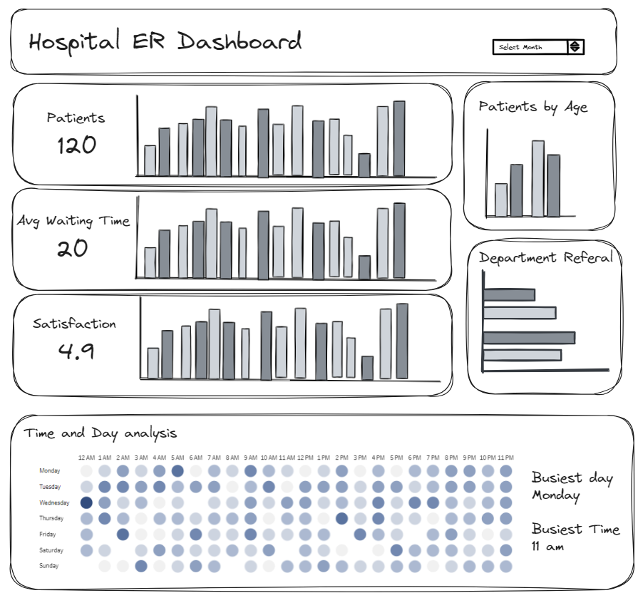
Here's my sketch:
And here's the dashboard:
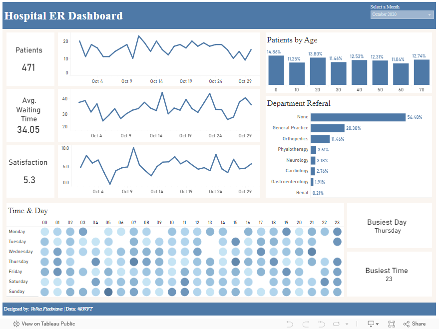
Good: I had plenty of time for design and making all the visualizations I needed. They all looked neat, and I didn't need to prep the data much.
Could've been better: More interaction in the dashboard. It would've been nice to click on a bar to filter data or to see the comparison between the current and previous months.