


In day 2 of Dashboard Week we were tasked with preparing LEGO data in SQL and then building the dashboard in Power BI. I chose to analyse botanical/floral sets with the aim of exploring the biodiversity of the parts, the range of colours, and the complexity between floral themed and city themed sets.
Plan
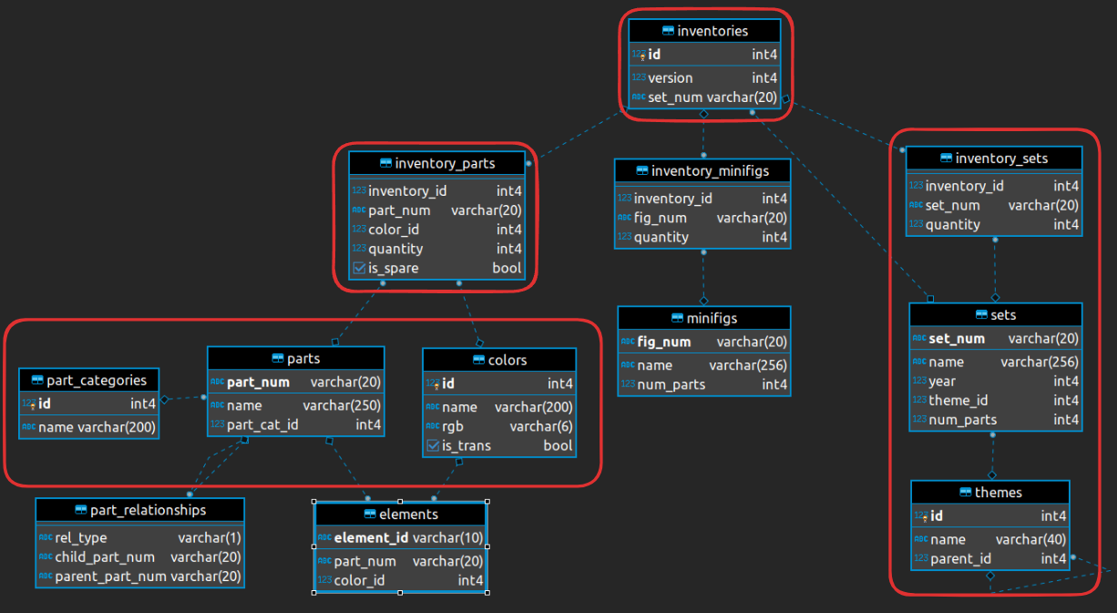
As always we have to start off with a plan! I had a little look through the data to look for key words and knew I wanted to search for anything containing flowers, floral, orchid, city, and cities. I also used the schema to choose which tables I wanted to bring in to SQL and made a rough list of the columns I needed for the dashboard.
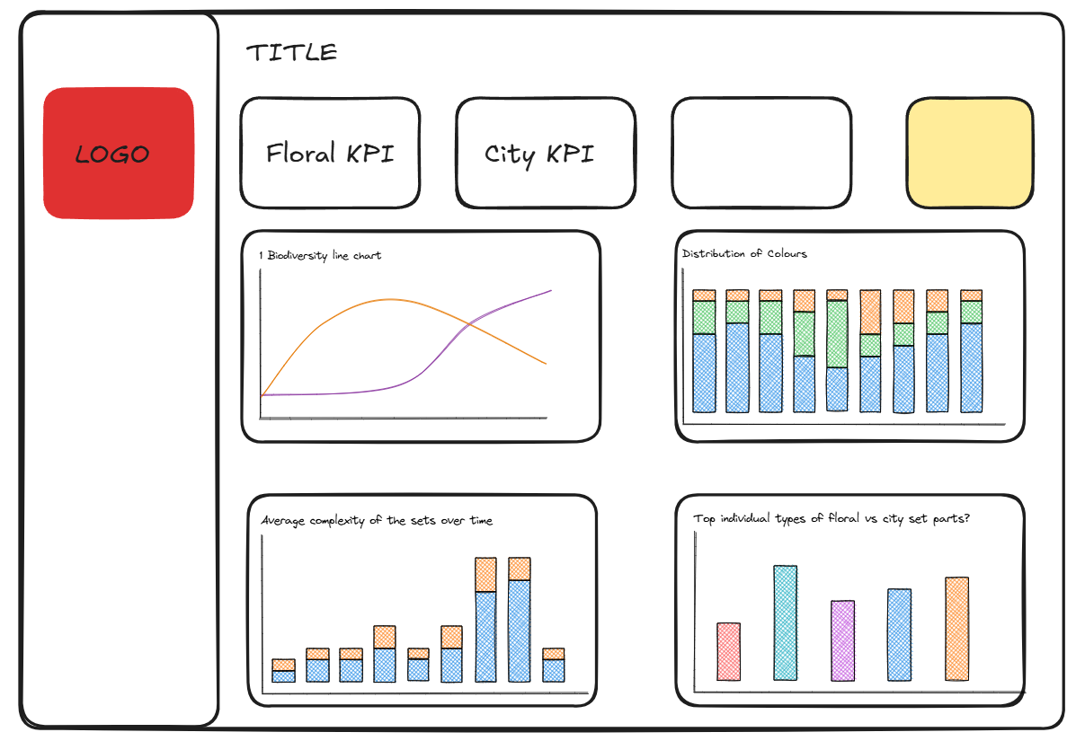
I also made a very rough sketch so that I could see if there were any gaps in what I'd decided to analyse. I ended up changing the bottom right chart, hoping to compare the average of the different number of parts per set across time but didn't have time to finish this in the end.
SQL
I took longer in SQL than I wanted to today but I started by creating two tables. One for the Sets side of the schema and one for the Parts side.
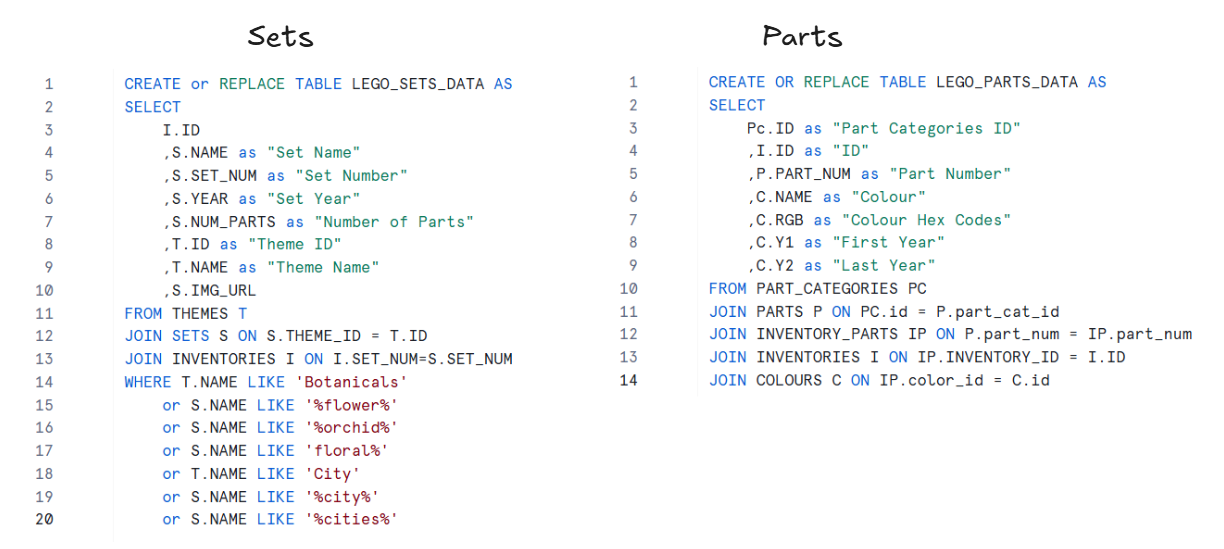
Once I had finalised the columns for each table I joined these two tables on ID so that if I needed to go back to one of these queries to change something, I would be able to find it a bit easier.
Power BI
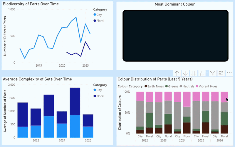
- The first thing I had to do (besides creating a measures table and a date table) was create a column for the two categories, floral sets and city sets so that I could compare the two in my line chart and stacked column chart.
- When I got to the colour distribution chart I needed a way to group the individual colour names together e.g. anything containing green, lime, and emerald should be classed as "greens". I put the list of colour names into AI so that it could group the rogue colour names I might've missed out like salmon and azure.
- I needed to create four measures for the first two KPIs. One for the total parts released in 2025 for the floral sets, one for 2024, and the same but for city sets. The only date data we had was the year so that's why I chose 2025, otherwise I would've done the last 12 months vs previous period.
- My last chart didn't work so I replaced it with a shape that shows the most popular/dominant colour in all of the parts - no surprise it's black. I also wanted to set it up so that when you clicked on one of the colour category bars it would then show the most dominant colour within that group and year.
Feedback
The feedback was short and sweet today phew! In the line chart you can see where the floral sets were first released and I filtered the rest of my charts to 2021 or 2022 onwards anyway so the first thing was to filter the whole dashboard to show 2021 onwards. The other thing was with the most dominant colour, I could show the top 5 colours instead of just the one (my tired dashboard week brain just didn't think of that).
Next Steps
I need to make those two small changes and finish uploading the SQL to github after this blog gets posted. If there was a next consultant there would've been room to analyse the release dates of colours or new colours using the first year and latest year data. We also learnt how to build Pareto charts so I feel like this project might've been a good one to see maybe how many colours make up 80% of the parts for example.
On to day 3!