


(Originally posted on my own blog here, on January 11, 2023.)
This is going to be a short and sweet entry on tooltips that’s less on the technical side than usual, as I’ll be talking more about some things to consider when getting your tooltips ready for your audience than about how to do something specific.
To be honest, I didn’t think much of tooltips when I first started using Tableau. Don’t get me wrong, I liked having them, but I didn’t really start thinking about how to use them more effectively until I was working on my HIPAA breaches dashboard and started thinking about every little thing going into it.
For starters, what is a tooltip? It’s the little window that pops up when you mouse over an element in a visualization (that has one, of course). The default information showing up in the tooltip depends on the fields you’ve dragged into your view. For example, for my first graph, which showed the number of breaches over time, the tooltip looked like this:
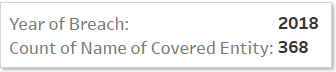
“Name of Covered Entity” is the name of the column in the dataset identifying which places were affected by breaches, which is something I know from working with this data.
But what about the people who haven’t seen this data, the people who’ll be looking at my dashboard to learn more about this topic? They don’t necessarily need to know the particulars of the data the same way I do as the one analyzing the data, so let’s make it easy for someone to understand right away.
The Process
- The first thing I asked myself was: Is it necessary to call it a covered entity?
There’s a definition for the term earlier in my dashboard, but this particular graph is showing the number of breaches over the years, and “Count of Name of Covered Entity” is just detailing how I got those numbers, by counting those covered entities (in this data, one covered entity = one breach). - The second thing I asked myself was: What’s easier to read, a tooltip listing the data like this or writing out the information in plain English?
It always takes me a second to understand a tooltip when it’s the former (i.e., the default format), and I imagine it’s the same for many other people.
Relatedly, what’s easier to read visually?
I like to bold the fields used in the tooltip, so that they’re easy to distinguish from all the other parts of the sentence. Other things to think about for formatting include font size and alignment (for example, I like to center tooltips with short descriptions). - Finally, the last thing I asked myself was: Is additional context needed? What can be added to provide that context, without overwhelming my audience?
The point I wanted to make with the line graph in the first section of my dashboard (following the introduction) was that the number of breaches is increasing each year. As a reminder, by answering the first two questions, I’ve so far formatted my tooltip to say: “There were 368 breaches in 2018.”

I know I’m the one who made the dashboard, but honestly, when I originally wrote it this way, this number meant nothing even to me. Getting breached is a bad thing, of course, but how bad? We need to provide context, to anchor this number to something the audience may understand more intuitively.
Thus, I calculated the daily rate of breaches with a calculated field.
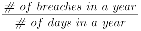
This ratio now puts the number of breaches in perspective, making it easier to understand (and be horrified by):

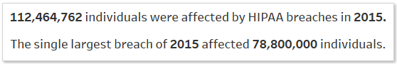
Another example of putting things into context is with the bar graph in the same section, which shows how many people are affected by breaches every year. Originally, the tooltip said something like this: “112,464,762 individuals were affected by HIPAA breaches in 2015.”
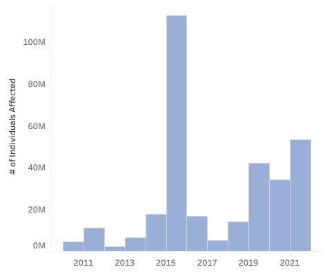
Millions of people’s data getting breached is of course super bad, but again, how bad? I wanted to show how even one breach alone can affect a heck of a lot of people, so I used a FIXED LOD expression to find the max single breach in a year and added that tidbit to the tooltip.
This also helped me realize that once you take away this particular outlier in 2015, you can see the upward trend of people getting affected by breaches over time more clearly.

There you have it, some of the things I think about when it comes to putting together tooltips. It’s not a complete list, of course, but they’re what I started with, and I hope they help you get started, too! Until next time!