


Creating buttons in Tableau is a fasten-ating process! Let’s learn how!

But before we do, let’s talk about why. Buttons don’t change anything regarding the interactivity of the visualization; rather, they replace the default drop-down menus when customizing your view. Buttons are really just for enhancing the user experience–they can make the layout of your dashboard look visually more appealing and are more intuitive for some users, especially when you just want to make one selection at a time (by way of parameters), though multi-selection (with sets) is still possible.
For this blog, I’ll start with how to make buttons in the most basic fashion (first the buttons themselves, before adding in the functionality), specifically using the example for including/excluding outliers, before mentioning a few other ways to trick out the buttons for enhancing the user experience further.
The Process
#1: Create (Non-Functional) Basic Text Buttons
As always, let’s start simple with basic text buttons.

1. Create worksheets for each of the buttons (don’t forget to name them! I like to call them “Button - [description],” so that I know these worksheets are for the buttons from the get-go.
2. Next, double-click on the blank space in the Marks Card. An empty pill will pop up with a cursor inside. Type in the string for the button’s text (e.g., ‘Include All Data’); wrapping the string in either single or double quotes will work, as long as you’re consistent. Hit ENTER.

- As you can see from the GIF above, once you hit ENTER, a blue box appears in the view. That’s because Tableau put the mark on Detail by default.

Drag the pill (this is an ad hoc pill; the only difference between this and a typical calculated field is that this pill isn’t saved in the left pane and can’t be reused–since we only need to make this pill once, I’m not bothering to save it as a calculated field) from Detail to Text to make the string appear.
4. Now you can format the button you like, such as font size and color, a border, background color, etc. Don’t forget to set the view to Entire View so that the text takes up the entire canvas.
5. Once you’re happy with the way the button looks, duplicate the sheet and replace the text. Repeat as many times as needed for the rest of your buttons.
6. Finally, bring the button worksheets into the dashboard.
7. NOTE: Basic text buttons where you type in the string itself are not dynamic; you would have to edit the buttons every time the values change, so this method is ideal when the text is not expected to change (such as when you’re toggling outliers on and off a visualization).
If you want to create buttons for values of a dimension (for example, Superstore’s Category), but the values may change (e.g., product categories may change over time if inventory changes drastically), use the actual dimension field instead of typing each value out.
#2: Add Button Functionality
Creating the buttons itself was half the battle; now it’s time to make the buttons work. Navigate to the dashboard to start.
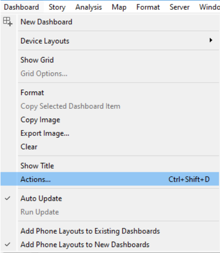
1. The Include All Data and Exclude Outliers buttons pertain to the corresponding parameter, so set up a parameter action via Dashboard > Actions > This sheet > Change Parameter…

2. You’ll need to set up a parameter action for each button you created if you manually created a worksheet for each button (another reason why basic text buttons are ideal only when few options are needed). If you create buttons dynamically via the dimension field, you’ll only need to create one button.
3. Now let’s configure the parameter action:

a. Name: Make sure it’s a name that makes sense, to save time on having to click it open each time to see what it’s doing.
b. Source Sheets: The worksheet with the button
c. Run action on: What do you want the user to do to trigger the action? I want the parameter update to happen when the user clicks on it, which is why I picked Select.
d. Target Parameter: Which parameter is the action going to update?
e. Source Field: Where is Tableau getting the values to update the parameter from? In this case, it’s the ad hoc field we created by typing in the strings that match the values from the original Exclude Outlier Parameter?

4. Create as many parameter actions as you have buttons. The only option that will change is the Source Field, which will be whatever the new ad hoc field is. If you’re creating buttons dynamically, you’ll only have to set up the one parameter action, as the Source Field will be the dimension containing all the values.
5. NOTE: This window is only for setting up the button functionality; we’re building off the calculated fields and parameters created before. Once this parameter action is created, we can remove the corresponding drop-downs from the dashboard, as having both the buttons and drop-downs would be redundant (and confusing).
6. Time to test!

Other Ways to Customize Your Buttons
Now that we know how to make super basic buttons, we can start enhancing them further, such as:
1. Bringing in an image to use as the button’s background (Tableau doesn’t have rounded corners, not yet anyway, so you can bring in a self-made custom button shape via Shape on the Marks Card (Refer to Getting in Shape to learn how to bring in custom images)

2. Coloring the button(s) that the user selected so that they don’t have to remember what they clicked on
3. Dynamically organizing the buttons into rows and columns, depending on how many values are in a dimension
Color in the User-Selected Button
#1: Set Up the Example
1. With Superstore, create a bar chart with SUM(Sales) on Columns, Sub-Category on Rows, and sort by descending.

2. Create a Category parameter:

Note: If you select When workbook opens, you’ll be able to capture the current list of values for the dimension every time you open the workbook, which is useful for not having to manually update it each time yourself.

3. Create a calculated field COLOR: Selected Category to color in the Sub-Category bars differently based on the Category selected:

[Category Parameter] = [Category]
4. Drag COLOR: Selected Category to Color on the Marks Card.
5. The legend with the two output values, True and False, will pop up. Double-click on the legend to change the colors. Your chart should look similar to this now:

6. Time to test!

7. Bring the sheet into a dashboard, and let’s move onto the next part, creating the buttons and coloring them in.
#2: Color in the User-Selected Button
1. Create a new worksheet. Instead of creating one sheet for each Category, this time we’re going to use the actual dimension field itself. Drag Category to Text. You’ll notice that the values are still positioned close together, even when set to Entire View:

2. Drag a second Category to Columns, by pressing CTRL and clicking on Category at the same time. Then hide the headers and field labels for columns:

3. Time to do a little formatting. Center-align the text and turn off the tooltips. Now the different categories are evenly spaced apart:

4. You can add custom background images here for the button shapes, but I’m going to keep it simple and just use one of Tableau’s default shapes. Select Circle on the Marks Card.
5. Time to color in the circles based on what’s selected. We can reuse the same COLOR: Selected Category field as earlier, which is great because we don’t need to set the colors again. Now you should have three buttons, with one of them selected and thus a different color from the rest:

6. Finally, drag this sheet into the dashboard. Make sure to remove all the parameter drop-downs and color legends that auto-populate when you bring the sheets in.
#3: Add the Button’s Selected Color Functionality
1. The dashboard currently looks like this, but nothing happens yet when you click on one of the circular buttons. We need to add in a parameter action, so navigate to Dashboard > Actions > Update Parameter… > This sheet.

2. Configure the parameter action.

Again, the Source Sheet tells Tableau which worksheet to refer to, the Target Parameter is what you want to update, Run action on Select means you want the updating to happen when the user clicks on the worksheet (i.e., the button), and Source Field is what data from the mark specifically that you’re using to update the parameter.
3. Time to test!

Dynamic Number of Rows and Columns
#1: Set Up the Example
1. For variety, let’s make a scatterplot. Place SUM(Sales) on Columns, SUM(Profit) on Rows, and Order ID on Detail.
2. Create the Sub-Category Parameter. As with the Category Parameter, select When workbook opens and Add values from (the Subcategory field) to make it more dynamic.

3. Create a calculated field COLOR: Selected Sub-Category to color in the dots differently based on the subcategory selected in the view.

[Sub-Category Parameter] = [Sub-Category]
4. Drag COLOR: Selected Category to Color on the Marks Card, and set the colors (and change opacity as required). Your chart should look something like this:

Now that we have the basic chart ready, let’s move onto the buttons.
#2: Build Calculated Fields for Dynamic Number of Rows and Columns
1. Duplicate the Category Buttons worksheet, and replace Category with Sub-Category on Label. We are now going to host multiple buttons on the same worksheet, but having all the options in the same row or column would not be an efficient use of space. I’m also using Sub-Category as the example to better demonstrate setting the number of rows and columns, but with 17 sub-categories = 17 buttons, I would advise against making so many buttons and stick with a dropdown instead.
This new sheet is going to be identical to the Category Buttons worksheet, except the Subcategory version. As you can see, a 1 x 17 column of Sub-Category buttons has a lot of negative space, and the buttons themselves are small.

2. We now need to create calculated fields for both the rows and columns.
Columns:

(INDEX() – 1) % 2

Rows:

INT((INDEX() – 1) / 2)


3. Drag the Columns and Rows calculated fields to their respective shelves. Right-click each pill to make them Discrete and hide the headers.
4. You may notice as you’re bringing the Columns and Rows in, the subcategories are out of order. We need to configure the table calculations (they both use the table calculation INDEX()). Right-click on each field and select Edit Table Calculation > Specific Dimensions. This way, we don’t have to rely on the way the view is built as would be the case with the options Table (across) or Table (down).


5. Time to test! You’ll also notice that the buttons are able to maintain their sort order as you select a different subcategory (another reason for why to use Specific Dimensions).

6. Now that you’ve confirmed that it works, you can bring it into the dashboard and add in the Update Sub-Category Parameter action, which I’ll let you figure out yourself 😄

And that’s it for this time! Hope it was helpful :)