


I don’t always talk about my love for UI/UX at the Data School, but it’s something I’ve always been drawn to. What I didn’t expect was how often I’d end up using those same UI/UX principles while doing data analysis.
During my application process, one piece of feedback stuck with me, my dashboard looked good, but it didn’t really tell a story. The data was there, the visuals were there...but the point wasn’t always clear.
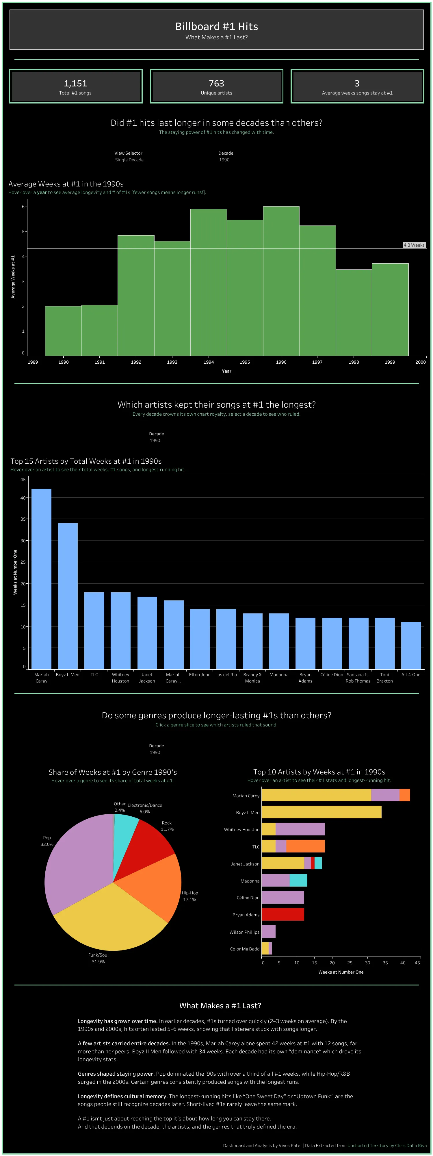
My dataset was about Billboard #1 hits and one simple question:
- What makes a #1 hit last?
Great question. Solid start.
The problem? I didn’t stay focused on answering it.
I explored things like:
- Did #1 hits last longer in certain decades?
- Which artists stayed at #1 the longest?
Interesting questions, but when you step back and look at the dashboard as a whole, it's not obvious how those pieces connected back to what actually makes a #1 hit last. If you were asked that question, the dashboard wouldn't have given you a clean, confident answer.
Thinking About Data Like a Designer
When people hear “analysis,” they usually think charts, numbers, and dashboards. What gets overlooked is how someone experiences those insights.
That’s basically UX.
In UI/UX, everything starts with the user:
- Who’s looking at this?
- What are they trying to figure out?
- What do they need to see first?
I realized those are the exact same questions analysts should be asking before building anything.
Putting It Into Practice
For my final dashboard, I centered everything around one question:
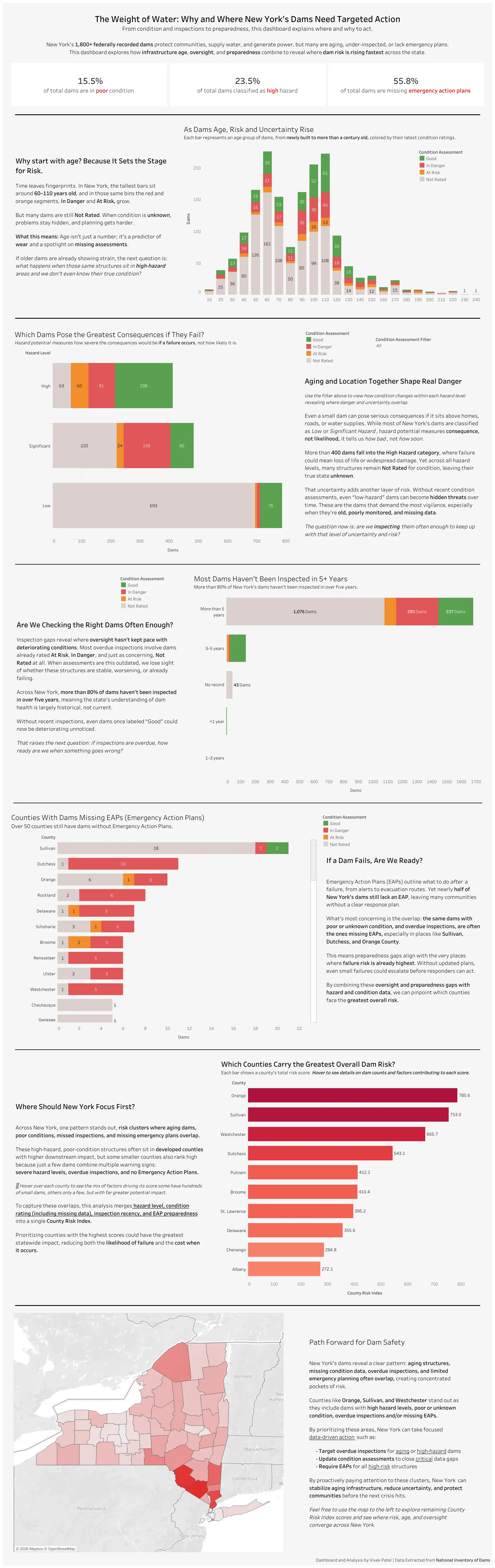
Why and where do New York’s dams need targeted action?
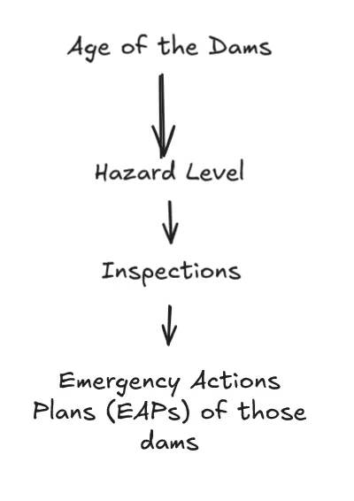
This time, instead of visualizing everything in the dataset, I focused only on what actually helped answer that question. The main factors were:
- Hazard level (what happens if a dam fails)
- Age of the dam
- Inspection history
- Emergency Action Plans (EAPs)
Just like in UX, order mattered. I wanted users to move through the dashboard step by step, starting with risk, then narrowing down to readiness, and finally landing on where the biggest issues were.
Keeping It Simple (and Useful)
Rather than throwing a bunch of charts at the user, I focused on what would be most helpful:
- A small set of high-level KPIs to set the context
- One combined risk score and how it was broken down
- A map to clearly show where risk is concentrated
The goal was that by the end, users wouldn’t have to guess:
- Why these dams matter
- Where attention should be focused
The dashboard should answer those questions for them.
Where UI/UX Meets Analysis
As I keep developing my analytical skills, I’ve been intentionally bringing UI/UX thinking into the process. My goal isn’t just to find insights, it’s to make them easy to understand and easy to act on.
Good analysis, like good design, shouldn’t make people work harder. It should guide them, tell a clear story, and help them walk away knowing exactly what they learned.
Turns out, thinking like a designer made me a better analyst, and good design didn’t just improve my dashboards, it improved my analysis.