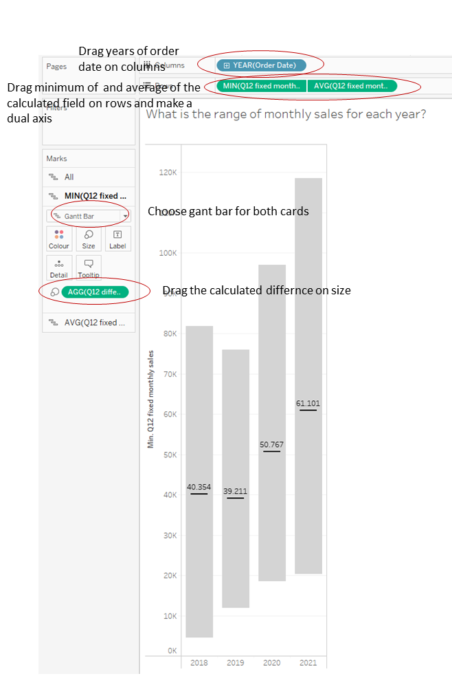
Gant in Gant Chart with min and max monthly sales per year
Imagine you want to show the monthly min and max for each year as a bar, that ranges from that min to the max and a line within that bar, that shows the average for the year.
You can accomplish that with a gant in gant chart (as example I use the superstore dataset).
With a gant chart you can “show distances” by giving the min or max- the upper or lower value and then drag the difference calculation onto the mark pane. The gant chart will then show the difference/distance between the lower and the upper value.
First, you want to have the order date as a dimension on columns, to present all four years.
To get the minimum (maximum would also be possible), we need a fixed lod:
{FIXED DATETRUNC('month',[Order Date]):SUM([Sales])}
because we want to accomplish the sum of sales per month, not per year. We create a calculated field, name it “fixed monthly sales” with this formula and drag it onto the row pane. Here we choose as the measure the minimum ( maximum would be possible as well ).
We drag the same calculated field onto the rows panel, next to the one, which is already there. But this time, we choose average as measure- we need this field for the line, that shows the yearly average.
Convert the two pills to a dual axis and synchronize the axes.
Now we have two single panes in the mark card, one for the minimum per month-pill and one for the average of sales per year-pill. The last thing, we need to do now, is to give the size to the mark card of the minimum per month-pill.
Therefore, we create another calculated field:
MAX([fixed monthly sales])-MIN([fixed monthly sales])
Here we just calculate the difference between the monthly maximum and the monthly minimum sales ( if we would have chosen the maximum as measure on the row pane, we would need to change the calculation to min-max ).
We drag this calculated field on “Size” in the mark card of the pill of the minimum of monthly sales to give the information, from where to where the gant should reach. Last thing we have to do, is to chose the type gant chart for both mark cards and format the chart as wished:

