


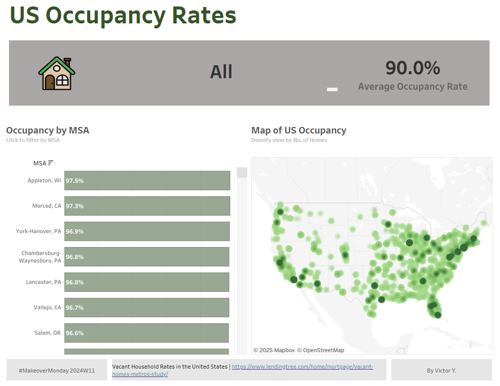
Today (Monday 24th Feb), our cohort participated in the MakeoverMonday challenge. This consists of taking an viz (or dashboard) already out there in the world wide web and redesigning it in an hour. For our task today, we had to remake this viz showcasing the US occupancy rates across MSA's.
The original dashboards can be found here: https://www.lendingtree.com/home/mortgage/vacant-homes-metros-study/
To approach this task, the first step I took was reviewing the dataset that the original dashboard was made from. From here, I could identify what the dataset consisted of - MSA, Metric, Total, Occupied, and Vacant. From here, I could then see what I wanted to use in my dataset. For example, Metric was a duplicate of the MSA's however had the estimate and margin of error for the data fields, and as I knew that I didn't was to use the margin of errors, I filtered out these fields - Similarly, Puerto Rico data was in the dataset however I also filtered these out to only get US data.
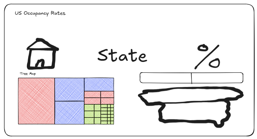
The next step was drawing a plan for how (albeit not my prettiest work). For this I sketched out on excalidraw how I wanted the bases of it to look and what graphs to use.
I then built out the dashboard using Tableau Dashboard. Whilst there were a few variations I made as I built (e.g. changing the tree map to a bar chart), most of this stayed the same as how I planned it.
The published dashboard can be found here:
Thanks for reading! 😄
Victor