


Last Friday, myself and the rest of the Data School’s DS49 cohort undertook a project which revolved around creating an interactive dashboard that fit a clients brief and user needs. The process of creating this dashboard was actually a culmination of several weeks work across different consultants. This was done to emphasis the importance of documentation (as the person who worked on it the previous week was not allowed to give any advice or guidance on what they did, only relying that their documentation and handover was suitable (another shameless plug – Go read my first blog about the importance of documentation).
My Friday task was to create an updated design sketch based on the feedback provided to the previous consultant working on this and then create the dashboard in PowerBI. We received this task at 9am and had to present this back at 1pm (and I wanted some time to have lunch in between😅).
So the first step in this process was to resketch the design based off of the feedback the previous consultant got with their design.
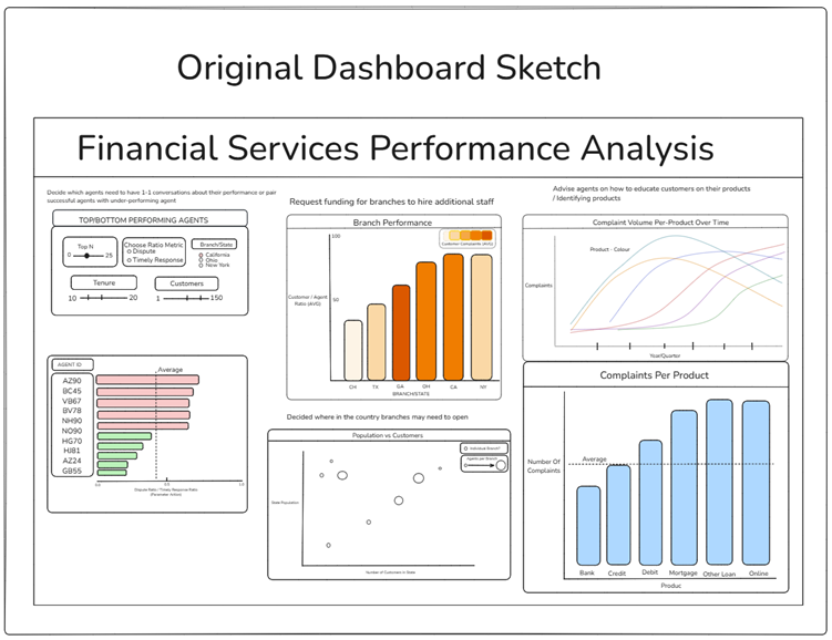
In this case, this design had the following feedback
● Useful to have KPI’s displayed
● Minimize filters in one chart and use charts as filters across dashboard
● Map for the middle charts/density to address user story 2 and 4
Using this format as well as my own interpretations of how the dashboard I came up with the following design for the dashboard as seen below.
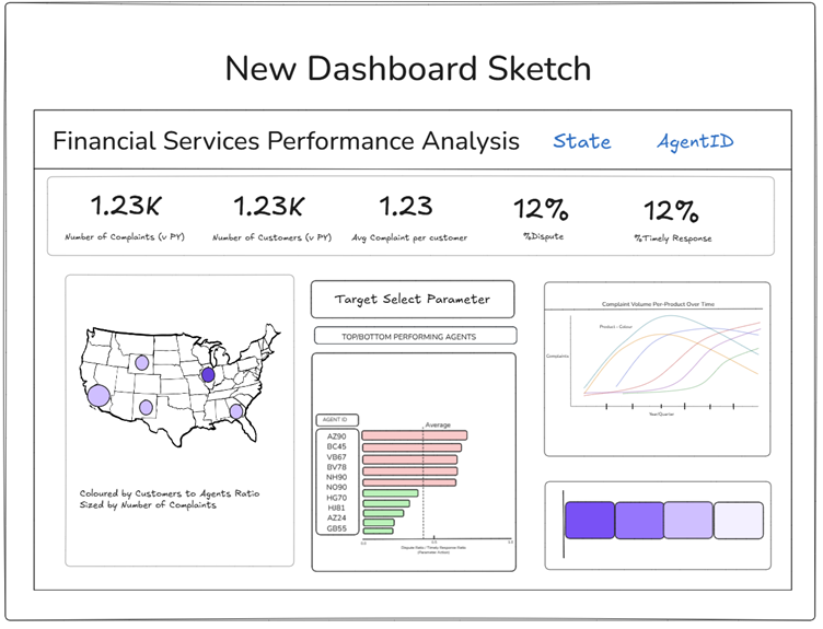
This new design incorporated the feedback provided. I added in a map that looks into User story 2 & 4 as well as being able to act as a filter for the whole dashboard (filtering by state). The top performing agents bar chart too, is also able to be used as a filter, with a dynamic target parameter slider allowing the user to easily identify which agents did not meet the user inputted target (as this was not set). I also added in KPI’s at the top of the dashboard as per the request, identifying 5 key metrics that I believed were of interest to the client based on the data.
Having planned out the new design, building out the dashboard was fairly straight forwards, although time was a big factor in the final dashboard. There were a few interactivity elements that I was also unable to create within this timeframe (e.g. State and Agent ID Filter identifiers), however having this plan when presenting to the client, they had an idea of how this would have turned out.
The created dashboard can be found here:
And that was it.
Thanks for reading! 😊
Victor