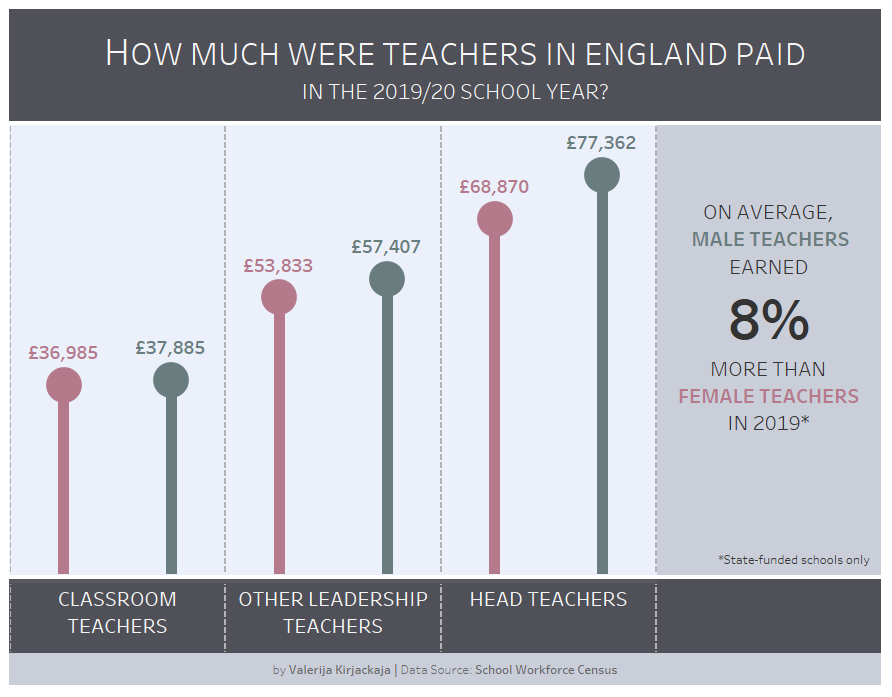
It’s September and schools across the UK have re-opened. This week’s Makeover Monday explores the average pay of teachers in state-funded schools across England.
What works well?
- It’s clear that we are only looking at 2019/20 academic year.
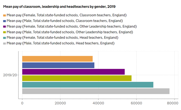
- Bar charts are a good choice to show differences in pay across different categories.
- The legend is very explicit so there cannot be any confusion.
What could be improved?
- There is no need for a different colour for each grade/gender combination.
- Although the legend is explicit, the wording is very repetitive – is there a way to incorporate that information or include category labels within the chart?
- The x-axis gives us a rough indication of where each mean salary sits but perhaps a label next to each bar could be helpful.
What I did
- My initial intention was to compare the average pay across time since the data in the source goes back to 2010, but the source article advised against that as salaries cannot be compared like for like (i.e. each year many older and more experienced teachers who would have likely been on higher salaries retire and are replaced by newly qualified teachers). So, I decided to stick to the 2019/20 data.
- While keeping the same data in the view, I decided to visually emphasise the differences in mean pay between male and female teachers.
- I added a statement about the percent difference between male and female teachers’ salaries to highlight the pay gap.
- I colour-coded the genders and included grade headers to eliminate the need for a legend.