


Today we were tasked with making Glasgow City Council city data more accessible to its residents. The data for this project was obtained from FixMyStreet.
My approach to this project was to make it a "universal design".
A universal design "is an idea that you design for everyone. You don't just design for "normal users". At the same time, you don't just design for users of assertive technology"
Kyle Waterhouse
Accessibility Project Manager, Alteryx
To make my design as inclusive as possible I made the:
- Used simplistic colours
- Make Text Large
- Avoid Overloading the dashboard
- Using descriptions to describe how to interact with the graphs
- Kept a singular a focus on a number of reports
I then went through the general principles from WCAG (Web Content Accessibility Guidelines)
https://www.w3.org/TR/WCAG21/
Perceivable
I used the DataTable extension to summarise what is being visualised in the bar chart
Navigable
I designed the layout of my dashboard to be simplistic and follow Tableau (left to right, top to bottom order), using the tab button on a keyboard
Adaptable
I used a table to summerise the bar chart and add labels to the end of the bar chart, to allow the user to interpret the same information in different ways
Distinguishable
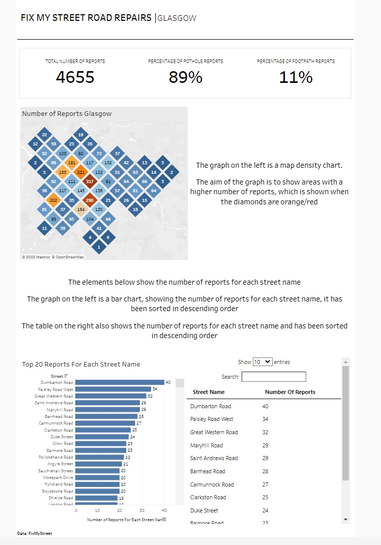
Hex map I used two distinct colours to clearly show when the number of reports is greater in certain areas
Things to work on
- Stating the purpose of the dashboard more clearly for those who are not familiar with the topic
- Navigation
Unfortunately, the order of navigating didn’t work in my dashboard. I would have to look into the XML and edit the id to allow navigation without a keyboard in the order I'd like the user to follow