


The Prompt: Google keyword trends for the phrase "Scary Dreams" over time from 2009-present. https://data.world/makeovermonday/2023w40
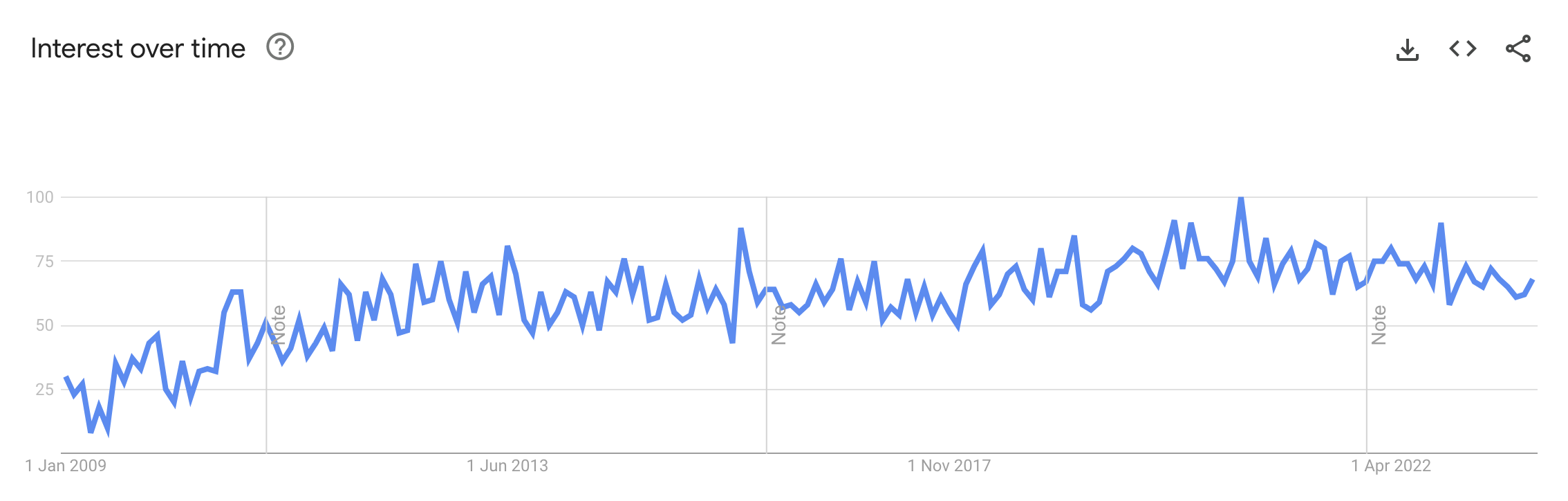
My Thought Process/Plan of Action: The first thing that I noticed about this dataset was that it was extremely simple. As you can see in the image below, it quite literally only consisted of the Google search popularity over time for one phrase. While I was thankful that there wasn't much to do in terms of orientation/understanding the dataset, the simplicity of this dataset brought a challenge of its own: what can I do with this?
Let's see: I have 2 total variables: search popularity and time. I briefly entertained the idea of bringing in external data; for example, I considered bringing in historical full moon data to see if moon phases and scary dreams had any sort of correlation. However, given the 1 hour time limit that we were allotted, I decided that this was out of my scope.
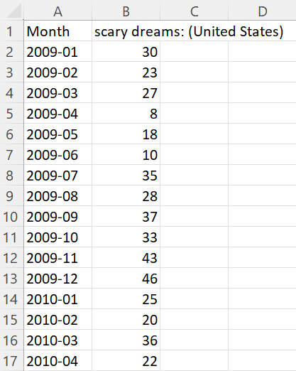
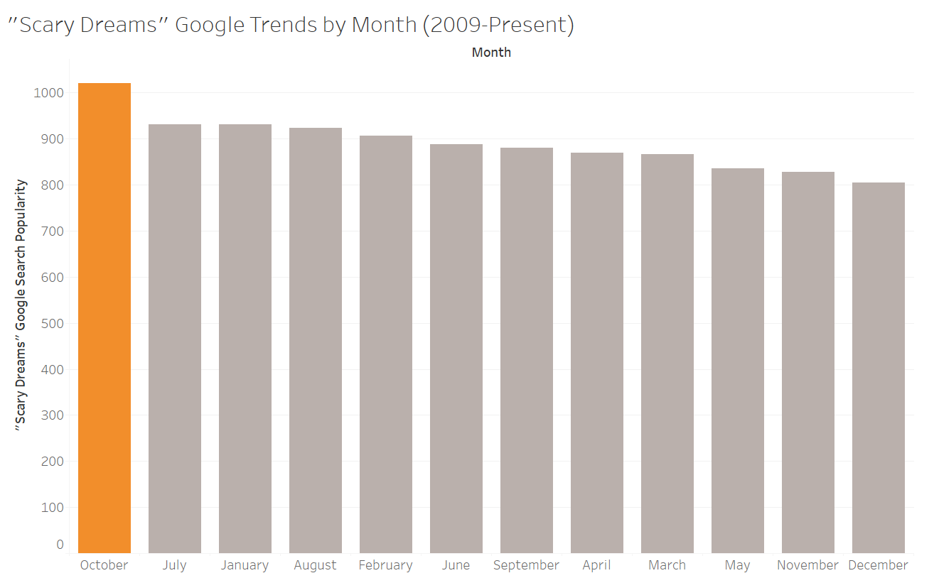
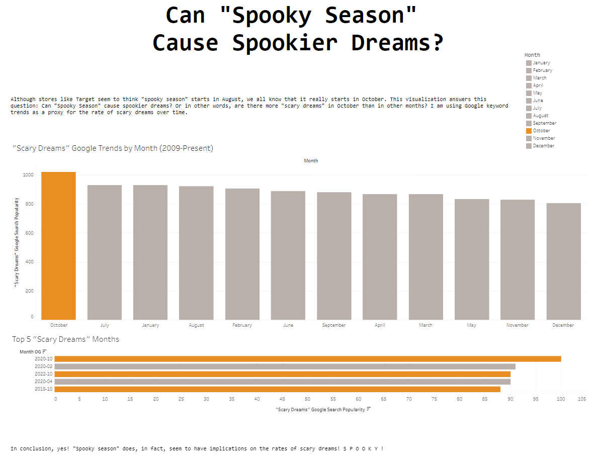
Since we received our data in a monthly format, I decided to split the data by month to see what trends I could identify. I was specifically hoping to see colder, winter months to have the highest search popularity, but I noticed something even better. The month with the highest search popularity for "scary dreams" was OCTOBER, aka the "spookiest" month (Thanks Halloween). This was where my plan and "story" came into focus. I colored October in orange (obviously) and made everything else grey to really emphasize my main insight.
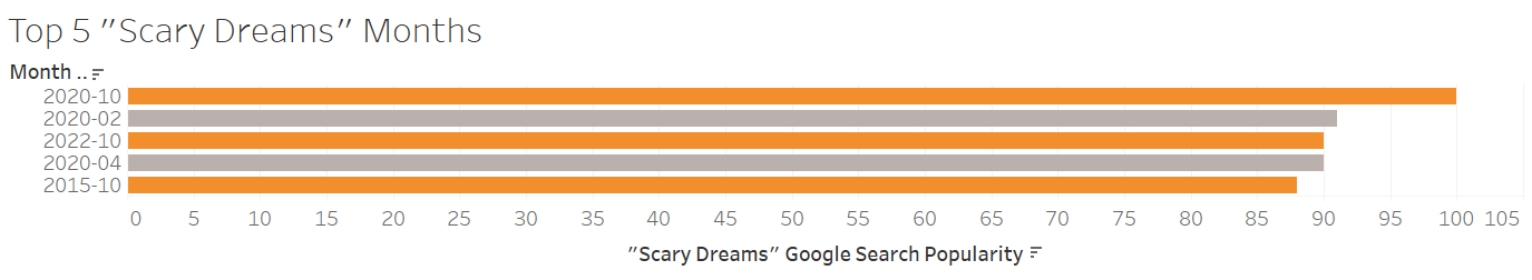
Additionally, since there were clear peaks and dips throughout the data, I wanted to take a deeper dive into the individual months to see if I could further drive my point home. To do this, I used a filter to only display only the top 5 individual months (ex. October 2020 rather than October in general) in terms of search popularity. I was pleased to see that 3 out of these top 5 individual months were Octobers (Oct 2020, Oct 2022, Oct 2015). The other 2 months were Feb 2020 and April 2020 (COVID implications ?). I used the same color system here to maintain consistency and again, to emphasize my main insight.
By this point, I was reaching crunch time. I believe I only had about 15 minutes to assemble my final dashboard so there was a choice that I had to make: design or analysis? For me, the choice was very easy: analysis. Everyone loves a pretty visual, but if it doesn't tell you anything insightful... it's not very useful. I gathered both of my aforementioned charts, added a fun title, and added a brief introduction/conclusion. Voila! My first Makeover Monday dashboard was complete.
My Dashboard: https://public.tableau.com/app/profile/tyler.ha7603/viz/ScaryDreamsMakeoverMonday/Dashboard1
The Feedback I Received: "Good simple dashboard, really like the font, suits the idea. Not sure I liked the top bar chart in amount order instead of normal, think having it in date order is more effective. Think the bottom chart is a little cramped and could do with some more space; I'd also think about trimming your legend to "October" & "Not October". Good work."
What I Did Well: I think I did a good job of keeping scope in mind on this project. I was cautioned by previous DSNY cohort members to not bite off more than I could chew, so I made sure that I didn't. I'm glad that I kept it nice and simple. I think the actual content/analysis was very clear and easy to understand.
What I Would Do Differently: Unsurprisingly, most of the feedback that I received was about dashboard design/formatting. With more time, I definitely would have made the dashboard prettier (font consistency, spacing/padding, adding pictures, etc). I also would have fleshed out my introduction/conclusion more since they were very basic. Additionally, if I had more time, I would have liked to play around with the data more to see if I could find any deeper, less obvious insights.
In Conclusion: This was a fun challenge! Up to this point, I hadn't really worked with Tableau under any type of major time constraint, so it was a great learning experience. I already feel much more prepared for next week's Makeover Monday, and I'm looking forward to it. For anybody out there who is looking to practice flexing their Tableau muscles, I would highly recommend taking part in these challenges.