


Power BI is a powerful tool for data visualisation and business intelligence. However, despite it's initial intuitiveness and ease-of-use, it's up to you to make your reports insightful, engaging, and actionable. This means going beyond click-and-dragging chart types and simple filtering.
Two of your best allies in Power BI to up your storytelling game are Conditional Formatting and Basic DAX (Data Analysis Expressions).
In this blog post, we'll explore how to transform static tables and visuals into dynamic, insightful charts that can actually guide your user to the answers they need most.
We'll start with the fundamentals of conditional formatting, then introduce the power of DAX to take your formatting rules in Power BI to the next level.
What is Conditional Formatting?
conditional formatting is all about applying visual changes to your data based on specific conditions that you set. Think of it as a spotlight that illuminates the most important parts of your report, helping your audience quickly grasp key insights without poring over every single number.
Instead of a dull table of numbers, conditional formatting allows you to:
- Highlight outliers: Easily spot unusually high or low values.
- Identify trends: Visually represent whether performance is improving or declining.
- Emphasise thresholds: Flag values that meet or exceed a specific target.
Power BI offers several types of conditional formatting, which you can apply to various visual elements:
- Background color: Change the cell background based on value.
- Font color: Change the text color based on value.
- Data bars: Add a mini-bar chart inside cells, showing magnitude.
- Icon sets: Display icons (e.g., arrows, traffic lights) based on value or rules.
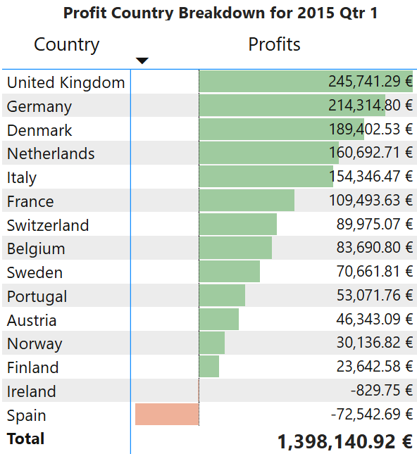
Here's an example of how conditional formatting can make a table instantly more readable:
Applying Conditional Formatting: A Quick How-To
Let's walk through the example above: conditionally formatting profit values in a table.
- Select Your Visual: Choose the table or matrix visual you want to format.
- Access Formatting Pane: In the Visualisations pane, click on the "Format your visual" (paintbrush) icon.
- Find Conditional Formatting: Expand the "Cell elements" section, then click on the "series" dropdown to choose the specific column you want to format (e.g., "Profits"). You'll see "Conditional formatting" (the fx button) with options like "Background color," "Font color," "Data bars," etc.
- Set Your Rules:
- Background Color (or Font Color): Turn the option "On."
- Format Style: You can choose between "Color gradient" (gradient based on min/max), "Rules" (specific colors for value ranges), or "Field value" (using a DAX measure, which we'll cover next).
- Apply to: Usually "Values only" for a table cell.
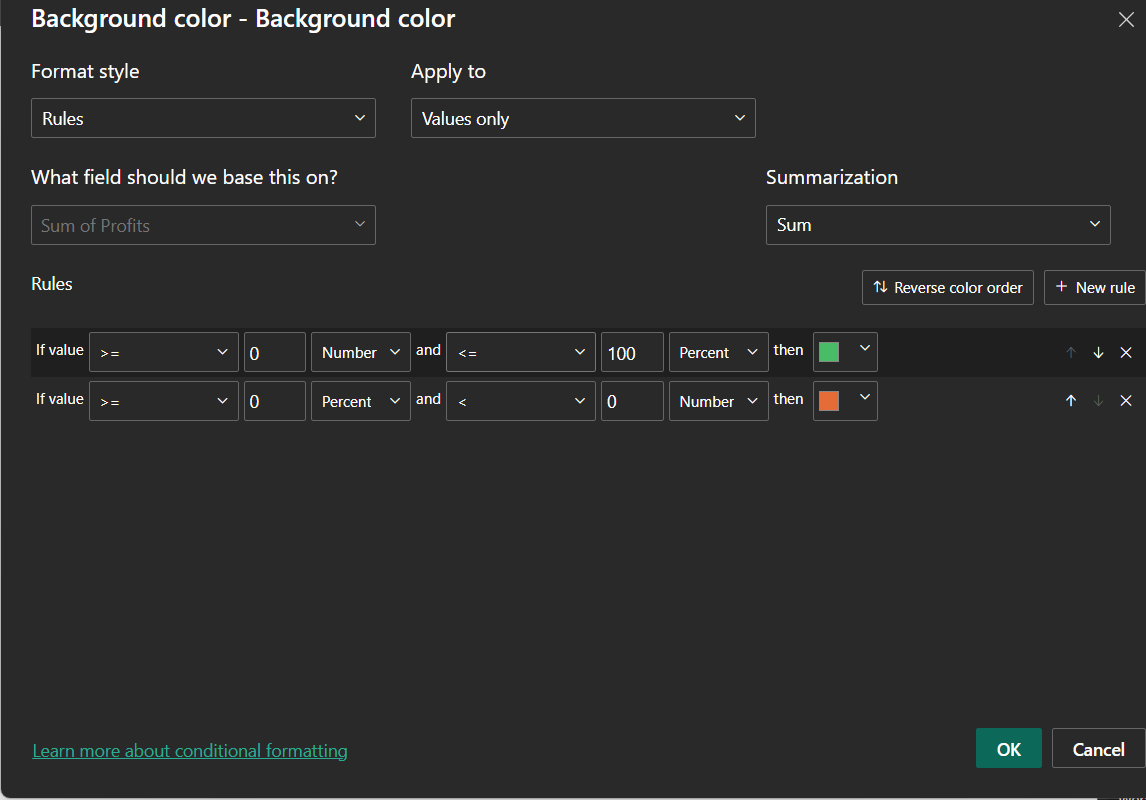
- Set up your conditions: For "Rules," you'd specify conditions like "If value is greater than or equal to 0 AND less than 1,000,000, color green."
Here’s what the conditional formatting dialog box looks like for setting rules:
Introduction to DAX: Your Data's Language
While Power BI's built-in conditional formatting options are robust, sometimes you need more sophisticated, dynamic rules. This is where DAX (Data Analysis Expressions) comes into play. DAX is the formula language of Power BI (and Excel Power Pivot and SQL Server Analysis Services). If you've ever used Excel formulas, you'll find DAX somewhat familiar, but it's significantly more powerful, and designed for tabular data models.
Why is DAX important for Conditional Formatting?
Basic conditional formatting uses static thresholds or simple ranges. But what if you want to highlight sales figures that are above the average sales for that month? Or compare a region's performance against a dynamic target that changes annually? This is where DAX is useful. By writing DAX measures, you can create these dynamic conditions and then link your conditional formatting to them.
Basic DAX Concepts for Formatting:
- Measures: These are calculations performed on the fly, typically aggregates like SUM, AVERAGE, COUNT, or more complex calculations. They don't store values in your model; they calculate them when needed. Measures are crucial for dynamic conditional formatting.
- Calculated Columns: These are new columns added to your table whose values are computed row by row based on a DAX formula. While useful for certain scenarios, measures are generally preferred for conditional formatting because they are more flexible and perform better for aggregations.
Using DAX for Advanced Conditional Formatting: A Dynamic Comparison Example
The built-in rules for conditional formatting are great, but the real power comes when you tie your formatting to a dynamic business calculation. A very common request is to visually compare performance against a prior period.
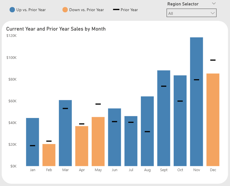
Let's say we have a bar chart showing "Current Year and Prior Year Sales by Month". We want to instantly show our audience which months performed better than the prior year and which performed worse.
We will color the bars:
- Blue if Current Year (CY) sales were greater than Prior Year (PY) sales.
- Orange if CY sales were less than PY sales.
We can't do this with a simple static rule, because the "Prior Year Sales" value is different for every single month. We need DAX.
Step 1: Create the DAX Measure for the Colour
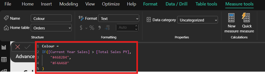
First, we need to create a new measure. This measure won't output a number; it will output the text of a color hex code based on our logic.
In the "Modeling" tab, click "New measure" and enter this DAX formula:
Colour =
IF (
[Current Year Sales] > [Prior Year Sales],
"#4682B4", // This is the hex code for a shade of blue
"#F4A460" // This is the hex code for a shade of orange
)
This formula checks, for the context of each month, if the [Current Year Sales] measure is greater than the [Total Sales PY] measure. If true, it returns the blue hex code; otherwise, it returns the orange one.
Step 2: Apply the Measure to the Visual
Now, we just need to tell our bar chart to use this measure for its color.
- Select your bar chart visual.
- Go to the "Format your visual" (paintbrush) pane.
- Expand the "Columns" (or "Bars") section.
- Find the "Color" option. You will see the default color. Click the small fx (conditional formatting) button next to it.
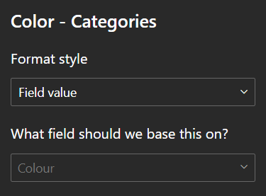
- This opens the conditional formatting dialog. In the "Format style" dropdown, select "Field value".
- In the "What field should we base this on?" box, select the
Colourmeasure you just created. - Click "OK."
Step 3: See the Dynamic Result!
Instantly, your chart will update. The bars for the months where you beat the prior year will be blue, and the others will be orange. You've now created a powerful, dynamic, and easy-to-understand visual with just one simple DAX measure.

This technique is incredibly flexible. You could use the same logic to color cells in a table, change font colors, or even show different icons based on your DAX measures.
Tips and Best Practices for Visualising Success
- Don't Overdo It: While powerful, too much conditional formatting can make a report cluttered and hard to read. Use it strategically to highlight only the most crucial information.
- Consistent Colour Palettes: Stick to a consistent colour scheme across your reports. Blue for good, red for bad, amber for caution is a common and easily understood convention.
- Consider Accessibility: Ensure your chosen colors have sufficient contrast for users with visual impairments. Power BI's accessibility options can help here.
- Document Complex DAX: If you create intricate DAX measures for your conditional formatting, add comments to your DAX code to explain its logic. Your future self (and colleagues) will thank you!
- Test and Refine: Always test your conditional formatting with different data scenarios to ensure it behaves as expected and truly enhances your report.
Conclusion: Empower Your Power BI Storytelling
Conditional formatting and basic DAX are not just aesthetic enhancements; they are fundamental tools for effective data storytelling in Power BI. By learning to combine these features, you move beyond simply displaying numbers to actively guiding your audience's attention, revealing hidden insights, and driving better decision-making.