After a challenging week of Alteryx exams, at The Data School we have 'pivoted' back to Tableau Desktop and have begun to explore more advanced tools within the program. One of my personal favorites so far has been parameters because it has allowed me to do many things I wanted to do in my application but had no idea how to. Parameters are defined as external dynamic variables that allow for input. Parameters allow us to switch out or modify variables being used within a visualization. This could be measures or dimensions (switching between sales and profits), highlighting (picking a state and it becomes a different color), dynamic date ranges, and even switching between two sheets. There are a lot of resources out there for parameters so we won't spend the time covering it all, but let's take a look at how to switch between two entirely different sheets, arguably one of the cooler abilities of parameters within Tableau (based on what I know so far). Remember to zoom into the webpage if you are having trouble seeing the gifs!

Why would we want to switch charts?
There are a handful of reasons why you may want to switch between charts on a dashboard (apart from it looking super cool and dynamic). For one, the insights from the charts may be valuable for the stakeholder, but showing them together could be misleading or confusing. Spacing may be limited on the dashboard but the stakeholders want a mountain of visuals. In this case, the option to switch between visuals could result in less space being used while keeping the overall interface cleaner for viewers. Finally, you may want to explore one variable, such as a state or country, but in a variety of different ways and visual forms. Chart switching is a great option for this use case, as you can thoroughly explore a variable without taking up a lot of space. Let's see how to make the dynamic dashboard above in Tableau Desktop.
- Create your charts
We will create two charts for the dashboard using Tableau's Super Store data set: A bar and a line chart. The superstore dataset can be found on Tableau and within Tableau Public if you are looking to follow along. The bar chart looks at the sum of sales by sub-category. The line chart is looking at the sum of sales by year.
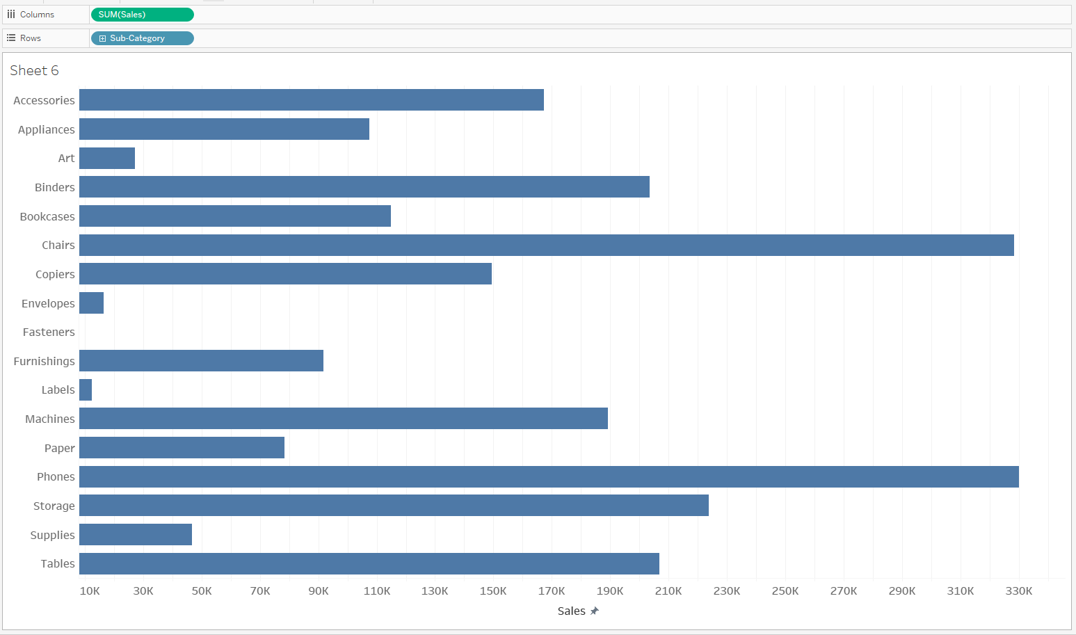
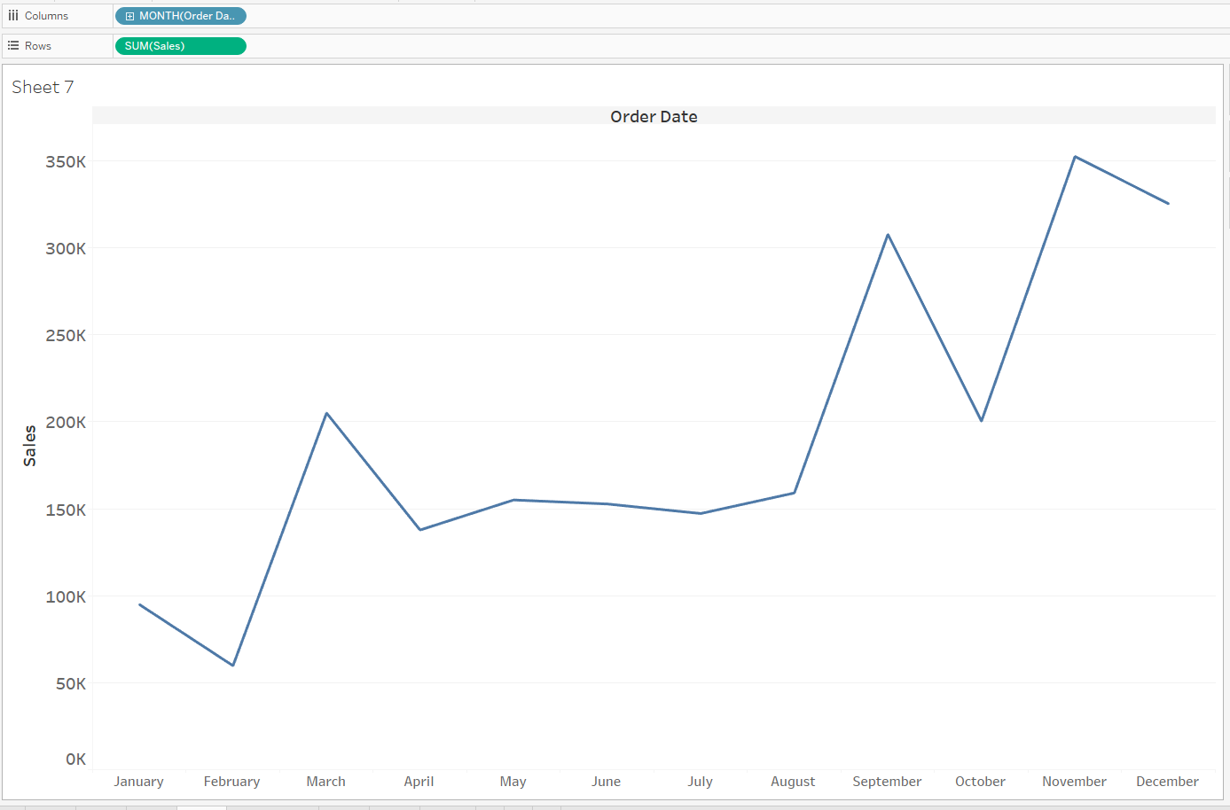
2. Create the parameter for your charts
Click the down arrow under the data pane and click create parameter.
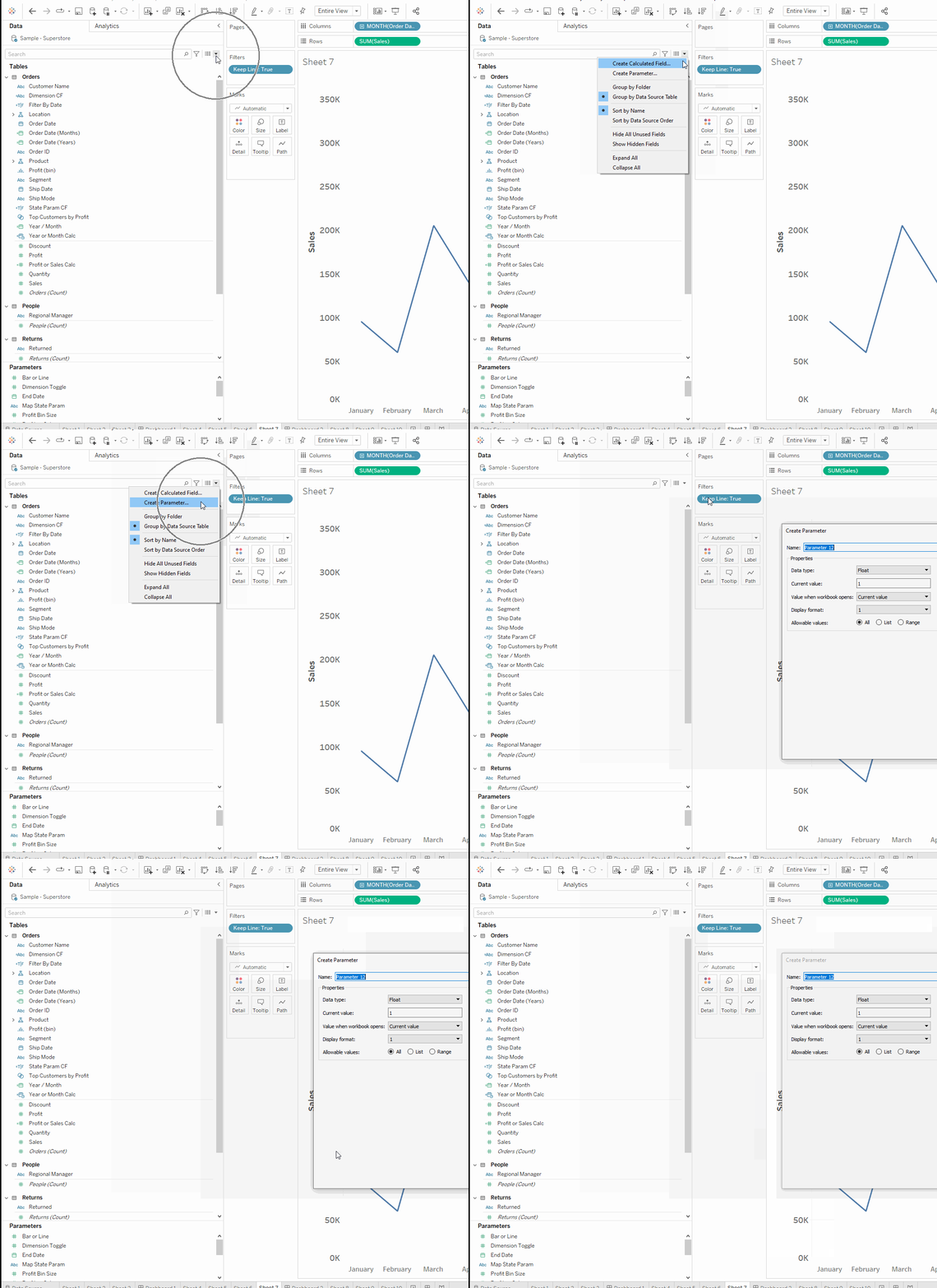
The parameter will allow us to choose which chart we will want to see, so we will be establishing our 'options' here. Give the parameter a good name such as 'Bar or Line'. Change the data type to integer and change the allowable values to list.
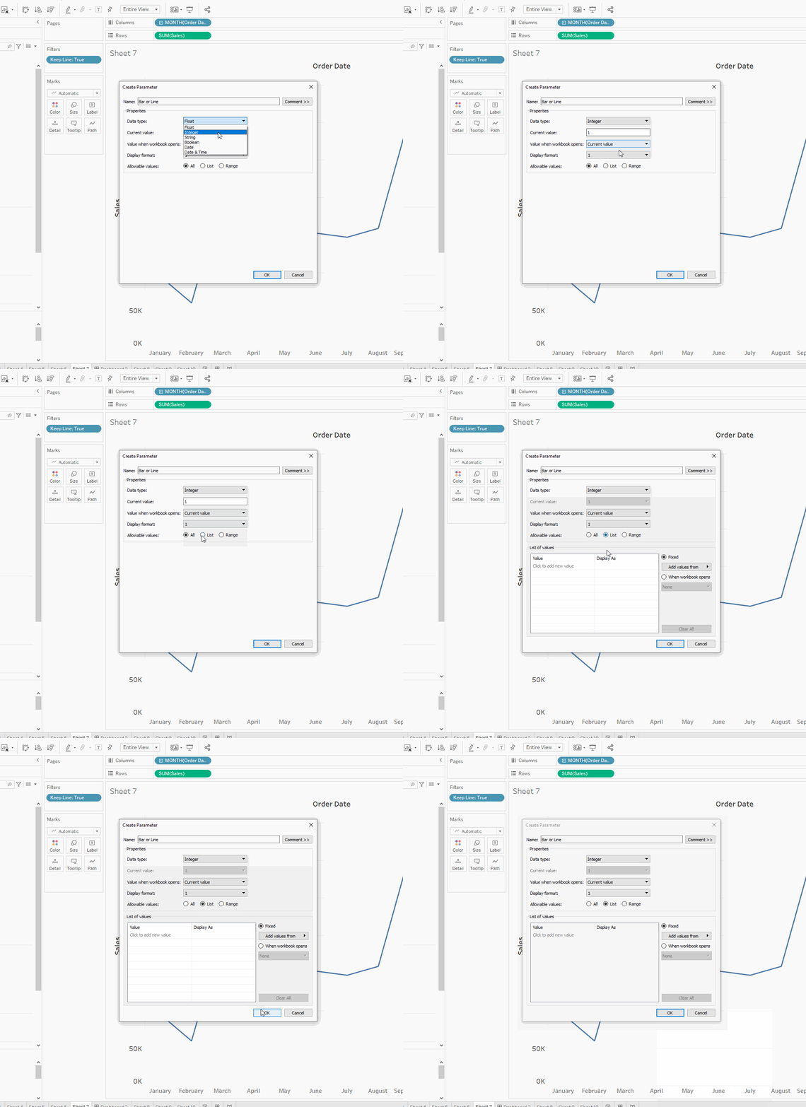
We will now be creating our list of values (or options) for the parameter. Under 'Value' make one row 1 and the next row 2. Under 'Display As' we will be writing the values we will actually be choosing from, so write Bar next to number one and Line next to number two.
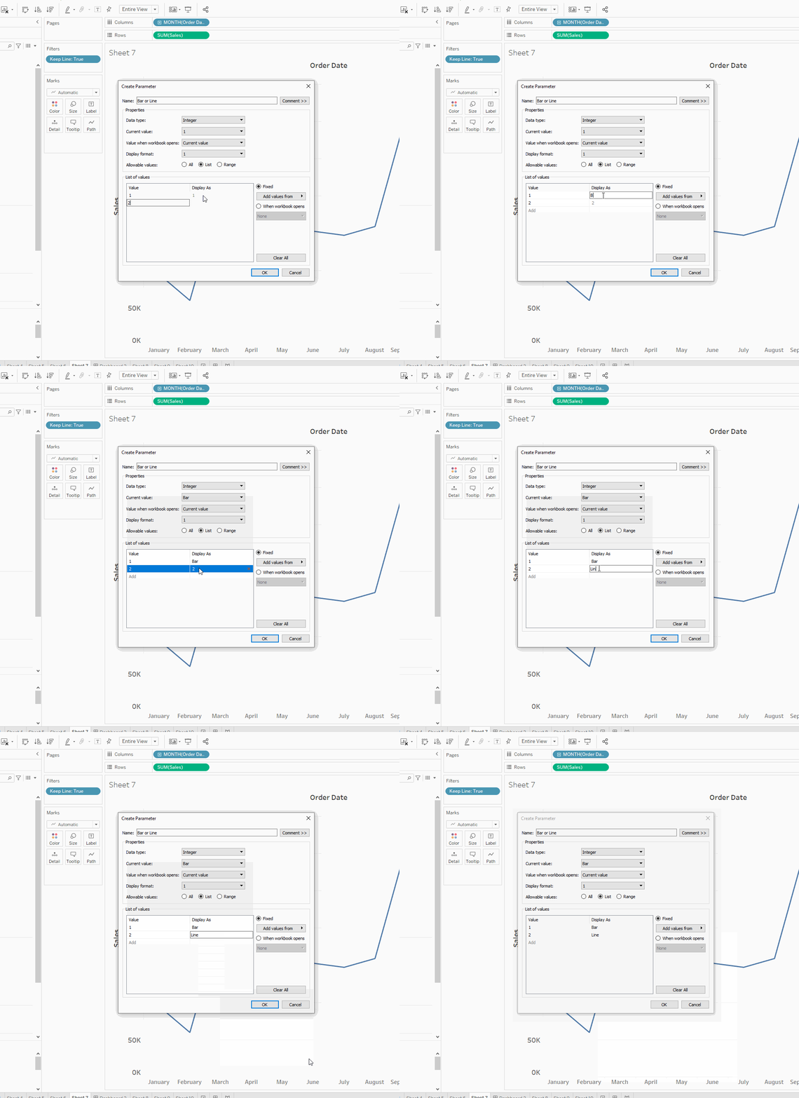
Your newly created parameter should now be on the left side under the data pane. Right click on your parameter and choose 'Show Parameter'. This will pop it out next to your chart, but if you press bar or line you can see nothing is happening. This is because we need to create a calculated field to connect our newly created parameter to the charts.

3. Create your calculated field
We will be creating two calculated fields to connect the parameter to our sheets. One will be called 'Keep Bar' and one will be called 'Keep Line'. These calculated fields will be put onto the filter pane of each one of our sheets and will be written as such:
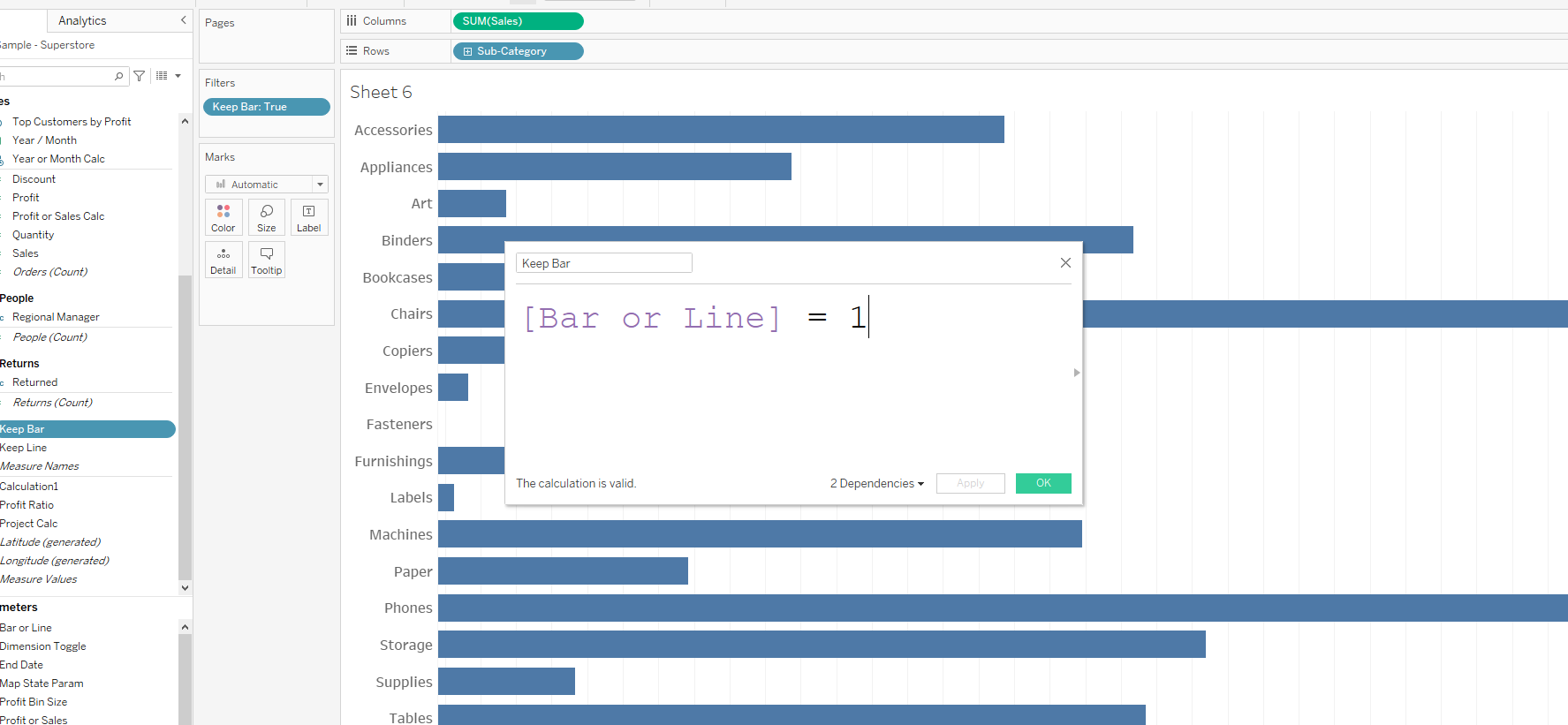
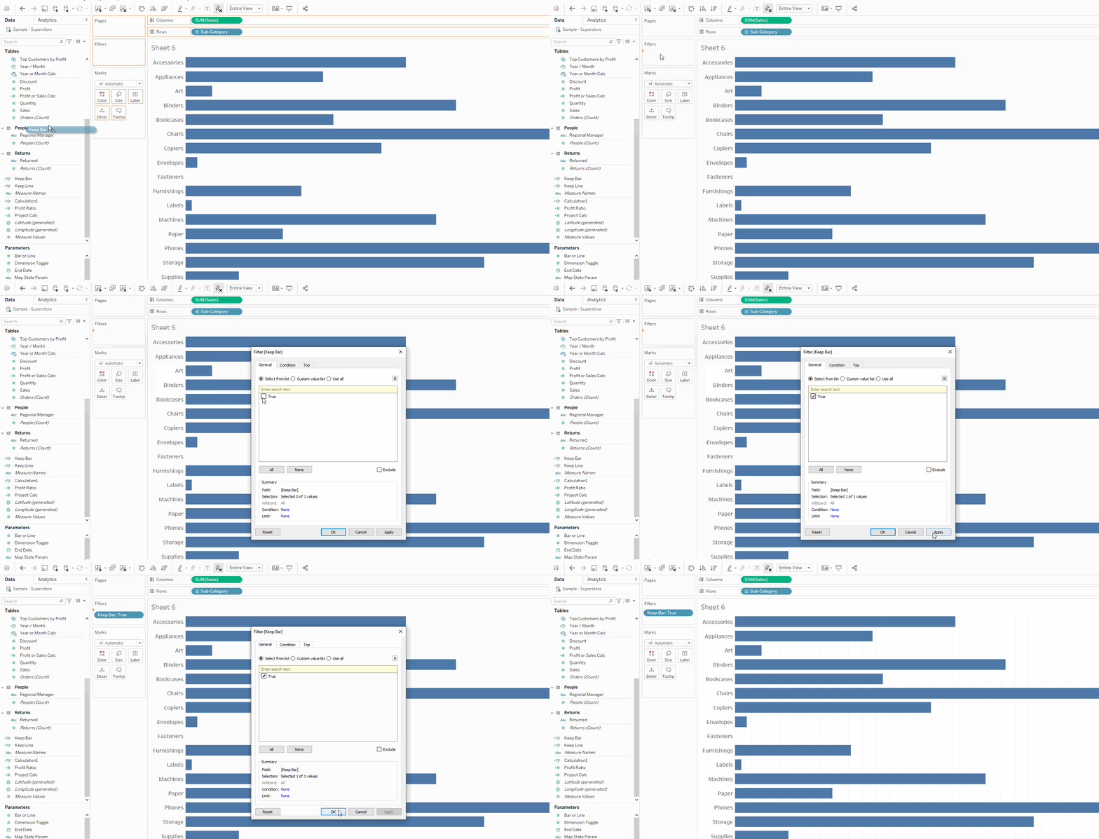
Add the newly created calculated field onto the filter pane and select 'True'. Do the same for both charts!
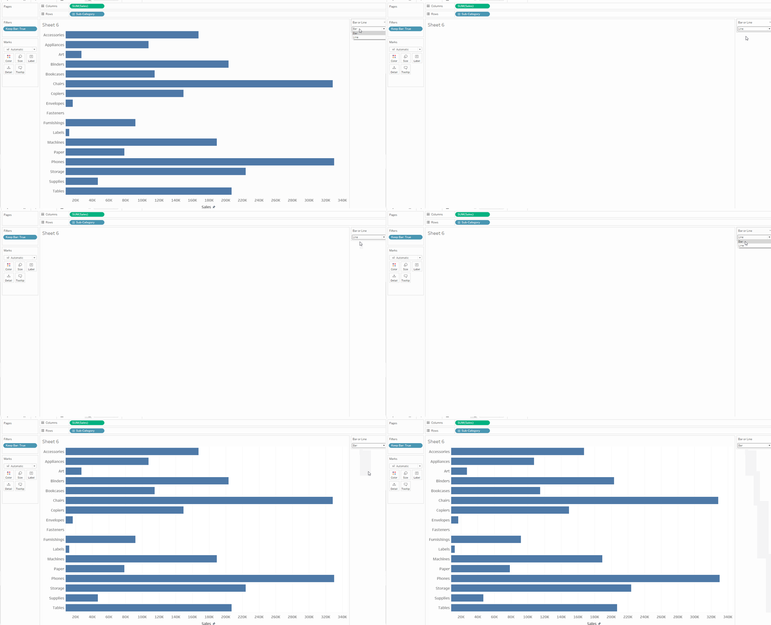
Make sure you have your parameter popped out and test out the filter. If everything is set up correctly, the sheet should disappear when you have the opposite chart selected.
4. Place Charts on The Dashboard
There are a few things you have to do to make sure the sheet swap works on the dashboard.
- Make sure the titles have been hidden. (If you still want to show the title I suggest using a dynamic textbox that can change the title name based on the sheet being shown.
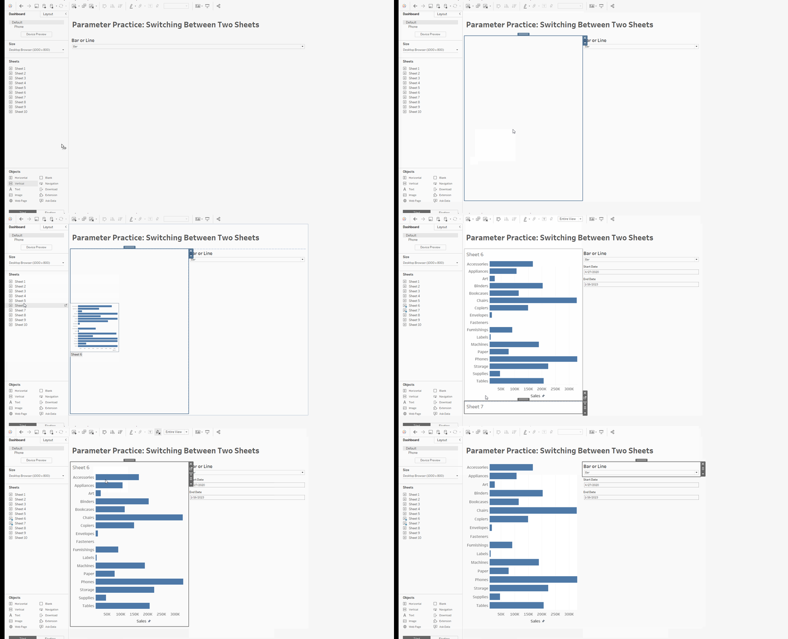
- Place the charts within a container. This can be vertical or horizontal, they just need to be in one container by themselves.
- Make sure the height/width of the sheets are NOT fixed and the container is NOT set to 'Distribute Contents Evenly'. This gives the container the flexibility to hide and show the sheets based on the parameter.
Simply put, we are going to place our container. Place both of the sheets inside of the container without titles, and then place the parameter button on the dashboard so you can switch between the two.
You now know how to do a sheet swap! If you run into problems feel free to reach out on my LinkedIn and ask for help.
