Happy Tuesday and welcome to day 2 of dashboard week! DSNY's rapid sprint through our final few days of training continues with the focus today being on Power BI. For most of us this is our first day using Power BI after months of Tableau and Alteryx, but you never know what visualization tools your company may use so there is value in having the ability to use a wide range of tools.
The goal today was to create a fake dataset using mockaroo.com for a chosen industry and make a dashboard in Power BI. This was a relatively easy task but with such limited time using a new product, it proved to be a decent challenge. This blog will briefly touch on some of the differences I noted between Tableau and Power BI but before I get into that let's take a look at the fake data I made and my final product:
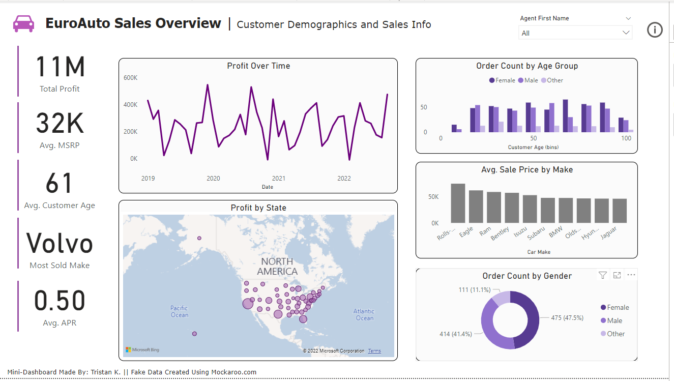
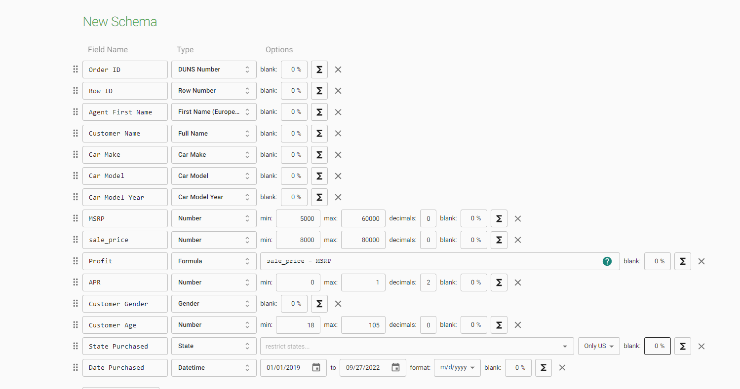
As I noted earlier this was my first Power BI dashboard and it had to be done in a couple of hours so cut me some slack but overall I was content with the final product. Compared to Tableau, the user interface is pretty intuitive for first-time users and mimics the interfaces of other common Microsoft tools such as Powerpoint or Word. For example, I (and likely yourself) am very familiar with the ribbon pane that exists at the top of all Microsoft apps.

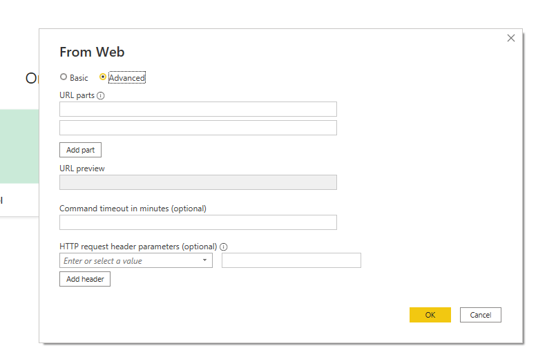
In both Tableau and Power BI, you are able to look at your data in a table and prepare it before visualization. This includes creating new columns for row-level calculations but also creating new fields that aggregate the data. A cool thing about preparing data in Power BI is that you can easily pull data from websites using web scraping or APIs. For example, by putting in the IMDB website Power BI was able to automatically pull any tables from the given link.
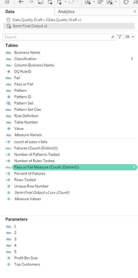
That said, my initial inclination is that the data source view and the data pane in Tableau are a lot easier to use when preparing the data versus Power BI. Part of this is because you can easily set the data type without having to click through a range of options, but also having the columns divided into a measures section and a dimensions section in Tableau (plus the use of the colors showing continuous or discrete) makes it a lot easier to discern how the column should be used when you start visualizing.
When it comes to actually making visuals it is a lot easier to get started with Power BI. When you click on a dimension or measure a chart will automatically get made (similar to Tableau) but the best way to start is to choose an actual chart type. This will put the chart on the dashboard and open a visualization pane with a bunch of slots for the axes, legends and more. From there you are simply dragging your dimensions or measures onto the pane. An interesting thing to note is that instead of building sheets that you would later insert into a dashboard like Tableau in Power BI you are just building the sheet right on the dashboard, which is convenient. I also want to note that there are a lot more visualization types to choose from in Power BI, such as a very neat KPI visualization that displays the value of your KPI and a trend chart behind it. You could make these in Tableau but they wouldn't exist as default options.
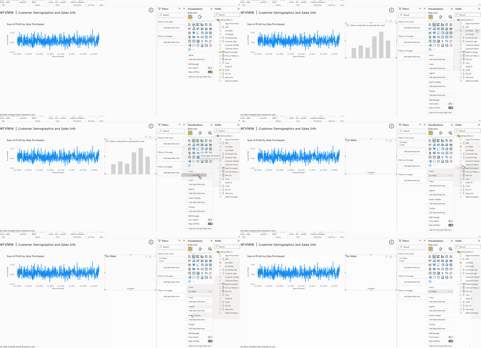
When it comes to designing the dashboard, there are two major advantages that Power BI has over Tableau. The first is the fact that dashboards will dynamically resize themselves based on the screen size. This function exists within Tableau but does not really work well. The second is that there are no containers in Power BI, but rather everything is floated onto the dashboard. It is a lot more intuitive when it comes to aligning the different sheets and there is a simplicity when it comes to quickly making a dashboard that Tableau is unable to match.

For this and the other reasons I have listed I believe that there is a much smaller learning curve when it comes to Power BI. This is a great tool for people who are starting to learn about data analytics and quickly want to create their first dashboard. That said, although it may be difficult to get accustomed to it I still prefer the user interface of Tableau. The formatting options take a little time to get used to but the actual creation of the visuals using the mark card is definitely preferred. Also for me, and I am definitely biased, the user interface for Power BI is a little heavy and overwhelming. I found myself clicking through so many different panes to find certain formatting options and it became quite burdensome as I moved through my visuals. A good example of this is that for the charts that had gender on the legend I had to set the colors twice. Power BI was unable to recognize that I had already set legend colors for gender on one of the charts and it kept resetting the legends back to standard colors.
At the end of the day, major companies throughout the world use both Tableau and Power BI, so it doesn't hurt to accustom yourself to both of them. Hope you learned a few things, and I will see you for day three of dashboard week.

