


Today was the first day of dashboard week and our final week in training at the Data School New York. What better way to end weeks of intensive training and client projects with one more week of intensive training and dashboarding?
We spent the morning learning about three types of design: Inclusive, universal, and accessible. The critical thing to note is that these design types focus on creating dashboards (or products in general) that can serve a wide range of people or users. With that in mind, today we were tasked with creating an accessible dashboard using "Fix My Street" data. This dataset was made up of people reporting potholes or other issues in Glasgow and included location data, the type or report, the address, and more. Take a look at my final product below:
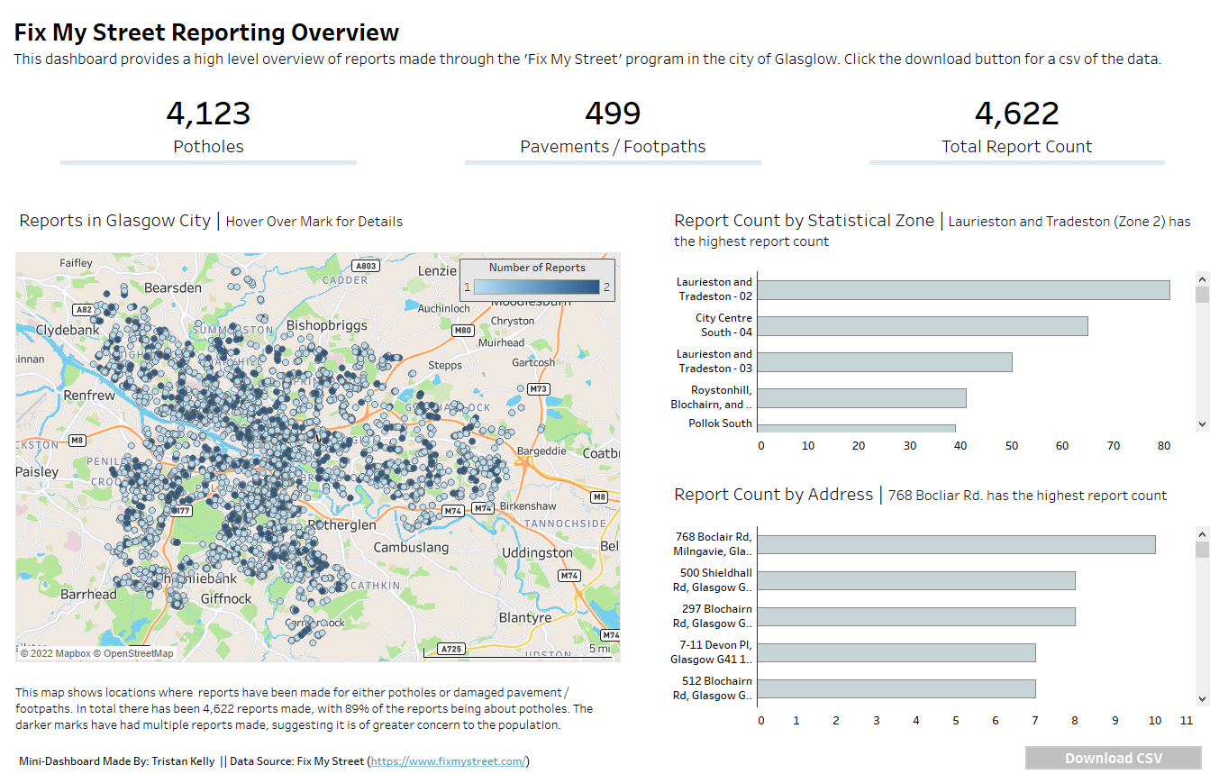
The dashboard is made up of a handful of KPIs as well as three charts. The map on the left shows points where reports were made with the color indicating the number of reports made. The two bar charts on the right show report counts by statistical zone (a higher level division of Glasgow) and the actual address. But of course the focus when creating the dashboard was accesibility, so I am going to briefly break down some of the decisions I made to improve the accessibility of the dashboard. Later, I will touch on improvements I should make based on recommendations from the team to improve overall accessibility.
Let's start with some neat, high-level options I made during the creation of the dashboard. The title, footer and all the KPIs were created within title boxes of blank sheets. Sounds like a weird move, but for people who use screen readers it can be super helpful. In Tableau, screen readers cannot read anything that is within a sheet, but they can read swhat's in the title! So when we put all of this high-level information in a title we are making it much easier for screen readers to immediately understand what is happening within the dashboard. For screen readers who can't see the visuals a download button has been added so that they can immediately export the raw data to Excel where it will be more digestible. All of the text has been made darker, bolder and bigger for the audience and I stuck with the Tableau fonts to keep things easy to read and differentiate. Items within the hierarchy were named so that if desired, I could go into the XML behind the dashboard and easily define where a screen reader should go as it moves through the visuals. Finally, hidden within each title is information about the visual and how to view the full data behind the visual (fun fact its CTRL+SHIFT+ENTER). Let's now break down some of the options I made within the charts to advance accessibility.
The Map
- I changed the map to street view so an unfamiliar audience could familiarize themselves with the area. Part of this process was removing a lot of the unnecessary background layers such as terrain or landmarks while keeping layers that would enhance understanding (streets and neighborhoods).
- Map scale was added for context.
- A caption was added to the bottom of the map. By adding the caption screen readers can read about the visual and have a better understanding of its intention.
- The opacity on the marks was increased and a border was added on the marks so they could be easier to see.
- The color blind pallette was used for the colors.
The Bar Charts
- Apart from changing the fonts and colors of the titles the axes were also bolded and made darker to make them easier to read.
- The bars were spread out more and a smaller number of bars were shown on the view as to not overwhelm the viewer.
- A border was added to the bar charts to enhance visibility.
What Could I Have Changed?
After presenting to the team I received a handful of valuable recommendations for improving the accessibility of the dashboard which I will list below.
- Add a search bar for the highlight action. A search bar for a filter action is also a good idea because people can easily type in what they are looking for and whittle down the data before attempting to view it.
- Although the colors on the map were color blind friendly, if I made the mark discrete I could've chosen two colors that contrasted even more.
- The bar charts could have used labels on the actual bars, and I therefore would've been able to get rid of the axes.
- The font type could be even better, such as Verdana.
- I should've taken steps to better visualize the report type, since only the KPI's broke that information down.
Just remember, a dashboard is neither entirely accessible or inaccessible. It is a continuum, one that you can improve on with every new dashboard you make. Check in soon for the second day of dashboard week!
And don't for get to check out my dashboard: https://public.tableau.com/app/profile/tristan8351/viz/FixMyStreetReportingOverview/Dashboard12#1