Following on from my previous #HowTo on how to make a Barcode plot - the idea behind the Jitter plot is fairly similar as they share a lot of the same use cases as a Jitter plot can also be used to display the distribution of points along a continuous axis. Again, they can be helpful to reveal the underlying trends within the data - such as identifying clusters of data points or outliers.
The jitter part of 'jitter plot' refers to adding a small amount of random noise to each data point plotted. This helps to differentiate the points and is useful for when you have overlapping points.
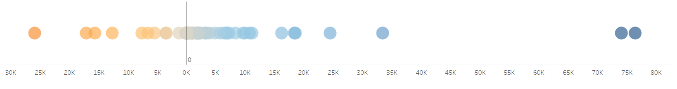
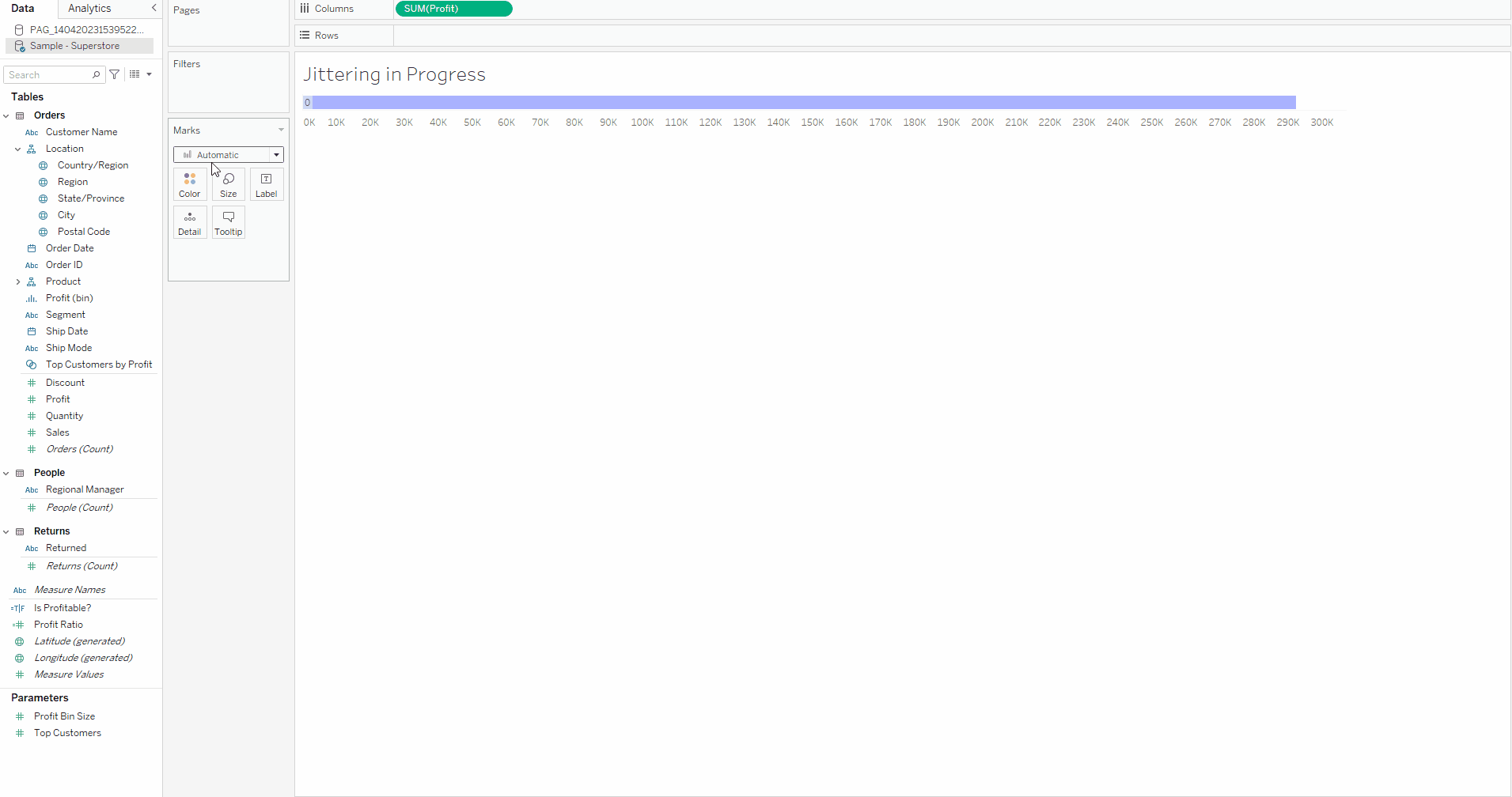
For example - Below is an example of an un-jittered dot plot. We can see that at certain parts along the plot, the data points are heavily clustered and it is difficult to differentiate them from each other.
Below is this chart with a jitter added.
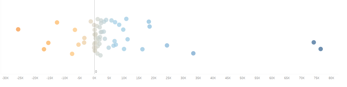
The jitter essentially assigned a random Y value to each data point and then plotted that. This separates each data point out from the others along the Y axis, where as prior, all the data point sat on Y=0 together. This makes each data point much easier to distinguish and the chart isn't so cluttered anymore.
In this #HowTo, I will be walking you through how to make a simple Jitter Plot in Tableau Desktop - using the Superstore data set.
We will be creating the same chart we created in the Barcode Plot #HowTo - just this time as a Jitter Plot!
1. First drag your continuous measure onto the columns shelf, in this example I will be using profit as the continuous measure, and I want the sum - so I also ensure that this is selected on the pill.
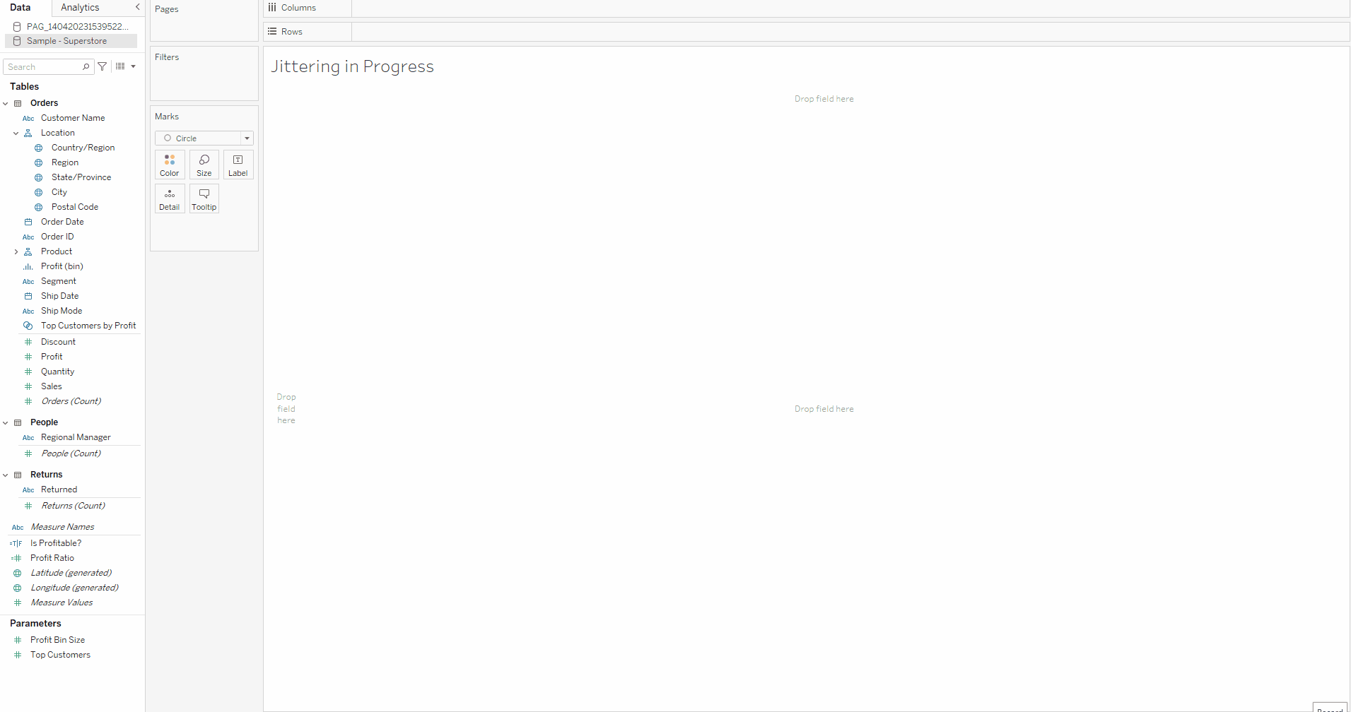
2. Double check that in the Marks Card, 'Circle' is selected as the mark.
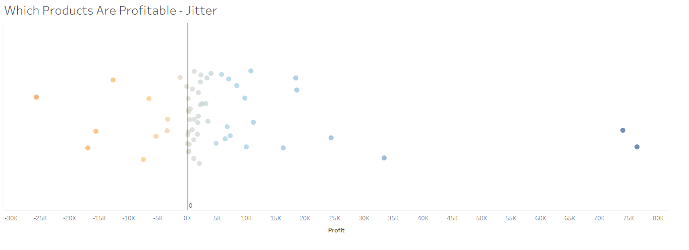
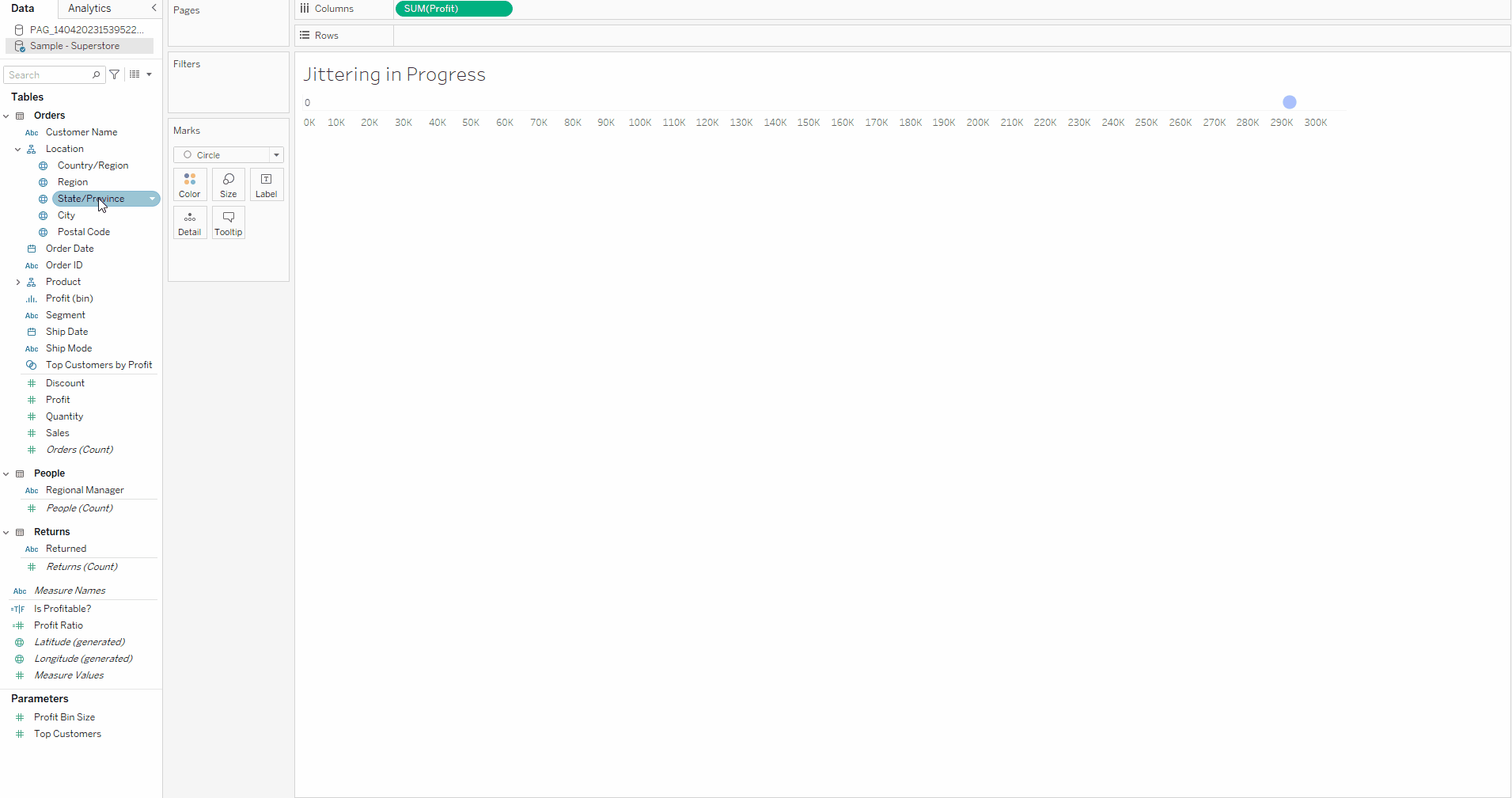
3. Then drag the measure that you want to become the individual dots of the jitter plot onto the details card - and for this example I will be using state , as I want each bar to represent a singular state and the profit for each state.
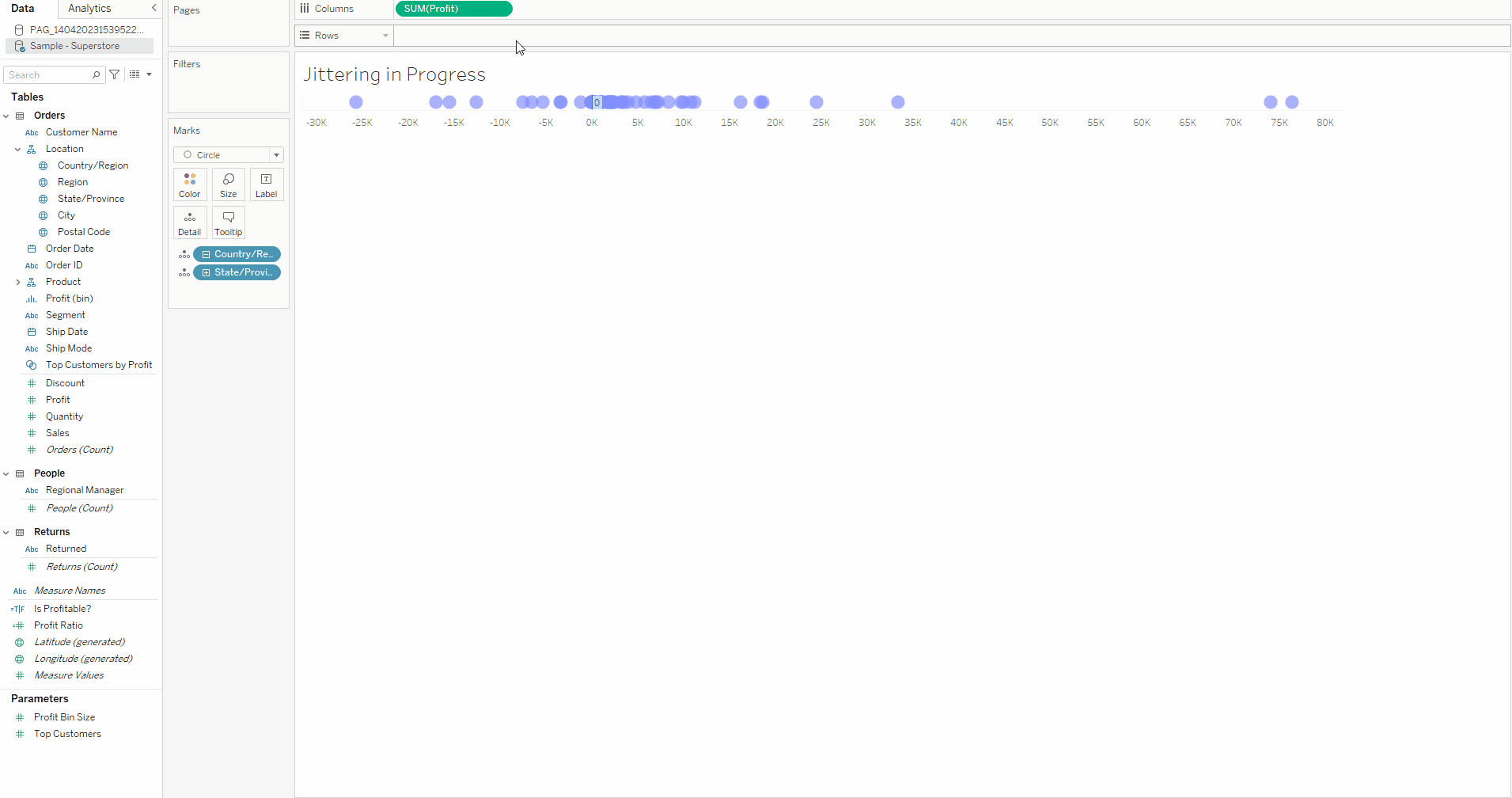
We can then see that the chart now shows individual dots for each state and their place along the axis corresponds to the sum of their profit. It really allows us to see the outlier states that are making a lot more profit than the majority of states, and also the states aren't doing so well profitwise. We also should ensure that our tooltips are turned in so we can see the relevant information for each bar when we mouse over the individual bars.
4. Now comes the part where we add the jitter into the chart. To do this - we click into the rows shelf and type the calculation AVG(RANDOM()). This calculation will apply a random Y value to each point on the plot.
5. Congratulations! You now have a simple jitter plot! Feel free to continue to format as you want.