


For a recent #MakeoverMonday (2o23 Week 20) I constructed a circular calendar chart.
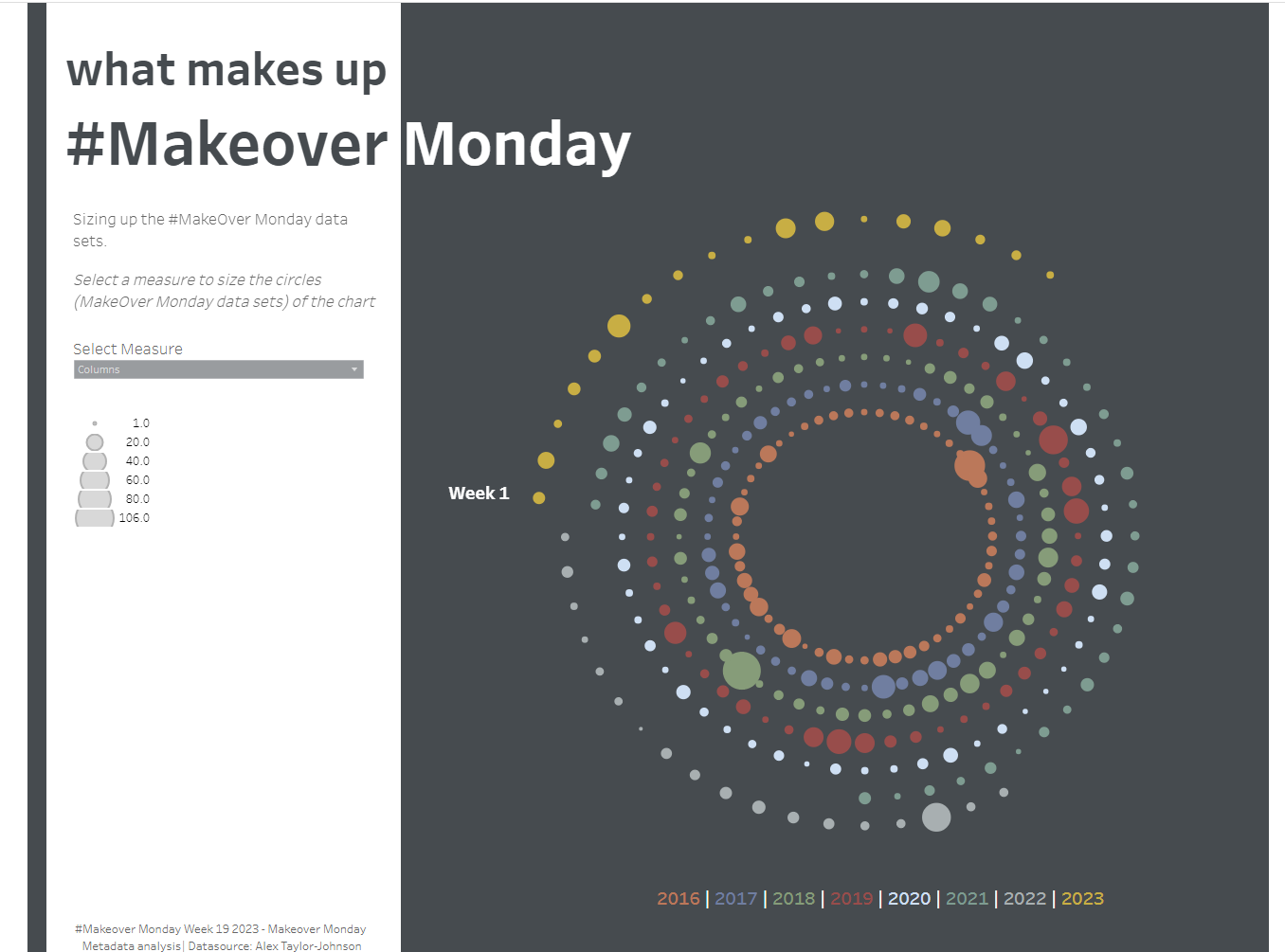
I was inspired to create this kind of chart after building a radial bar chart using some previous DS blogs and also a post by the Flerlage twins and adjusted some of the calculations to fit this new chart type that I had never tried out before.
I will be using the dataset from #MakeOverMonday 2023 Week 19 - Which you can find here
Firstly, I will be building out the extra calculated fields in an excel sheet, but feel free to use whatever tool you feel most comfortable with for this part.
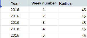
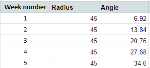
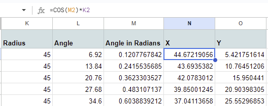
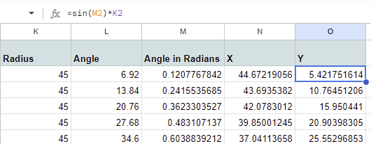
1 . To begin, we want to input a value for our radius. I have just chosen 45 for this as I want a fairly reasonably sized gap in the centre of my chart. However, I have multiple years in my dataset and I want them each to have their own circle, spaced out from all the others, so 45 is the radius value for 2016 and each subsequent year the radius is increased by 10.
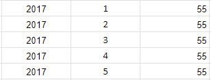
2. First you need to determine the degrees between each point. We want our points to be equidistant from the previous point and the next point along. As our points are along a circle, we can use trigonometry to help us construct our chart today. As such, the area between each point and the next point is a sector (see below) and every sector in our chart is equal. Essentially, we divide 360 (the degrees in a circle) - by the number of points we want to plot in a singular circle. In this example I want to point 52 points, one for each week of the year - 360/52 = ~6.92
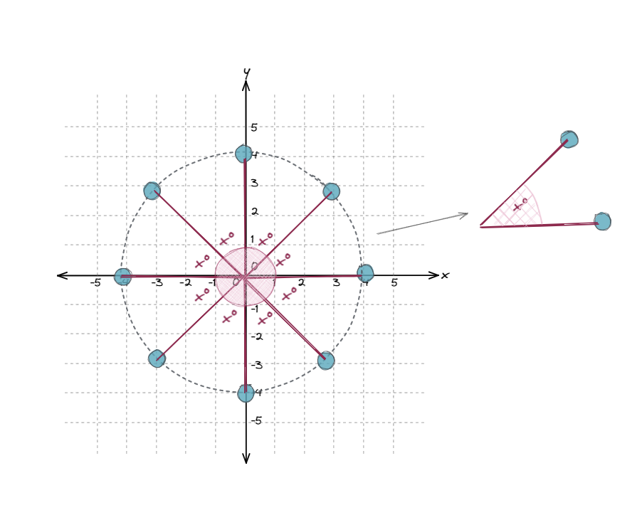
3. Input this value x into a new field/column for your first point. Each subsequent point will have a running sum of this value. So the second point will be 2x, the third point will be 3x, and so on for your entire first circle. For each subsequent circle you can just copy and paste the values from the previous year - so for example, the angle for Week 1 Year 1 should be the same as the angle for Week 1 Year 2.
So for my chart, this value was 6.92, so the angle for the first point was 6.92, the second point's angle was 13.84, and so on for all of my weeks.
4. Next we need to create another new field to convert our degrees values so radians - as we will be using some fun trigonometry later on and will need radians values for these. I will be using excels built in function =RADIANS([Angle Field) for each row.
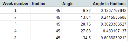
5. Now we need to bring in some trigonometry to calculate our x and y values to plot our points with. Going back to secondary school for a minute for this - we are essentially using the basic calculations from circle theorem (SOH-CAH-TOA) and rearranging to give us our formula for x and for y
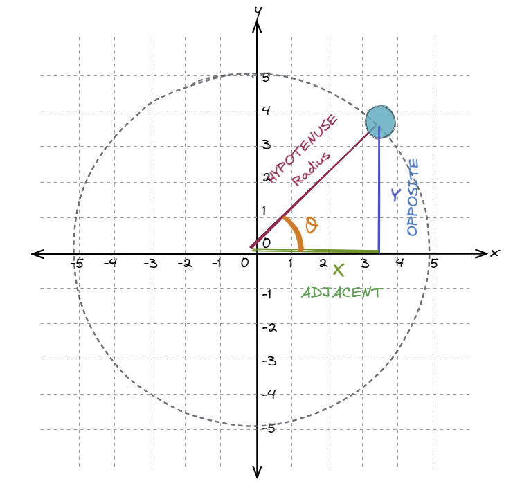
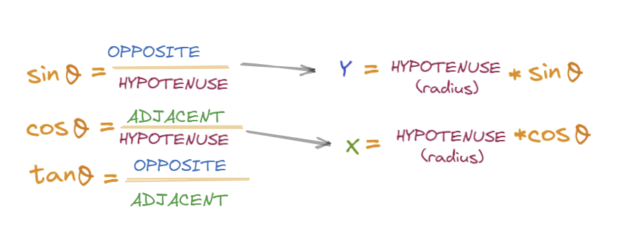
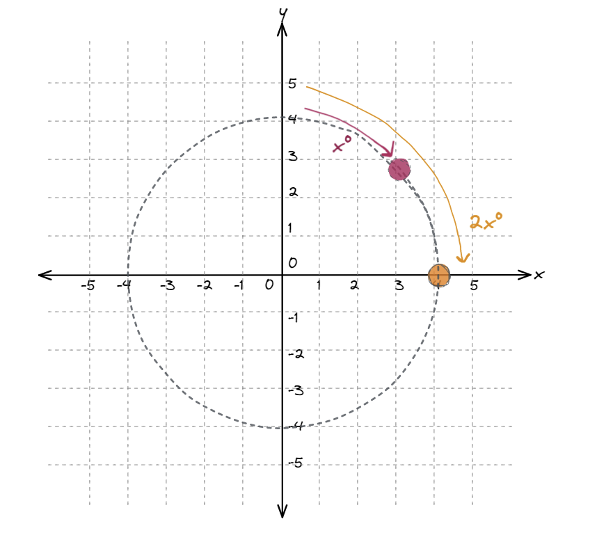
So our x value will be based off the calculation x = radius*cos(angle in radians)
And our y value will be based off the calculation, y = radius*sin(angle in radians)
I then add these two fields to my sheet, see below - where you can see the calculations shelf also
Now that we have all of the fields we need, we can now bring this into Tableau to start building our chart - which I will show you how to do in Part 2.