


Sparklines are a frequent component of dashboard KPIs as they provide a helpful bite-sized visualisation of a trend. The addition of start and end dots to the spark lines are a useful way to mark the most recent and least recent data points, as well as being a nice aesthetic feature.
In this #HowTo, I will be showing you how to add these start and end dots to sparklines in Tableau Desktop, using the classic Sample-Superstore dataset, so you can follow along if you wish.
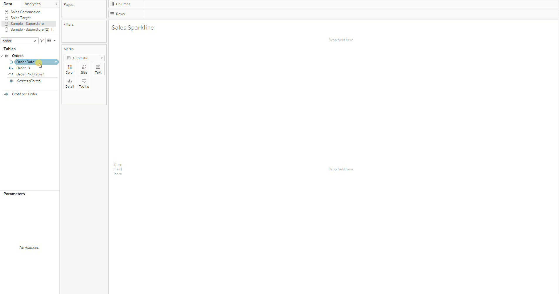
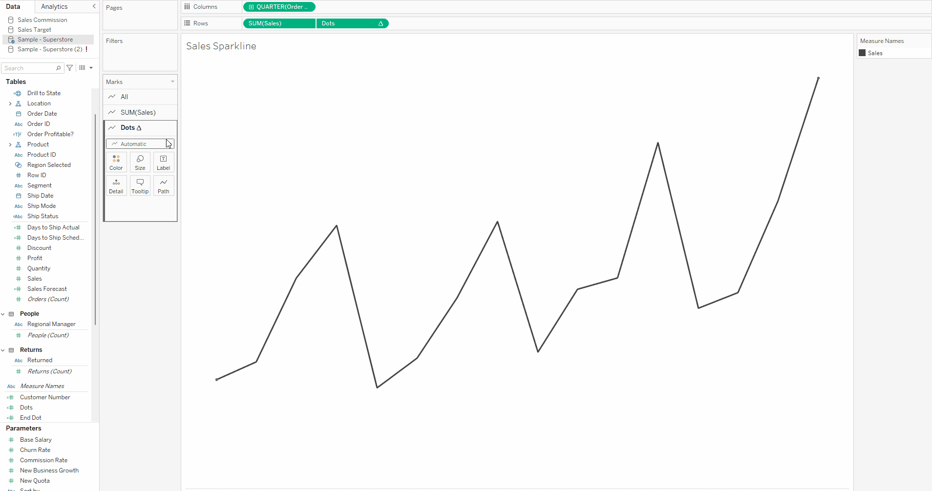
- First set up your sparkline as normal. For my sparkline I want to show the Total Sales for each quarter in each year. As illustrated below I have dragged my Order Date field to the columns tab and selected QUARTER from the dropdown and then dragged my Sales field to the rows tab. I also formatted my chart to remove the headers so I just have the bare line graph.
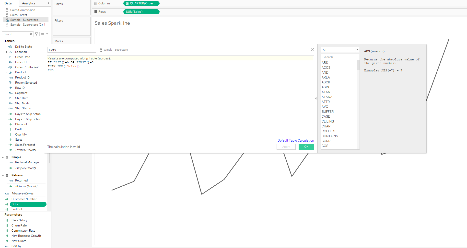
2. Then create calculated field, which I've helpfully named "Dots". In this calculated field, input the following formula.
IF LAST() = 0 or FIRTS() = 0 THEN sum([Sales]) END
This calculation checks if a datapoint is either the first or last data point using the first() and last() functions. The first() function returns the number of rows between the current row and the very first row of our data, and since we have inputed first()=0, this is only true when our current row is our first row of data, as there are 0 rows between them, and only then will return our sum(sales) else will return null. We are then doing the opposite with the last() function as it returns the number of rows between the current row and the very last row of our data, and when we input last()=0, this is again only true when our current row is our last row of data and only then will return a value, sum(sales). Every other row of data will return as null and we end up will only the first and last values to plot.
So to summarise in plain English - we have basically said - If this is the first or last row of data give us our sum(sales) value
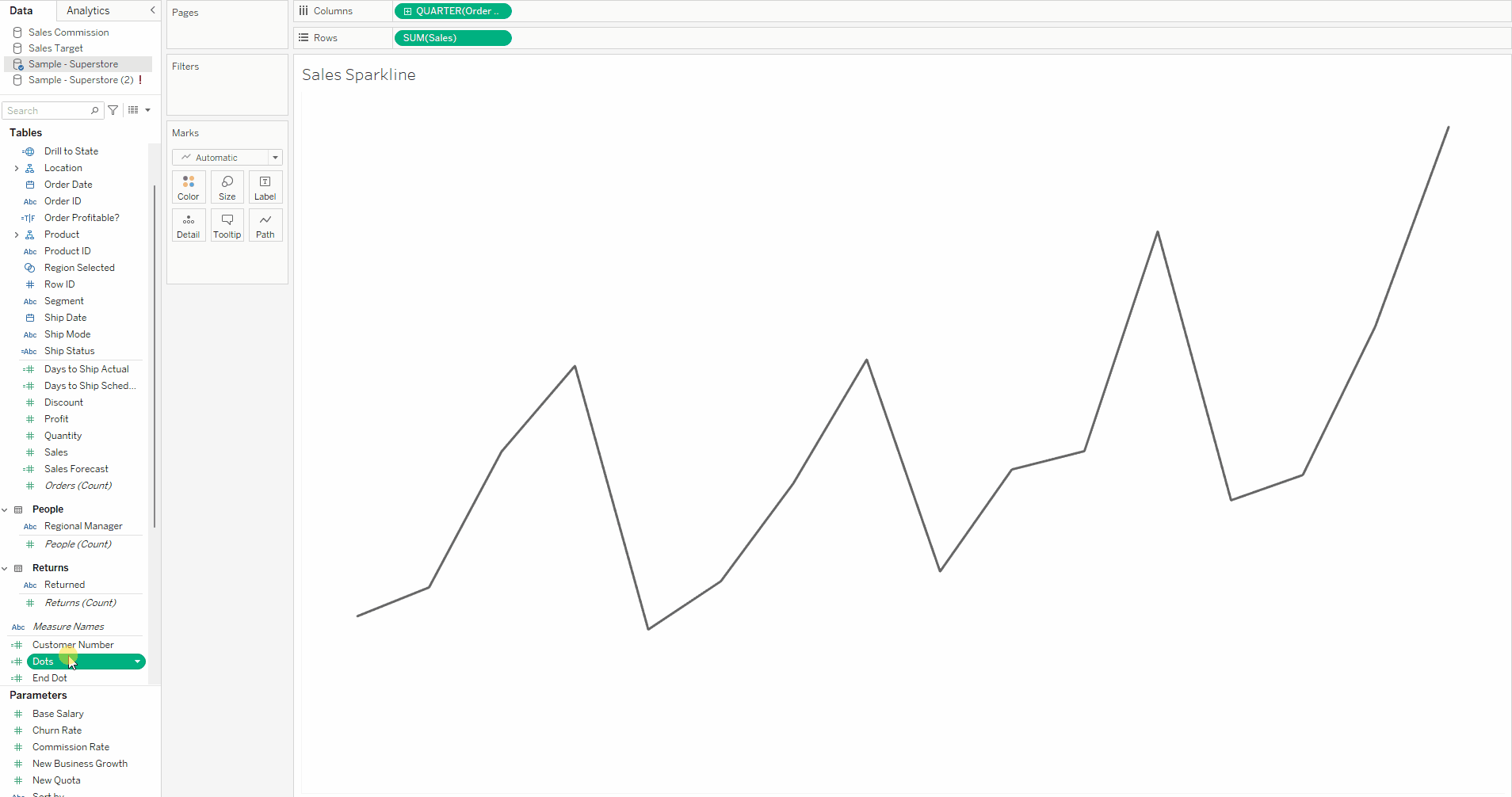
3. Drag this new calculated field onto the rows tab.
4. Click on the Dots pill and click dual axis in the drop down. Then right click on the axis on the right hand side of the chart and select synchronise axis from the menu. You can also then click on the axis again and unclick show header.
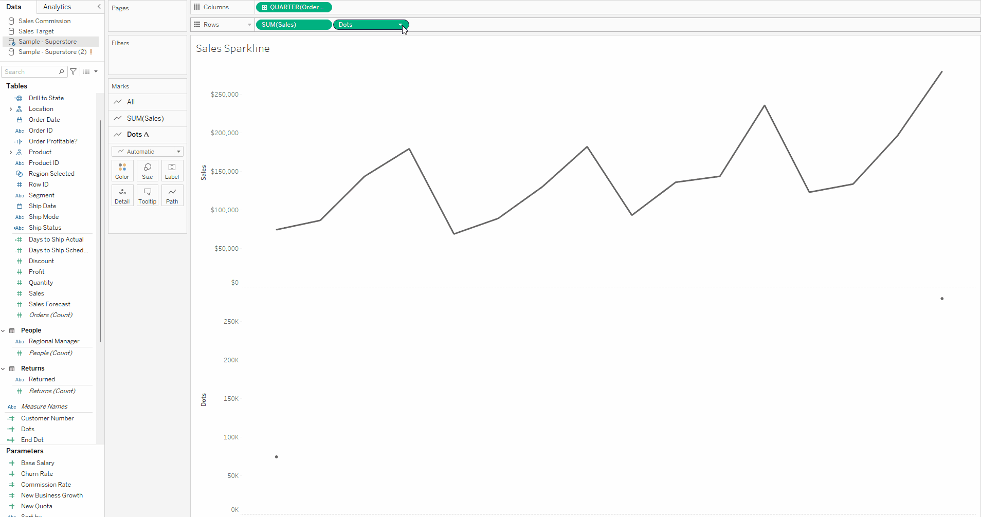
5. Navigate to the Dots marks card and change the marks type to circle and use the size feature to size as appropriate.
Congratulations! You have now added start and end dots to your sparkline!