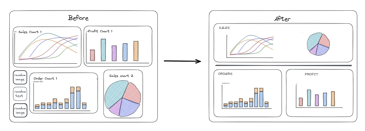
Your dashboard is essential for communicating important information and insights, although it's not always easy to design a dashboard that is both aesthetically appealing and effective at communication. Here are some key tips to help you create dashboards that are show clear data insights without becoming too visually complex or just straight up ugly.
Containers
- Containers and dividing lines allow you to visually group related dashboard aspects together and create sections.
- White space and padding help to create a visual buffer between charts on your dashboard and helps prevent it from becoming too visually overwhelming and overstimulating the viewer. White space and padding can also help create sections within the dashboard and further visually group related aspects as mentioned above.
- Place charts in a logical order that makes sense, for exampledrilling down as your eye moves down the dashboard. Also remember that in the Western World people read things from left to right, top to bottom.
- Include relevant information and charts only and avoid cluttering your dashboard, especially concerning large chunks of text. Although if you feel some text is essential, you can always hide this within an info button. Keep it focused on the most important insights that you are trying to show.

Consistent Formatting
- Keep font type and size consistent throughout - for example - keep all headings in the same size font and type while maybe having body text at a smaller font
- Ensure that all dashboard aspects such as charts, text, dividers, are all aligned with each other and not jutting about all over your dashboard. This can be achieved through padding and containers.

Colour
- Keep a simple and consistent colour scheme throughout your dashboard. To being with, focus on 5 key colours and expand on this if your dashboard requires. Keep one colour for highlights and also potentially consider having a "positive" colour and a "negative" colour.
- Use colour and formatting to highlight the key metrics or trends in the data and guide your users to identifying trends and patterns.
- In addition to your main colour scheme, keep the majority of your dashboard neutral and light in colour, and avoid high contrast and high saturation in general as this can be quite straining on the eyes.
- Coolors is a great website for creating and exploring colour schemes.
Communication
- Ensure that the key insights you want to display are clearly communicated via appropriate chart types. While it can be tempting to choose the prettiest chart type, this isn't always the right decision and you could end up unnecessarily overcomplicating your dashboard.
- Focus on the key metrics provided by your analysis and ensure they are well communicated to the user. Also as mentioned above, colours can be used to better communicate these key metrics.
- If you have interactive aspects of your dashboard such as filters, ensure that these are intuitive or your user is guided through these.
- Reflect on who your user is and design your dashboard with them in mind.
Hopefully these tips help you to design more visually appealing dashboards that are also great at communicating across your insights!
